Lean Bean – brand identity

Lean Bean approached us to create a unique brand identity as the business was faced with significant growth across Dublin and Ireland. Lean Bean is a well-established Fresh Food Outlet in the centre of Dublin, serving up some of the tastiest breakfast and lunch time meals on the island. Reputation soon spread of the fast, fresh offering across the city and demand for the product dictated an increase in stores. With this in the pipe-line the owner of Lean Bean realised opportunity to re-define and re-state the brand purpose, look and feel and communications. With the naming already in the mix it was our job to deliver an identity to reflect the reputation and truthfully communicate this forward-thinking delicious offering.

In their own words:

Founded in 2017, Lean Bean is a destination for healthy food served fast. To us healthy means real food made from scratch. Lean Bean was built on the idea that today people are time poor and the food on offer is of low nutritional value. We want to change that by providing real food, real fast at an affordable price. We believe education around food is very important to our success and that people are actively making more health-conscious decisions.

First off was the logo. We created a unique word mark based on a Stencil font which provides a sense of tradition, sophistication and modernity. The way the letters fall in the stacked version of the logo allowed the typography to play over the line ever so slightly to create an interesting, stand out identity. Paired with the traditional stencil style mark we introduced a modern san-serif to bring harmony in the brand across headlines, menus and body copy that was to be used. Clarity between the two typefaces is important as you will see throughout the menu and website, a natural yin and yang balance really elevates the brand and gives it strength to roll out across any medium required. 

Following the craft of the word mark we created a colour scheme to suit the offering and attract the right audience. Numerous concepts were put forward but the pairing of the fresh ‘lemon’ and the strong ‘teal’ working together provided something completely new for the industry landscape. Teal’s of course reflective of the green ingredients with the hint of Lemon to freshen things up across the brand. The completed palette is extremely ‘fresh’ and packs a real punch when placed in front of the fantastic plates, ingredients, drinks and interiors at Lean Bean.

One of Lean Beans mantra’s is sustainability, as seen here:

Sustainability

We are always trying to reduce our carbon footprint. Over 90% of all our packaging is now compostable with some of the remaining being used from either plant based or recycled plant-based material which is 90% less carbon.

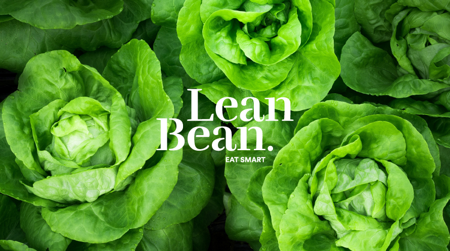
This Lean Bean ethos of sustainability sparked an idea for a new style to accompany the word mark and colour palette. With this in mind we created a unique set of bespoke illustrations which are intertwined across brand textures, backgrounds, interiors and the website. The illustrations are hand-sketched and really bring an air of sustainability to the whole brand personality. This in toe we wanted to introduce a strapline to sum this up. Eat Smart was born. Eat smart encompasses once again the brand ethos of Scratch Cooking, Transparency, Healthy Living and great food. We felt it was a much easier was of letting the customer know that ‘we do healthy food’ and encouraging them to join the food revolution. 

Lean Bean very much is a revolution in fast food and we continue to work with them in the brand roll out and evolution of the business.

Tips on working with a Graphic Designer

As expert graphic designers in Belfast, we have helped thousands of businesses with their creative projects. From full brand development to basic flyer design no project is too large or too small. Engaging with a graphic designer for the first time can seem daunting, but it shouldn’t be.

With our top tips below, we’ll guide you through the process from briefing to print and everything in between. And if you are looking for a graphic design studio to work with, we’re of course happy to recommend Kaizen Brand Evolution.

Our top tips on working with a graphic designer are:

Briefing a graphic designer

A clearly defined brief is the starting point for any successful graphic design project. It should include: Project Goals, brand guidelines, final copy and any assets for consideration of use in the project. We of course can get started on a project without some of these items, but using best practice will always achieve better results. When speaking to a graphic designer, tell us of projects you like and also those you dislike. They may be local design projects or international. This gives us an indication of what style you like and a starting project for the project.

Project Goals

As marketers and business owners we must always consider the end goal of a project. What is our aim and how do we hope to achieve it. Considering the end first, will help us design a project much more efficiently.

While not necessarily a consideration for the design team, it’s always prudent to consider the effect a successful campaign will have on your own internal resource. To give an example, our recent headquarter move was originally timed over the period we intended to run a national print offer on our roller banners. It was determined that the offer may put too much pressure on our production schedule with the move considered. While it will still happen at a later date, running a successful campaign could have put undue pressure on our team.

Assets Matter

When it comes to creating high quality graphic design, starting with high quality assets is key. These assets comes from a variety of sources, your own branding, previous photoshoots or from supplier image banks. We also have access to millions of high quality stock images on Adobe Stock & Shutterstock.

Content is King

When we start any design project the first thing we suggest is that our clients begin or complete the copywriting process. Even we as regular content writers underestimate the time taken in creating and finalising great content for projects. With larger projects such as websites, annual reports or magazines, this is of greater importance.

We hope you found our tips on working with a graphic designer useful and informative. If you have a project you’d like to discuss with us, we’d be glad to hear from you. Simply message us via the contact form below with some further information.

Start a Project Contact Form

[contact-form-7 id=”1665″ title=”Contact form”]

Town – brand development, website design & social media

When branding a new venue, whether restaurant, hotel, nightclub or bar, thee are considerations we must make as your branding partner. Our initial discussion will focus on customer demographics, market opportunities and the heritage of the business in the case of a bran audit or brand refresh. After meeting with the owners of Town, Leixlip we were blown away by their passion and drive within the hospitality trade in Co.Kildare. They had a vision for the bar / restaurant and we were engaged to bring that vision to life through: Brand Strategy, Brand Identity Design, Logo Design, Menu Design, Website Design and a social media launch campaign.

About Town, Leixlip

Town is a bar based in Leixlip, Co. Kildare, Ireland. They loved the idea of being the ‘Talk of the Town’ bar as this would be great for a ‘Town’ campaign they can work with and evolve over time. We explored diffident uses for brand language, which could easily evolve over time. Their target audience would be locals who would head into Dublin for a night out. They were inspired by well known neighbourhood bars in the likes of Dublin and Manchester and aimed to bring it back to Leixlip so punters could get the same experience and not having to travel as far, back in their home town. A place you can go for your coffee meetings, family dinners to having a night out partying on the dance floor with your friends. 

Town is “More than just a bar”.

Town approached Kaizen Brand Evolution to create a brand for their bar because they wanted to create a bar for everyone in the local community. Town’s approach was creating a friendly bar for all generations of the Leixlip community. They needed a branding system, which worked for everyone. It had to feel homely after it all it was a Town in their hometown. Town is a bar that would rely heavily on their social media to advertise their events each night and mid week offers. The Brand would have to work particularly well on social media platforms as most of their audience would be on these, to create a social media friendly brand we looked at how other bars across the globe used social media to promote their business. 

We created the branding system in way, so it’s simple for Town to use. It had to also stand out from their competitors but mainly be consistent. To get the brand identity for Town, we gathered our research of places the owners of Town liked. We took elements from our research then we crafted 3 concepts, which were all unique created to tell the story of Town. 

We Partner Your Interiors Team

We worked closely with the interior designer to make sure the brand worked with the interiors and to complement the building. We introduced a contemporary colour palette for the brand, using a rich blue, teal and gold with contrasting pinks from the floral elements used to add more depth to the brand.

Crafting the TOWN mark had to represent a place for everyone with some character. The Mark had to feel established, friendly and Town had to you make you feel like you belong, a place where you can go for a morning coffee, or grab a bite to eat or have a really good time with your mates, it had to feel like a place you never have to leave as it’s all under one roof. This is where it ties back to he underpin for Town, “More than just a bar”. 

Brand Language is Critical

The brand language had to be simple, but unique to Town. “Fancy a G&T”, “It’s T-time” and “Down to a-T” using the T mark, which can easily evolve for future adverting promotions. The language is playful, and it’s simple. 

Brand Development Is Just The Start

As well as the branding system we produced a range of visuals to show them how the brand could be used across different mediums; including work uniform, menus, hand stamps, glassware, and online presence. When you see how all the brand elements are brought together it’s clear to see how well the brand works as a whole. With this brand structure, Town will stand out from the rest of competition.

Website Development

With any branding project we must further consider its reach beyond the conceptualisations presented. We look at all manner of print and digital mediums the brand is to shown on and develop these further in line with the brand strategy. For most in the hospitality sector, the main focus of attention moves from brand to website development. As you can see from the graphic above, we have captured the essence of the brand and brought to life a new website for the thriving business.

We enjoyed working with Town on this branding project and we look forward to seeing the branding used across social media, the branding paired with the interiors of the bar and we are excited to be part of the Town evolution.

Start a Branding Project

Want to start a bar, restaurant or nightclub branding project of your own? We’d be delighted to have a chat. You can get in touch with us on +44 289507 2007 or you can get in touch with us via the contact form below

[contact-form-7 id=”2934″ title=”Blog Post – Branding Blog Post”]

Why is typography important

Here in the Kaizen Brand Evolution studio, we use typography every single day in our work. In every brand that we generate, on every website that we design and in every logo that we create, it’s always there and always important to us.

Typography is described as being “the study of the design of typefaces and the way in which type is laid out on a page to best achieve the desired visual effect and to best convey the meaning of the reading matter”. It may seem like something very simple, and like it may not make much of a difference when it comes to design, however, this couldn’t be further from the truth. In fact, Typography can often be the element that either makes or breaks the main design, whether it is a logo or just a piece of packaging.

But why is it that important you might be asking? Surely the way in which an image looks is going to be more important than what is written there? Well within this article we are going to look at just why Typography is so important, and hopefully, after reading this you will understand it a little better.

Catches The Attention Of The Reader

The type that you put on your marketing material is your message. This is going to be the part that tells the customers exactly what it is that you are offering. As such it is important that it catches the eye of the reader. It needs to draw them in so that they begin looking at your marketing material, and then they can begin noticing everything else, such as the design. It is important in this sense then to have what is called a ‘type hierarchy’ on your marketing material. This means that when there is more than one piece of type, one takes dominance over the others, becoming the main body. This is the piece that will catch the eye of the reader and draw them in. Once they are in, they will begin to notice the smaller bits of type, where the rest of the details about your message are being conveyed.

Conveys The Feeling and Mood Of Your Message

Typography is just as great for helping to set the feeling and tone of your message as your design is, and it all depends on which font you choose and also the typeface that you choose. There are thousands, if not hundreds of thousands of fonts and typefaces out there for you to choose from. However, it is important that you make sure and choose one which suits the message your brand is trying to convey. It is often evident a mile off when the type on a brands marketing material doesn’t fit, and even if it is only small, it puts the whole thing off.

Shows Professionalism

Good typography not only helps your immediate design and marketing material look good, but it is also helping to look your and your business look good, by showing the professionalism you carry. It shows that you take care when designing your marketing material and that you want people to notice what you are trying to say.

Build up recognition

Consistency is key to recognition, and recognition is exactly what you want from your branding and marketing. If you start using one type of font and make it distinct to you, customers will begin to immediately associate this with you and your brand. All the biggest brands in the world are consistent throughout all of their marketing when it comes to type because their typography and font have become a staple of their overall brand.

Hopefully, by reading this article you can start to see just how and why Typography is important to your brand, often becoming just as big a part of the brand as the logo.

Glo – Brand Creation

Recently we branded Glo Beauty, a new Beauty Salon in Belfast. This undertaking included: full brand development, logo design website design and social media campaigns.

The client’s ambition was to create a modern beauty salon offering a customer service in Belfast. Bringing a similar feel to other Cities across the globe like Dublin, London, New York and Milan. Glo is based in Kings Square, off Kings Road, Belfast. Offering a variety of services from Manicure & Pedicures, Tanning, Wax & Hair Removal, Eye Enhancements, to Make Up. Building upon the foundation, Glo will deliver a quirky experience, which makes you feel really good about yourself.

Glo Beauty is one of the first Beauty Salons in Belfast, to be funky, modern and appointment only to give you a premium service and only using the Top Market brands. Ireland’s Leading Make up artist Aimee Connolly (Sculpted) has trained Glo’s very own Maria Chesser. Maria is a prodigy in the industry, bringing elements she has learned from across the country into Belfast. As well as running the business Maria wants to get heavily involved with the services, as that’s what she’s being training for. She will be available for appointments as well.

Glo approached Kaizen Brand Evolution to brand their Salon opening in their Flagship Store in Belfast. They asked us to design and develop a new branding system for their salon; it needed to feel welcoming, bright, and luxurious. It should look modern so it could really stand out in Belfast. We wanted to Glo to brighten up the beauty industry in Northern Ireland.

Our research revealed some amazing hair salons and beauty brands across the globe. We explored texture, palette, photography – fashion, landscape and otherwise. We tested and worked with a range of type, and mark making to create something unique. We used “Your skin is Glowing” as the initial concept behind the brand identity. We combined an array of light and eyelashes for beauty with the word GLO. This creates a beautiful mark, which becomes the GLO Ray device that can be used to highlight the subject and used throughout the branding collateral. The colours used in Glo Beauty are natural colours, which will work in contrasting colours across the brand.

We incorporated ‘Glo’ into the language. This helped with the photography direction used within the brand. We created Glo’s brand language and tone of voice to offer her services. Statements like “You Glo Girl and “Glo on your Day” were created during the creative writing process for the brand. Glo Beauty Is the place where you’ll feel better every time, your skin will Glo and to really make the brand shine we had to show the brand could be used to motivate women and feel positive about the way they look. Using this brand language will help Glo in the future for marketing campaigns and advertising and will across the services Glo offers.  We married together the brand language and the logo mark to successfully to show Glo’s brand.

Following the identity and language creation, we implemented the branding across a number of deliverables. We visualised how the brand can be used across everything Glo will need from coffee cups to uniforms to help with the overall experience at Glo. These visuals will help show the direction on how the brand can be used for the signage to branded collateral for when Maria goes to beauty events. Having a strong visual brand with a clear message will help her stand out amongst the big competitors within the industry.

It was great to work on the branding for Glo and we look to seeing the brand will be rolled out across their social media, uniforms and in the salon itself as Glo continues to evolve.

Watch out for these pitfalls when designing brochures

When it comes to Brochures, they can often be one of the best pieces of marketing material that you can own. For something being quite small, it can be so important, as they can carry a lot of important information, that perhaps you couldn’t quite get across in a meeting, for example, due to a lack of time or a need for further information, brochures expand on what you have already said in greater detail, or give you the choice to let it do the talking for you.

However, it isn’t just a matter of including all of this information and expecting it work from there, as well as getting across vital information your brochures also need to look good. If they don’t no one is going to want to pick one up and read it, as more than likely they won’t even notice it. Here’s what exactly to avoid when it comes to designing your brochures, and how you can get the most out of them.

Visually Pleasing

Brochures need to be visually pleasuring, there isn’t any denying that. It’s the first thing that is going to attract someone into lifting up your brochure, whether you happen to have left them behind after a meeting, or else you’ve sent some along to a trade show, as mentioned before if it doesn’t look good, no one is going to be enticed to pick it up. In that sense, it’s a good idea to make your brochure look exciting. While it may be a temptation to produce them quickly, and you might think it will look professional, this will not be the case. It will end up just being walked by and not noticed, as there is nothing there to make it stand out from the rest of the brochures that happen to be sitting on a table, for example in a waiting room, or at a show. There is a fine line between being too boring and also being too over the top when it comes to designing of brochures, and it is the middle ground that you want to be on. “don’t judge a book by its cover” is a phrase thrown about but the reality is people usually do.

Easy to Read

With all of the information that you are going to be putting in your brochures, it wouldn’t do them or you any good if your target audience can’t read them. There are a few factors that you have to be on the lookout for here, to make sure that they are legible and do what they are supposed to do. Firstly, make sure that you choose a font you can read, for example staying away from scripted fonts unless absolutely necessary or used large enough to be easily read. As well as this, make sure that the font you have chosen isn’t too small on the finished article. A good way to ensure that this doesn’t happen is to print a few tests runs with different fonts and sizes, so that you can see exactly what they look like, instead of printing a large batch, only for them all to be unreadable. Another thing to keep in mind is the colours which you choose, both for the overall design and also the font itself. Using a font colour that contrasts with your background colour is the best way to go, for example using a darker font colour with a lighter background and vice versa.

Good Quality

The job of a brochure is for it to be lifted, held and read in someone’s hands. This means that it is going to be moved around a good bit. Therefore, they need to be good quality. Don’t think that by going for a cheaper paper stock you will get the same brochure but you are saving money. It won’t turn out like this, as the cheaper quality will eventually show through. The more the brochure is read and handled, the more it will start to fall apart and therefore be discarded, meaning you don’t get anywhere near the same marketing coverage that you were hoping for. They need to be durable and feel good in the hand, meaning even if the better quality paper stock is slightly more expensive, it’s a good idea to choose it, as you will reap the benefits in the long run.

Hopefully, by reading this article today, you have a better idea of what to watch out for when you are designing your brochures or getting them designed for you.

In that regard, if you are need of some help designing your brochures, we can help you here at Kaizen Brand Evolution. Our team of professional designers have been designing them for years, so know exactly what they are talking about. Give us a call on 028 9507 2007 or get us by email via our contact form.

The Number 3 – Brand Identity

The Number Three is a traditional Bar & Restaurant based in Limerick with a contemporary audience. Previously trading as Tom & Jerry’s it has since changed owners, the new proprietors wanted a brand to reflect the new services that they would have to offer of food and drink as well as live music. The name Number Three comes from the location on Glenworth Street.  The logo’s mark is tasked to show that the business serves food as well as alcohol through iconography, we have interpreted the request across the logo with the symbolisation of beer, drinks and food brought into the logo. The most important message was food/drink and bringing that together for the new bar and therefore we came up with the tagline ‘Pub & Grub’ this shows the traditional Irish side with the slang term ‘grub’ meaning food, as well as the pub element. As the new owners are starting out fresh they wanted the logo to look contemporary but with the old Irish feel to fit in with the local community of Limerick and the industry landscape. Kaizen Brand Evolution had to create a logo that was adaptable for the future that didn’t fit in with trends so that it could be timeless and stand alone for the business and stay classic for the duration of the bar’s lifespan.

The No 3. logo design uses a timeless cursive styled font with vector illustrations of wheat, barley the types used in beer making, there is also wine bottles to symbolise the pub and drinking aspect. We have also used the iconography of a knife and fork to show the grub side, the style is a contemporary vector design around the framing to show food and drink together. The logo is a established with the colour scheme gold and dark green to give an old traditional feel of Irish food and drink in Limerick. The logo shape is in a circle with the iconography crafted around it, the circle breaks for the wheat and barley at each end to come to show. It gives that traditional friendly vibe with a modern take on it with the vector illustrations. The photography and art direction style is comfort and homely atmosphere with a sepia filter, showing good live music with also traditional connotations.

The No. 3 logo comes in two versions, the circular version with iconography and main 3 typography as well as the longer version with ‘The Number Three’ in landscape for signage for the front of the bar. For the rollout of The No. 3 logo, it will be used on glass etching for the glass windows which will work well for the etching typography for the number three, signage for the front of the bar and interiors, mirrors, doors, food and drink menus, social media. The interior designer will be working alongside the brand for the No.3 to give that homely traditional but feel inside with booths, picture frames, high stools, a long bar and wooden interiors everything you would expect to see in your typical traditional Irish bar. We look forward to working with The No.3 across all of the deliverables and seeing the brand live in Limerick, we wish the owners the best of luck in their new venture.

Sports Medicine NI – Branding

Sports Medicine NI approached Kaizen Brand Evolution wishing to create a new brand to go with their new premises in Windsor Park. In their own words “Sports Medicine NI offers a comprehensive management service for athlete injury and health. Using our in-house sports science and medicine experts, we are able to provide a holistic team approach to guide the athlete on their journey to health and performance. Whether you are an international athlete, a coach, sports club/association or simply someone who enjoys being active, we are able to provide tailored support to recover from injury, regain health and remain healthy to achieve your sporting goals. Our specialists have experience in working with athletes and teams at the highest level and can bring that expertise to address your specific problem in one venue, simplifying the process, increasing the communication and reducing the cost.”

Sports Medicine NI target market is anyone who has been injured through physical activity or someone who takes part in physical activity or competitive sport. Their ideal customer would be a regular gym player or an amateur sports player, coach or schools player. Sports Medicine NI provides expert advice on all athlete injury, illness and performance. The aim of Sports Medicine NI is to get the player back into the game and for them to stay in the game. They specialise in physiotherapy, exercise physiology, sports psychology, sports nutrition, strength and conditioning and sports medicine, with touch points also in radiology, surgery and other specialities.

From this excellent brief from the client we were able to use this terminology for the language and strapline, this came as the key brand pillars of “Injury, Health, Performance”. For the key narrative, “Getting you back in the game” ‘helping you stay in the game’ and ‘succeed in the game’ was thought of as it covers all of the key touch points for the clients ideal market. The positive messaging shows what Sports Medicine NI can do for you throughout your sporting career. This is paired up with an inline font to highlight the words, back and stay and also in keeping with the logo design.

The Sports Medicine NI logo is made up of lines symbolising the many lines on a track or pitch, and an arrow is crafted in the M to show positivity and moving forward. The logo used a friendly soft san serif font – Effra – which is approachable and corporate at the same time. A key element in the rebrand was to have a smaller version of the logo using the SM only which can be used with and without Sports Medicine NI to the right-hand side. The colour scheme used is a cobalt blue, bright yellow and turquoise as the brand colours. The colours are bright, they stand out and are also current, as well as being representative of a sports brand such as Nike and Adidas. Additional colours of navy, pink and red are used to highlight six key sections within the brand. Throughout the brand rollout, the arrow is used in the M in the SM NI logo to denote the forward thinking and moving forward, which is very important in a athletes life, especially if they have suffered from injury.

The photography used within the brand is bright and full of colour, showcasing athletes taking part in their chosen sports, as Sports Medicine NI has clients from all manner of different sports. We have used a diverse range from swimming to karate, as well as the most popular sports such as football, boxing and rugby.

The brand rollout has been visualised on a number of different deliverables including billboards, website and social media, business stationery, flyers, signage and uniform. We enjoyed greatly working on this project and we look forward to continuing working with Sports Medicine NI as their brand rolls out.

McQuillan Companies – Brand Identity

McQuillan companies approached the branding team at Kaizen Brand Evolution to re-position and revitalise their brand identity. The family-owned business is well established across Northern Ireland and is specialists in civil engineering, quarrying, waste management and outdoor cleaning services to name a few. McQuillan Companies have a large presence on the road, their vehicles being instantly recognisable, a lot of which is down to their unique colour palette, something that the branding team had to keep in mind throughout the brand audit. Auditing a brand is our way of truthfully expressing the business offering today, whilst retaining loyal clients brand understanding and improving brand touchpoints (such as vehicle livery) we aim to create a brand purpose that keeps the business relevant and exciting for new and potential future clients.

McQuillan Companies – in their own words:

McQuillan Companies are a Northern Ireland based family run business which incorporates a diverse range of activities including civil engineering, demolition, quarrying, hazardous and non-hazardous waste management, outdoor cleaning services and analytical chemistry. A fourth generation business operating for over 100 years through the parent company John McQuillan Contracts, the McQuillan Companies name is synonymous with quality and excellence throughout our various divisions.

Getting started we focussed our research and investigation to forward-thinking, modern brands in the engineering, construction and land service industry – looking to London, New York and further afield. With brand learning’s from across the globe we built a solid understanding of what branding was working and not working in this industrial landscape. Following initial research and mood boarding, we filtered the findings down into 3 solid directions and began brand planning.

We initially developed the narrative before jumping into the design for McQuillan Companies. The narrative on this occasion was ‘Here for tomorrow’ – a modern, forward-thinking strapline for a modern, forward thinking business who are, in effect working on making tomorrow a better, safer place to live. We purposely avoided building or construction clichés so that the narrative was widespread across the entire company intern breeding a positive brand culture – essentially this narrative has legs to be flexible across different business facets.

We now needed a logo mark that reflected what we were talking about in the narrative. The McQuillan monogram stems from the idea of engineering and overall solid work that the company undertake. The new logo is a strong, trustworthy mark that brings together the initials of the family name and visualises the industry – simply. Our goal for any brand undertaking is to simplify, make brands that people get, without the use of selfish design techniques or trends. The logo proves successful when used across brand materials and especially in the brand livery and uniforms. Alongside the new mark, we introduced a structured contemporary typeface that suits the tone of voice and industry of McQuillan Companies. The flexibility of the new identity becomes apparent across the different business sectors where the company sector is simply introduced to the stacked lettering in each instance. Throughout the new branding, we have directed the new photography style, using modern dramatic images of the work in progress as well as team members in situ.

The crescendo of the brand audit was the re-design and use of the new branding across the vehicles. The vehicles that define a McQuillan job have been reinvented for future use and business growth, utilising the flexibility of the new logo mark and brand narrative they suitably stand out on the roads and truthfully represent the businesses heritage and future.

It was a pleasure working on the brand audit for McQuillan Companies and we look forward to rolling out the brand collateral in the not too distant future.

Blast 106 FM Brand Development

Belfast’s most music station Blast FM approached Kaizen Brand Evolution to design and develop a new brand identity system for their group of radio stations across the UK and Ireland. Blast FM has been live on air for a number of years and reached a point of significant growth, and they needed a brand identity that was going to help propel them to even greater heights, appealing to more listeners. The market of radio is highly competitive and the team at Blast FM needed a unique identity to truly reflect what they offer and stand out in their industry landscape.  Blast Fm’s brief was to create a modern, recognisable identity that spoke to their core audience correctly as well as being bright and bold. They wanted something that was going to stand out within the market, showing them as one of the leading players within the industry. A unique request was to include a WAV file of an important figurehead from Blast FM talking who had recently passed, a touching piece of communication now represented forever in their brand mark. Blast FM as a group own 7 further stations and a part of the challenge was to create their identity so that it could become a flexible mark, easily recognisable across all markets, as well as being easily adapted in colour and name for other stations whilst retaining the group look and feel.

We designed a flexible identity system around the concept of the play button. The play button represents radio, music, playfulness and fun so we thought it was the perfect symbolism for the group identity. We also introduced a secondary keyline surrounding the play button to represent movement, volume and radio signal. Utilising the play button’s shape we were able to house the frequencies of each station and the WAV file from the brief. The play button acts as the boilerplate brand mark for the set of group marks, on each of the different stations identities the colours change as well as the frequencies of the related station. The name of each station and it’s geographical location sits to the left of the button and is easily interchangeable as the brand rolls out across the remaining stations – Blast Fm Belfast, Iur Fm Newry & Mourne, ABC across the ABC region, Blast Digital Glasgow, Your Fm Stockport, Blast Blackburn and Blast Northwest. Each station adopts its own unique colour system, each palette as bright and eye-catching as the last. This approach keeps the group brand profile true across all business areas and reinforces the brand personality across the UK and Ireland.

Along with the play mark, we introduced black and white art direction for the brand imagery. The choice for black and white imagery was primarily to place further emphasis on the identity and its bold colour palette. The two, when designed together, marry very well and create an over well rounded, bright and modern identity with a considerable and noticeable change from their previous brand identity. The photography is primarily portraiture of key musicians featured on playlists from the respective radio station. Each set of images is put together in a concertina format for use across social media, advertising and in print. We also introduced a set of geometric 3-dimensional backgrounds for the Blast FM brand rollout which can be seen on their social media channels. The geometric shapes and 3D effect simply adds depth to the brand mark and creates a more modern corporate brand world for the new mark to thrive in.

As the brand rollout continues across the entire group we look forward to creating further digital and printed collateral. As brand guardians for each of the business facets, we have a clear understanding of how the branding should be treated across all mediums. We thoroughly enjoyed the design and developments of the brand system for Blast FM and look forward to seeing the branding out in the real world as it begins to evolve.

Harlow Brand Identity

The client’s ambition was to supply top of the line Italian and Scandinavian fashions online with an eventual ‘bricks and mortar’ store in Northern Ireland.  The brand had no name, identity, narrative or visual strategy. It was our job to sculpt and direct the branding from naming to delivery.

We chose a name that reflected the company’s ambitions, high-end, one with an abstract meaning and a subtle hint to a landscape in which the clothes are made. The name Harlow was a great driver for the identity creation and overall styling of the brand collateral, as it reflects elegance, subtly and confidence.  The naming process was approached with the same rigour as any brand identity project. Firstly with research and investigation, looking at hundreds of colloquial, European meanings and names, names that echoed style, femininity, and confidence, all brand pillars of what is now known as Harlow Clothing Company.

With the company name to hand, we could now focus on creating the brand identity. Our research revealed some really outstanding fashion outlets and quirky retailers across the globe. We explored texture, palette, photography – fashion, landscape and otherwise. We tested and worked with an array of type, symbolism and mark making. We used the stem ‘passion led us here’ as a backbone narrative for the project – this language opened up the door for passionate photography, and an overall ‘chill’ – ‘hippy’ lifestyle vibe for the brand – something that the client was immediately connected with.  The narrative paved way for an ‘airy,’ modern use of type with wide spacing between letters. The font used for the primary type mark is a Grecian typeface, one that screams ‘foreign contemporary’ to keep in line with the business ambition and to suit the product. The type in the mark now decided upon we wanted to introduce a simple device to enhance the overall identity. Traditionally when thinking to European or foreign language we expect to see accents or glyphs that derive from foreign alphabets, so how do we introduce this – cleverly. Taking inspiration from the missing holes inside a button we introduced an “umlaut”-style device above the H in Harlow. This addition creates a unique brand identity and creates a new brand atmosphere to begin to use dots and the separated H as part of the brand material and roll out.

The colour palette is subtle, confident and modern reflective of the 3 pillars of Harlow Clothing Company. The greys and blues echo the denim and highbrow fashion on sale. Pairing the colour palette with fashion photography enhances the brand personality, solidifying the clients’ expectations and price ticket of some of the brands on sale at harowclothing.co. Harlow’s initial brands are Italian denim magnates Freddy and Scandinavia’s SVEA – two unique, stylish brands that radiate quality and fashion. Harlow sits confidently in this brand landscape and showcases the products on sale fantastically. The photography brings another element of landscape to the identity, transporting its customers to the origins of the garments on sale. The photography is a welcome addition to the brand pack, it’s storytelling ability enhances the experience and establishes the new business as an already market leader in this field. I must highlight that Harlow is the first business in Northern Ireland to stock and sell the Freddy and SVEA brands.

We designed all brand material from online e-commerce site to tags, labels, packaging and signage. All brand elements adapt the same brand tone, minimal yet impactful. The brand is now live and boasts an already impressive online following on Instagram. As Harlow’s reputation builds we continue to work with them, acting as brand guardians, as they evolve so do we.

GB Poultry Brand Development

The family business of GB Poultry contacted Kaizen Brand Evolution wanting to their refresh the identity of their well known brand. GB stands for Gregory Bell which is the family name of the business established since 1982 that has been passed down the generations. In their own words “GB Poultry Ltd is a family owned business based in Crossgar in the rolling countryside of County Down”. There are 7 Directors in the company, all from the Bell family who are personally involved and committed to the general day to day running and operating of the business. An EC Approved Cutting plant and are guided by DAERA (Department of Agriculture, Environment and Rural Affairs). Supplying a wide range of Whole Chicken, Flash Fried Chicken, Sauces, Cooked Chicken, Turkeys and other meat products. GB Poultry wanted to modernise their brand and bring it into the future as they are leading in their field of poultry in Ireland. Supplying to outlets such as Boojum, Pallas Foods and Henderson a refresh of brand is what they wanted to align with their customers aspirations.

One of the main USPs that GB Poultry wanted to bring across is that they are from Crossgar, a small village in County Down, we travelled down to their offices and were met by fields upon fields! They are very proud of where they come from therefore we have come up with the tagline ‘A Taste of Crossgar’ as an important part of narrative of their brand. This brings in the origin of the product and also links to the taste of which is also developed in Crossgar.

The previous logo consisted of a cooked chicken and a wreath, similar to your traditional styled butchers, our creative studio updated this with a modern rounded typeface which gives connotations of friendly and approachability. We created a custom vector illustration of a chicken to match the rounded typeface. We have selected the colour scheme of a dark grey and light blue palette which gives a refreshing difference from their usual red and green branding. We have used the colour separation of the blue and white two toned logo for the GB and the Poultry text.

When we travelled to Crossgar we noticed the beautiful landscape around it, we captured this by creating a custom illustration of fields with trees, tractors and chickens in it that can be rolled across their branding. We used textures and muted colour palette for this to utilise the brand and the modern logo, they bring across the farm aspect of the brand. GB Poultry have several products requiring packaging design, this includes sauces, flash fried chicken and cooked chicken which flavours they create themselves. The flash fried chicken products are readily available from most local shops, make sure you try them out. We have visualised up three different types of products, sauces, salt & chilli chicken goujons and breaded chicken burgers using three different colour schemes to define the different products. The packaging is a sticker on the products which sit on shelf with all of their competitors therefore the bright colours of blues will stand out. The brand roll out includes tone of voice, business stationery, packaging, vehicle graphics and signage.

We greatly enjoyed working with Bell family on their brand refresh for GB Poultry and we are looking forward to seeing the packaging roll out and the well known vans on the road.

Belfast Mens Health Logo Design

Belfast Men’s Health Group (BMHG) is made up a group of people across the community of Belfast and volunteer organisations across Northern Ireland, all with a strong interest in the health and well being of men, by raising awareness of all the main health issues relevant to men and sharing events of interest across Greater Belfast.

BMHG provide a range of information shared by experts who really are experts in their fields. Organising meet up events, provide videos, podcasts and even hosting competitions, they want men to really feel good about themselves and to look after others. BMHG want to make sure there is access to all the relevant information where ever you are.

In their words:

“Belfast Men’s Health Group is a made up of representatives across statutory, community and volunteer organisations across Belfast with a strong interest in the health and well-being of men. Each year we celebrate Men’s Health Week and International Men’s Health Day by organise events to raise awareness of health issues that are relevant to men. We also work with other agencies at other health events to raise further awareness. We are developing the work of the group and a website to further evidence of our ambitions.”

Initially approaching Kaizen Brand Evolution on a website, designed to help them share a range of media and information to a wider audience, our working relationship grew. After our first studio meeting, BMHG noticed our wall of clients and our portfolio of work, it was at this point they decided to rebrand their logo as they felt it was outdated, and it wasn’t communicating the tone of their current direction.

BMHG wanted a logo that worked along side the Northern Health and Social Care Trust branding, they wanted it look like a sub brand to the Northern Health and Social Care Trust and to feel like a brand you can really trust with some sensitive topics within the health and general well being of men.

Hoping to show people that they were a Belfast based organisation, whilst also hinting at what they stand for. They also didn’t want a logo that was too clinical, so this became our challenge to produce a mark, which would become instantly recognisable, corporate and memorable to men across Belfast.

We created a device using the B for Belfast, removing the counters and replacing with the cross for health. The colours are more of a muted blue, which when in use is quite corporate and masculine. The B+ device could be used as a window what information BMHG has to offer, the logo will work well online, email signatures, on t-shirts, beanies and also work on pop up banners, and flyers for events. The use of blue helps the logo have confidence, and feels trust worthy.

We are also creating a website for Belfast Men’s Health Group which will be their audience’s digital handbook for anything and everything they need to know about Men’s Health and well-being. The website will include a range of videos, podcasts, blogs and links to other websites in a visual and clear manner, to help men understand the importance of good health and uniting together. The site will be launching during Men’s Health Week in September 2018.

It will be great to see how their new logo will be used around Belfast, knowing they are helping Men across Greater Belfast.

Day & Age – Brand Development

Day and Age, creators of short films, use video to make sure the little moments are never forgotten. Kathryn approached Kaizen Brand Evolution when she wanted to steer Day and Age in a new direction, when she wanted to hand her brand identity over to safe hands for an all over evaluation, and when she wanted to evolve her business.

Starting from a young age Kathryn was capturing videos for weddings, corporate insights and family events. Day and Age is now pushing forward to new areas of film, looking to create memorable films that become powerful memory aids. Focusing on making memories and treasuring each moment, whether it be for promotion or an event, a memory for someone that may forget, or even just to give as a gift – Kathryn creates the most beautiful and effective videos.

To display this evolution of the business, we took the Day and Age brand and re-focused it. A brand that will appeal to the current, the new, and the expanding target audience. Kathryn and ourselves agreed that that bold and fitting name of the business should remain, everything else we could assess, address and push in the right direction.  

Throughout the process, it was clear what Day and Age represented and what it would bring to each of its clients-memories. A Day and Age film would provide a beautiful memory aid and so much more. With memories, nostalgia and capturing the moment in mind, we came up with the suitable brand language that would surround the brand. The strapline ‘Memory Studio’ helped give definition to the name, explaining exactly what Day and Age is. They create memories and help you ‘Remember each day’.  

The brand identity itself was provided as a wordmark and an abbreviated device ‘D and A’ to apply throughout any brand extensions. We found the connection between the initials of the brand and term ‘DNA’ riveting. Day and Age’s main aim is to celebrate families and individuals, all about the ‘DNA’. Displaying this connection subtly through the abbreviated device meant the ‘Day and Age’ name still held prevalence.  The versatile device can be applied in many different ways to connect you directly back to the Day and Age name while highlighting the ‘DNA’ or ‘D and A’. We used the combination of a rounded and modern font to reflect personality, approachability and style, a brand that you would want to work with and trust.

The colour palette and imagery came naturally from the Day and Age films.  Using all stills from taken footage, we could see how well the brand would work. We applied a soft and neutral colour palette to compliment the brand identity, language and each film. Not to distract, but to honour the nature of the brand and each film. 

We are now seeing the brand come together to display a clear focus and direction, the direction that Day and Age were and are aiming for. The new Identity is tailored to evolving clients, through narrative, identity and finally the implementation, whilst still appealing to a greater audience. Day and Age creates memories, but it can also still cater to and appeal to any possible film seeking client.

We continue to work with Day and Age, rolling out their new brand across various different forms of stationery and promotional materials. The new brand is coming to life and complimenting all the great work that we are seeing from Day and Age. It is a pleasure to work with such elegant content and now a new brand that compliments that content. We look forward to seeing where the business and new brand goes from here.

Graze, Belfast – Brand Audit & Logo Refresh

Graze is a restaurant based in Ballyhackamore, East Belfast. They love serving tasty little dishes (also know as tapas). These dishes are full of flavours using quality local produce, paired with your favourite wines. Graze is a great place to enjoy your tapas as they have created an atmosphere that is comfortable, friendly and the ideal place for people who just love great quality food and drink. Graze has made a name for themselves because of their special fish dishes, which change daily, based on the catch that morning.

In their own words:
“The Graze experience is about more than just food. A sincere effort to educate our staff on all aspects of food and wine culture is the basis for our service philosophy. We take great pride in our relaxed style of service and our welcoming staff at Graze go to great lengths to make diners feel at ease, comfortable and well taken care of.”

As well as the restaurant serving tapas & wine, Graze has the Lounge; soft lighting, with dark interiors and comfortable seating makes the Lounge feel relaxing. It’s known for their range of local Gins, craft beers and ciders.

Graze really know how to make your experience extra special; with their resident mixologist, who will make you some amazing drinks and cocktails.

Graze love their Gins so much they have their own Gin Club. Get involved in their monthly club where you can try 5 new gins, and shown how you can serve them up yourself.

Graze approached Kaizen Brand Evolution to create a brand audit for their restaurant because they wanted a brand which was consistent, and reached a new audience of late 20’s early 30 year olds. Graze’s approach has always been simple, so we felt we needed to create a branding system, which would be easy to use. They will be able to use across all of their marketing for both online and offline. It had to be simple for them to use. It had to stand out from their competitors and it most of all had to be consistent.

To create a brand that really represents Graze and develop a brand identity really needed. The previous brand and the food didn’t pair well so we took inspiration from everything within Graze, from the dishes they serve to the colours used in the interiors of the restaurant.

The Graze brand combines a word mark with a personality, a popping friendly colour palette and referencing the tiles they have in their interior. We developed a tone of voice which is friendly, and sounds familiar, it reminds you to “Enjoy the little things” in life and to cherish those moments with friends, family and to be surrounded by great food and drink.

As well as the branding system we produced a range of visuals to show them how the brand could be used across different mediums; including work uniform (aprons and chef jackets), interior signage, exterior signage and menus.

I enjoyed working with Graze on this branding project; I can’t wait to see the branding all over social media and Ballyhackamore. I’d like to see Graze develop into a restaurant, where people come from all over to try their tapas and gin.

I hope Graze sets the mark for what tapas should really be all about.

Meet our evolutionaries – Dawn

1.What has working in Kaizen Brand Evolution taught you about the design industry?

The main thing it’s taught me is adaptability. The world of design is fast moving and it’s so important to evolve with it and to be able to work on a wide range of projects. It’s also taught me that you can’t just think like a designer making pretty pictures, you have to think like a marketeer, an advertiser, a strategist, an accountant, a business owner and a consumer to ensure you get the best and most effective results for your client. Oh and it has to look good too.

2.Desert Island Design Studio, which typeface would you bring with you?

Burford. It’s not one I use all the time, but it’s a really creative typeface that you use by building layers. It consists of base layers, top layers and bottom layers that you can have a lot of fun with. It would definitely keep me entertained and give me something to do if I was stuck on a desert island!

3.What do you use for motivation inside the studio?

When I’m in need of some serious motivation, there’s nothing for it but headphones and heavy tunes. Anything from ASIWYFA, Daft Punk, Royal Blood, Muse or Biffy Clyro depending on how I’m feeling.

4. Any designers you have been stalking online recently?

I’ve been following/stalking Morag Myerscough on Instagram since I was at her talk in Offset last year. I love her use of bright colours and typography. I really want to decorate my house in this style, but I might need to invest in some super strength sunglasses first.

5. What are you listening to in work today?

Today I’ve had a bit of 6 music with Father John Misty, and The Vaccines, Temples, and um Justin Bieber on Spotify. I have a very eclectic taste in music. Don’t judge.

6.Any exhibitions in Belfast recently that are worth checking out?

The Late Night Art Bus Tour is absolutely brilliant and definitely worth checking out. The bus takes you round various galleries and street art in Belfast, often to places you’d never think of going to. Some of the stops even include a glass of wine, so it’s a super night out, very inspiring and great craic.

7. What’s your pet called? Tell us about them.

Sadly, I’m currently petless. I did have 3 goldfish but it didn’t end well. Nuff said.

Code Fixer – Branding

Codefixer are a small web design and development company based on the Malone Road, Belfast. They design websites for a range of clients  across many different industries all over Ireland. Codefixer are one of the few companies that specialise in Google Ad words, SEO friendly websites and Analytics. Having this all under one roof helps give you the ultimate package for your business. They make the whole experience very easy for your business and needs.

In their own words:

“Codefixer offers a comprehensive range of first class web design and development solutions including e-commerce and WordPress, that coupled with our extensive skillset in SEO and Pay Per Click helps all types of websites punch above their weight.

Whether you are a small to medium sized business, a start-up to a multi million pound online business we’re confident that we can help you improve and get more of out your online business. Our success is due to our hunger to succeed and provide web solutions that exceed client expectations.”

Codefixer came to Kaizen Brand Evolution wanting a new look to their brand. The old brand was out-dated and didn’t match the professionalism and years of experience Codefixer had. It just looked cheap and amateurish and this was so far from the truth. In fact they have been in this industry for just over 15 years. Codefixer wanted a refreshing logo that would set them apart from the industry landscape. They needed to look like a professional web design studio who you want to look after your online presence. As being a company who works with the internet they are potentially competing in global market not just local. The current brand doesn’t do Codefixer and justice.

Our approach was to create a memorable logo, which is future-proof; we wanted it to say exactly what sector they were in without looking like your typical web design company. We created a logo that would easily develop into a brand with sub logos.

In the meantime it had to be a logo that covered all basis of what Codefixer do into an eye-catching design, which prominently worked across all screens from mobile devices to desktop.

The mark is a inspired by the language of code. A main object is written in square brackets ‘code’ followed by an instruction ‘fixer’ in this case. This language is written in lowercase (computers don’t understand uppercase). The [code]fixer mark can easily be written when the logo isn’t present on any device and will become instantly recognisable. The use of azure blue helps reach out to more corporate clients. This blue makes the business feel trust worthing and reliable.

The new logo will be used on social media, Linked In, their own website and possible print materials.

I believe the new mark will help them get the business and clients they want for their business.  The logo will be able to work well for training course and possible coding events in the future in Belfast and across Ireland.


Active Health – Brand Development

Holywood based Active Health Solutions approached the team at Kaizen Brand Evolution to reposition their brand identity to tie in with their plans to build a new website and a re-fit to their facility on Hibernia Street. Investment into their online service and internal facilities sparked the requirement to refresh their entire brand identity from their logo mark to their brand purpose and narrative. Active Health Solutions required a fresh, contemporary brand audit that reflected their ambitions for the business and a brand that spoke to new and existing clientele.

In their own words:

We are a company of passionate health care professionals providing a holistic, multidisciplinary approach to healthcare from our bespoke clinic in Holywood, County Down. Our mix of services include Physiotherapy, Podiatry, Chiropody, Massage Therapy, Pilates, Personal Training, as well as the provision of Occupational Physiotherapy to a number of large companies and organisations across Northern Ireland and Ireland.

Active Health Solutions was started in 2006 by husband and wife team David & Rachel Saligari who are both are highly trained Musculoskeletal Physiotherapy Specialists who met while completing their Masters of Manual Therapy in Perth, Western Australia. They and their clinical staff pride themselves on providing the most up to date and evidence based treatments available. Whatever your requirements, you will be directed to the health care professional within the company with the expertise to solve your problems and achieve your goals.

Utilising their own description of Active Health Solutions we crafted a brand narrative and identity that would help re-position the business as market leaders, experts and forward thinkers. The first port of call was the logo mark itself. In a brand audit we retain and refresh rather that re-invent. This ‘refresh’ was a modern take on their existing mark, a contemporary word mark with considered typographic detailing using the ‘sportier’ glyphs found in ITC Avant Garde along with a simplistic ‘Plus’ brand device that the business can introduce as a nod to the health industry as well as reflecting that they are a physiotherapy business at the core “PLUS’ so much more. A key piece of the audit was also to remove the word ‘solutions’ from the primary brand mark – this decision came into play rather early in the design process, we felt that ‘solutions’ was too generic a word to describe the full set of services on offer at Active Health. This was an easy removal for the business owners as most clients refer to the business as ‘Active Health’.

We introduced the narrative ‘Activate your Health’ to use across all branded touch points both online an in print. Activate your health is a direct call to action for the brand and acts on its own as almost a sub brand for the business to use around the building, on advertising and in any promotional material they produce. With the logo mark and brand language set in place the colour palette and photography direction was next in completion of the brand audit. The colour palette reflects the previous branding, rather than using a primary lime green, we have introduced a pastel scheme to accompany a beautiful blue grey. The colour symbolises renewal and growth, addressing the key selling points of Active Health Solutions. The photography direction is focussed, dramatic and telling of the services carried out at Active Health – we wanted to move away from the traditional stock photography direction of clients smiling in a clinical environment, something that this market is saturated in. The imagery is much more though provoking and speciality focussed.

Active Health are currently working on refreshing their website with us, creating an informative, user friendly experience online, all reflective of their service in store.

Mongey Communications – Branding

Mongey Communications tasked the Kaizen Brand Evolution studio with a full company rebrand of their hugely successful communications business based in Co. Kildare. The work that Mongey carry out is instantly recognisable across the island of Ireland with reach across audio and visual in some of the most prestigious sporting and high profile events across Ireland, not to mention their security communications and audio work. Mongey communications reputation is exceptional, however their brand identity was falling behind. We created a new brand purpose for the business including strong brand narrative, ident and brand vision for future growth and success.

In their own words:

Mongey Communications , founded by brothers David and Cyril Mongey is built on over 30 years worth of experience in the sound and communications market. Operating throughout Ireland, the company has the commitment, resources and experience needed to provide a comprehensive audio-visual and communications solution for any event, project or venue.

We have developed an enviable reputation in providing AV and communications solutions for the event industry in Ireland in the sporting, cultural and entertainment arenas.

We are experts at providing first rate audio-video solutions. This is our job. We have been doing this for the past 20 years at some of the biggest events Ireland has ever witnessed, from the hugely successful Ryder Cup in 2006 to all the rugby and soccer internationals in Landsdowne Road and Croke Park.”

Our first challenge was the name, we believed that the name Mongey stood alone in its own right as a recognisable name, so we decided to drop the ‘communications’ from the brand paving the way for a simple, clever mark. As we investigated further with narrative and storytelling for Mongey we introduced the ‘MORE” concept. More audio, More visual, More CCTV for example. This alliteration makes the Mongey name synonymous with More than communications. This new strapline also aids Mongey for growth and introduction of new technologies, which the company pride themselves on. Any new technique of communicating to audiences Mongey is an early adapter, from Walkie Talkies to drone work they are a progressive, contemporary business with focus on the future. All of these business attributes have been considered in the new branding for Mongey.

The new Mongey mark is very much an audit of the original abbreviation “MC” that they used as their brand identity for many years, we felt this was the best approach for the business, to recognise success by treating the logo mark as a contemporary 21st century brand system with modern values. The M becomes the device for the brand and evokes the sense of the Mongey personal touch. This personal ‘signature’ style was crucial in reflecting how the Mongey business is very much a family business, a subtle but relatable hint. The remaining word mark takes a very modern, structured approach. Increased kerning and valued space between letters in the mark improve its visibility on screen and in print. We have retained the original Mongey red palette and introduced a beautiful Teal palette to work alongside it, as well as a brand image library full of high impact, abstract photos. The photo direction is an important factor in the new Mongey brand as it propels Mongey as a stand out communications company. Competitors traditionally use images of their actual equipment, screens and speakers we have focused on the experience that Mongey brings to a project with bright, dramatic shots of fibre optics, close ups of audio systems and even high impact visuals of the types of events that Mongey has experience of working in.

The brand itself has extensive reach across Ireland which we as a studio are excited about, from Croke Park to Kingspan Stadium the Mongey brand is now prepared to soar across Ireland successfully. It was a pleasure to work on and we look forward to continuing the brand roll out across print and digital.

Meet our evolutionaries – Dean

1. What has working in Kaizen Brand Evolution taught you about the design industry?

From only being here a week, I’ve noticed how fast-paced the studio can be, you always need to be on the ball.

2. Desert Island Design Studio, which typeface would you bring with you?

Odd place to use a typeface; I love geometric typefaces, I’d take LL Circular, it’s fun, and has character…

3. What do you use for motivation inside the studio?

Flicking through some design books, drinking coffee (black, no sugar) and being surrounded by creative people.

4. Any designers you have been stalking online recently?

I’ve been stalking Tony Futura over a year now. He’s a fantastic conceptual artist, creating tongue in cheek visuals. It’s different.

5. What are you listening to in work today?

Today I’ve listening to Eric Prydz (he’s coming to Belfast in June) always puts me in a happy mood, love his visual work to (GMUNK). I usually try to sneak in some hard house and hardcore.

6. Any exhibitions in Belfast recently that are worth checking out? 

I’m looking forward to an exhibition called ‘The Museum of the Moon’ (W5). It on 10th Feb to 4th March. It involves a massive installation of the Moon. I’m get excited by new uses of technology.

7. What’s your pet called? Tell us about them.

Heidi and Kitkat, Heidi’s a cross between a Dachshund and a Bichon, then there’s Kitkat (Chunky). She’s a massive cat.

Poppogoblin

Poppogoblin are a healthy focussed café/juice bar situated on Alfred St, Belfast. They have garnered a reputation for fantastic, delicious healthy alternatives for lunch and for having warm friendly staff that make the entire experience with Poppogoblin one to remember. The owners approached Kaizen Brand Evolution to re-position the branding for plans to refresh the business alongside an interior fit out and a unique Poppogoblin juice range. The businesses reputation an integral part of their offering, which became apparent in our own research into customer, reviews on trip advisor and the broad social media landscape. One thing that was reoccurring was the focus on how the customers where blown away by how friendly and lovely the staff were in Poppogoblin, which immediately set them apart from competitors and highlights their brand purpose. With the brand purpose in mind we made sure to include hints to the unique offering in their brand identity, narrative and tone of voice.

The brand mark itself reveals a smile in the typography, which is paired alongside a re-draw of their infamous lotus flower. The ‘smile’ in the typography immediately triggers a sense of positivity and the experience that Poppogoblin offers as a destination – you’re going to leave smiling. To balance the re-enforce the logo mark we introduced the strapline ‘eat smart, smile more’ – a strapline that sets the tone for the entire re-brand. You can now see as the brand launches in their signage, on their menus and even on their newly launched food truck – ‘eat smart, smile more’ is as dominant in the design as the logo itself, highlighting the power language can play on your brand.

Colour choice was a delight for Poppogoblin, healthy modern pastels we’ll call them help extend the brand reach to the modern diner without isolated a particular gender or mind-set. You can dine in Poppogoblin if you are vegan, veggie, and carnivore – any palette really so we kept the colour scheme open and friendly as to represent the brand purpose fully. Photography plays a role in telling the brand story of Poppogoblin to which we called upon one of our favourite Architectural, interior and food photographers Donal McCann. Donal’s shots extend the brand direction fantastically, capturing the warmth and friendly atmosphere as well as the beautiful food and drinks on offer.

Brand launch began some months ago in the background of the shop façade. Behind the scenes our team were building the full responsive website for Poppogoblin as well as preparing the social media channels for launch. The website utilises Donal McCann’s photo-shoot alongside beautiful typography, layout and brand placement. The full screen imagery on the site play a hug roll in telling the brand story and giving you a taste of the Poppogoblin experience on your desktop, on your mobile, anywhere really. We ensured that the brand roll out kept on track with the vision from the branding exercise. This extended into quality control with signage companies, interior fit out teams, vehicle wrap companies and juice bottle label manufacturers. We always like to keep a close eye on things as roll out happens, acting as full brand guardians as a brand starts to launch. This process and relationship with a brand extends our reach and expertise in the branding process and ensures that your investment in the brand is realised and achieved correctly as agreed.

Poppogoblin is a fantastic case study for us a brand designers, the brand itself highlights how every aspect of your brand can be considered for maximum purpose. The Poppogoblin brand identity, language and brand guidelines are all set in place for a bright future.

Meet our evolutionaries – Ciara

1. What has working in Kaizen Brand Evolution taught you about the design industry?

Other than all the practical do’s and don’ts, form and function.  Working in Kaizen Brand Evolution has taught me a lot about the customer focus, everyone has a different eye, therefor, see’s things differently, something you have to always keep in mind.

2. Desert Island Design Studio, which typeface would you bring with you?

Brandon Grotesque is hot. It would totally be my sidekick. So versatile, friendly, strong…

3. What do you use for motivation inside the studio? 

I find working in a studio with a group of talented designers motivational. I can look around the room at any time and be impressed, interested and motivated by all the amazing work going on around me. That and some heavy tunes.

4. Any designers you have been stalking online recently?

I am always stalking every designer. Recently I have been obsessing over Young Jerks. I’d recommend anyone to check out their work.

5. What are you listening to in work today?

I hate to admit it, but DJ Ryan Stanfield has usually got the best mix on. If I need to focus, I will usually listen to some small angsty band or Little Mix.

6. Any exhibitions in Belfast recently that are worth checking out? 

I am so proud of Belfast and how well the creative scene has blossomed the last few years, there is a beautiful new mural every few months. The Black box puts on a walking tour and exhibition of Belfast street art, I’d love to go.

7. What’s your pet called? Tell us about them.

My favourite thing in the world is my cat Kitty. She is small, black, and very noisy. She always has her tongue out, unless she is drinking milk or giving kisses.

Naturally Rosie

Rosie came to Kaizen Brand Evolution seeking a brand for her Naturally Rosie naturally hand-made animal products, a balm for animals paws, an oil for fur and a toothpaste for their gums. Rosie has been selling her products at local craft fairs around Northern Ireland and wanted an established identity to make her stand out in the market and progress to sell on Etsy, Folksy and Amazon. We have produced a brand that is ready for the high end shelves and incorporates the values that her product is all about.

We created the logo for Rosie bringing in her name into the imagery, incorporating a rose and lavender to bring across the natural handmade iconography, as all of her products are made out of naturally grown ingredients and lavender is one of the main ingredients in most of her products. The logo is modern, using a minimalistic typeface with her ingredients represented in icon format that will be recognisable in the craft market. The brand language for Naturally Rosie ‘Nourish Your Furry Friends’ is a friendly message to show her target audience that she caters for all types of animals with her products and they are like a spa treatment for them. Throughout the brand roll out we have highlighted her iconography to represent her products, these are tested on humans, natural ingredients and hand-made with love, each of these three pillars were matched with a sketched icon to represent them. To show the softness and friendly nature of Rosie’s products we have used watercolour sketches of ingredients and a muted pastel colour scheme of light pink, blue and navy. We have also incorporated textures of rose gold and paper texture to uplift these colours and give an organic feel. The photography plays a large part as it shows warm colour tones with happy pets with their owners. The image library is made up of cats, horses and dogs used to show that the product is for all types of animals.

‘A Tail Waggin’ Treat’ and ‘A Perfect Present’ language has also been added to emphasis the ‘Nourish Your Furry Friends’ encouraging that this is a special treat for your favourite pet but it also has health benefits. For each product we have also created a symbol so that each product can be easily identified for Rosie’s clients. The Wham Balm we have used an icon of paw print to represent the animals paws, the Tell Tail Oil we have used an droplet to represent the oil and for the Gums+Tums we have used a tooth icon. Each product design comes in three different scents, therefore three different colour schemes have been added to distinguish. Stress is a scent with lavender ingredients to soothe and calm the pet down, to reflect this we have used the colour violet, sleepy which is to help your pet slumber is denoted by the colour green as it is associated with sleep. Fussy is non scented therefore we have used a natural tone for this one. The watercolours also represent the ingredients used in each product. The white minimal packaging design deliberately shows the products clean and pure derivatives. 

Naturally Rosie presentation collateral has included stationery, bags, tags, advertising, stall graphics, social media concepts and web development. We have visualised these in a loving engaging way with kind colour scheme to engage her target market. It has been a pleasure to work with Rosie on her new branding for Naturally Rosie and we look forward to seeing her in our next local craft fair and beyond!

Punchestown Racecourse

Punchestown approached Kaizen Brand Evolution to perform a re-brand for their established and celebrated racecourse and entertainment venue. We re-positioned the Punchestown brand by creating an engaging narrative and strategy for the business. With focus on the new ‘Town’ campaign we developed a suite of versatile straplines to use across the new brand roll out and marketing campaigns.

The Punchestown Festival is considered amongst the Racing community as the equivalent to the Wimbledon of Tennis and the Augusta of Golf. The best of the best from far and wide and the entire annual racing season compete at Punchestown. The sheer audience and exposure of the Punchestown brand provided the need to keep their identity and advertising fresh and representative of their unique offering.

There is a deep history at Punchestown Racecourse, which helped immensely in the craft of the brand narrative, from the famous horses, trainers and events that have taken place there is much more than meets the eye at Punchestown. The racecourse is not only synonymous with racing, there is so much more to the venue, from music festivals, corporate catering, family days, hospitality and new years celebrations to name a few.

We felt that the best way for us to communicate the wider offering was to generate a campaign that’s going to be immediately representative of the brand and evoke the emotions and sense that you feel when attending events at the racecourse. This is where the “TOWN” campaign was born. Developing the campaign narrative from the courses namesake, presented potential mileage for the brand and its campaigns immediately and it seemed like an organic development for the branding. With the TOWN campaign decided upon we generated a suite of potential Irish colloquialisms, sayings and relative straplines that would become the driving force behind the new brand identity. ‘Get out of town’ was a saying that marries a few points at once, which we explored on launch.

The idea of getting out of Dublin Town to visit Punchestown is the initial response to this phrase, however we’ve blended a traditional Irish colloquialism in the messaging “get out of town’ also gets used when you’re surprised to hear or see something. i.e. ‘I got a new Ferrari handed to me by my boss’ – the response would be “get out of town’. So the narrative bar was set, to communicate on two levels and engage vocally through the brand materials.

With the narrative and strategy in place we could work the craft of the logo and brand materials. The logo, which features the Punchestown Fox (identifiable through the years across each variation their brand history) has been brought into the 21st century with the use of a fresh new type family and custom fox mascot, who sits neatly above the TOWN letters, harking back to the narrative and campaign messaging.

We introduced a contemporary colour palette for the brand, keeping yet improving on the notorious Punchestown red we added a seasonal suite of colours to be used across the festival graphics, easily identifiable with the likes of Spring, Summer, Autumn Winter festival days. The colour flexibility has really strengthened the brand materials and creates an immediate association with a time of year at Punchestown. Primary colours explore pairings that compliment the Punchestown red, gold and a deep navy.

Once the brand elements are married together it is clear to see the visual results of the successful re-brand, which now addresses the ambition of Punchestown as a business. The new brand identity and campaigns stand out from their local and national competitors. Everything from the strategy, narrative, identity, implementation and management of the brand has been considered and carefully treated to ensure absolute success as the brand evolves. We absolutely loved working on this brand as a studio and we continue to work with Punchestown as brand guardians and as the racing seasons come around.

KBE Upcoming Events

We’ve got a busy few weeks ahead of us, so here’s the full run down on what we’re up to in November.

/ Belfast Design Week / Helvetica Screening / 08.11.17

First up, we have a few events at Belfast Design Week Our first event is a screening of ‘Helvetica’ in our studio on 8th November. Tickets are free, and if you fancy coming along, heres the link to book: http://bit.ly/KBEHelvetica


/ Belfast Design Week / Design Startup / 09.11.17

Ryan is also hosting a workshop on Nov 9th as part of the Design Startup: Build Your Own series.

He’ll be talking about the commercial application of design, and the tools designers need to have in order to successfully apply their design knowledge to a commercial market. Should be a great workshop for any aspiring designers, so make sure to apply if you’re thinking of starting your own design agency!


/ Digital Tourism DNA / How to Build a Successful Hospitality Brand / 20.11.17

On Nov 20th, we’ll be heading to Digital Tourism to host a special Studio Session with a focus on branding for the Hospitality and Tourism industries. We cant wait for this, especially since it’s an industry that we’re extremely passionate about promoting.

We’re showcasing alongside some of the biggest brands in the digital industry, as well as some massive names in hospitality and tourism. It’s a big honour to be asked to showcase alongside these brands, and we hope to bring something valuable to the delegates. 

We’ll be showcasing some of our branding projects, and discussing the essential tools for hospitality brands to evolve their business and outsmart the competition. We’ll also be exploring the importance of a strong brand in a digital world, and the impact it can have on customer perceptions online. We’ve got a lot of ideas, and we can’t wait to share them with everyone.

If you’d like to come along and attend our session, we have a special discount for our customers and followers; use the code KAI30 at the checkout for 30% off full day tickets to the event, and come along to see us! http://bit.ly/Digitaldnatourism


/#ImWithTheBrand / NIce Design / 23.11.17

We’re hosting the third event in our #ImWithTheBrand series on Nov 23rd; this time around we’ve got something special for all the design lovers in Belfast. Our event is called ‘NIce Design’ and we’ll be hosting a panel of designers from around Northern Ireland to share their experience and knowledge about their specialist area of design.

We’ve got a great mix of design experts, from lifestyle branding to illustration, animation and graphic design. We’re really excited about this one, so if you’d like to come along you can get tickets here.

Tickets are £5 until Nov 10th (£8 after) and 25% of all the proceeds will be donated to Alzheimer’s Society.


/ Networking Brunch / With Panacea / 26.11.17

Lastly, Ryan will be joining our client Panacea Drinks for a networking brunch on Nov 26th at the Merchant Hotel. 

If you work in the health and wellness industry this is an event not to be missed. Appealing to health food producers, personal trainers, instructors, gym owners, coaches, competitors, athletes, influencers, bloggers, healthy cafe and restaurant owners and anyone else involved in this industry. 

Come along to learn about building your brand, working with influencers and bloggers, gaining and keeping customers, what works and what doesn’t work and how to stand out. For tickets see https://ti.to/northstar/brunch


And that’s it for November! Well, aside from the most important thing we have going on…creating memorable and purposeful brands for businesses who want to take their business to the next level. Does that sound like you? If so, get in touch. 

The Cookie Jar

The Cookie Jar is a well-established bakery situated in the beautiful surroundings of the Mourne Mountains. Since 1965 The Cookie Jar have been baking some of the country’s best known breads and sweet treats, from Wheaten bread to Soda bread, Fruit Bannock and beyond they have built on their Grandmothers fame across Northern Ireland and kept true to her original recipes. To this day owner James has kept every recipe his grandmother created the same, as they were in the 60’s – a testament to the quality of the products. From their premises in Newcastle, County Down The Cookie Jar noticed that there was high demand for their traditional Irish baking outside of the bakery shop and across the world. Ex-pats living in Australia, America and Europe seek the traditional baked taste of home and The Cookie Jar was happy to help. The power to re-create your favourite Wheaten, Soda, Scones and much more from your home, no matter where you are in the globe spawned the idea of ‘Bake your own’ – The Cookie Jar’s solution, in the form of ingredient packages. The ingredients simply need water and oil added in order to re-create the beautiful taste of home, still with James’ Grandmothers original recipe. With increased interest and success of selling and shipping the ‘Bake your own’ model required a brand identity as well as some packaging design.

In creating the brand identity we needed a narrative for the brand that immediately told the brand story before a logo or package is seen. How do we sum up a traditional bakery that is famous for their product in Newcastle, Co. Down – Mourne and Bread. Mourne and Bread is the lead narrative that sets the foundation for the brand identity and tone of voice. Mourne and Bread addresses the surroundings in which the bread is created and recognises the tradition and nod to being ‘born and bred’ in the Mournes.

Now that we have the narrative the identity would soon follow. We created a brand mark that remembers the old identity through a revised wheat icon as well as bringing the texture of the work surfaces in the bakery to the type design. The textured type instantly tells the tale of the bakery and once paired with the new, improved colour palette the entire mark communicates as a fresh, contemporary identity. We created both stacked and horizontal logotypes for versatility across the branding both in print, signage and online.

Marketing and promotion for The Cookie Jar allowed us to build upon the narrative, copy and art direction – from ‘Mourne and Bread’ to ‘up here it’s bread into us’ and gorgeous, epic shots of the Mournes and dramatic bread shots the branding, when pieced together is very powerful.

Following the design and marriage of all branding elements we were able to focus on how the ‘Bake your own’ packaging would appear. Taking into account the direction of marketing material and storytelling across the brand we wanted this to continue. Utilising the ‘Bake your own’ theme we designed the packaging to reflect the homemade feel and resonate with the ‘crafty’ audience who would be baking the breads and mixes. We introduced scenic Mourne illustrations and photography to the package design as well as a contemporary ‘way-finding’ icon set to be used as the product list develops.

We not only got to develop a fantastic brand identity and strategy but we also had the pleasure of creating some of the delicious breads and scones in the studio. The ingredient bags make it so easy and believe me the results are delicious – personally I had the Wheaten Bread and Scones and both are incredible, highly recommend you try out The Cookie Jar.


Staying Healthy by Working Together

Slim’s Healthy Kitchen is one of the longest standing clients on the Kaizen Brand Evolution roster. Since their fruition, we have developed the brand, from the brand identity, tone of voice and brand personality to their website, social media design, menus and interiors. Our working relationship has strengthened as the business has continued to grow significantly, with the opening of 4 new restaurants in the Belfast area and now a new venture into all of the DW Fitness Clubs. Slim’s Healthy Kitchen continues to develop and evolve their brand with us and the understanding of the brand values is what makes our business, and theirs, truly successful. When we received news that Slim’s garnered a contract with DW Fitness Clubs to open the Express model across all stores in Ireland, United Kingdom and Scotland we were absolutely thrilled for their business.

The past two weeks has seen the launch of the Slim’s Healthy Kitchen brand in DW Fitness Clubs across Northern Ireland and with our help, we have delivered the Slim’s brand experience in this new venue. Brand consistency across the DW roll out was imperative and with the design of Digital menus for screens behind the counter, interior graphics for the restaurant, promotional material such as flyers, pop-up banners and social media posts we have set the standard for future Slim’s Health Kitchen Express roll-outs.

We worked closely with the marketing and management team at Slim’s Healthy Kitchen in the design of the new menu for DW Fitness Clubs. The brief was to attract and engage gym users, parents of children using gym facilities and appeal to personal trainers alike. We designed and developed a series of high impact graphic devices and colour schemes, bringing the screen menus to life. The brand personality is highlighted in the Slim’s Express model, use of contemporary graphic design utilising standout illustrations, high impact photography and personable brand language.

Along with the new menu design, we had to adapt the Slim’s Healthy Kitchen brand to suit the interiors of each DW Fitness Club. We created a series of branded vinyl signage, which can be seen throughout each location on counter fronts, window displays and feature walls. Vinyl signage is a great way of displaying brand identities, language and offers across the store especially on this project we were able to brand the already existing unit rather quickly. In addition to the vinyl signage we created and designed a series of internal posters for the restaurant. For the poster designs, we called upon local photographer Fergus Jordan (Whitecloud Photographic) who produced a beautiful series of stylised food photography showcasing the offering at DW Fitness Clubs. The imagery reflected the brand values for the Express Store fantastically using bright, eye-catching backdrops as well as some extremely creative food styling shots. The mix of high-end photography, graphic design, typographic design and illustration really sets Slim’s Healthy Kitchen apart from their competitors. The introduction of the branding into the DW Fitness Clubs has completely transformed the way healthy food and drink is now offered in this fast paced environment.

With the success of the first four Slim’s Express restaurants opening across DW Fitness Clubs Northern Ireland in Boucher Road Belfast, Bangor, Newtownabbey and Londonderry we are excited to evolve the brand even further as Gary McIldowney prepares to take over the DW Fitness Clubs restaurant offering across the United Kingdom and Scotland. Slim’s Healthy Kitchen is the perfect example of brand evolution, highlighting our own business model that together we are creative change makers, achieving big results from small changes over time well spent with clients. The Slim’s Healthy Kitchen brand has never been as strong as the business continues to grows, so do we.

Robert Roberts

We had the pleasure of working closely with Robert Roberts on their brand and marketing materials recently. With the launch of their new range of flavours, based on famous landmarks across Northern Ireland we designed the advertising campaigns. Using the location specific designs with contemporary photography we created some intriguing ads that spanned the province.

Most prominently the ads are featured at Belfast City Airport. Branding the airport in a blanket fashion for Robert Roberts really profiles the brand, highlighting their forward thinking brand values and setting them ahead of their competitors. We continue to work closely with Robert Roberts and with our team of avid coffee enthusiasts we are excited for the working relationships future!

Vandal opening night

Nothing gives us more pleasure than to see a brand created in the Kaizen Brand Evolution go live. Working with the management at White’s Tavern we designed the brand identity for Vandal.

On Friday night the Kaizen Brand Evolution team had the pleasure of being invited to Belfast hottest new bar/eatery. Vandal is located on the first floor of White’s Tavern and boasts a brand new type of crowd that you wouldn’t usually associate with the lovely, traditional surroundings of White’s Tavern. Vandal taps into the glory years with a cool twist – 90’s throwback design echoed through the branding, interior and whole experience really. Nostalgia is a powerful thing. You immediately associate with the Vandal brand, it transports back to a time when mortgage payments and car insurance meant nothing and all you cared about was your high score in Donkey Kong on the Super Nintendo and the Fresh Prince of Bel Air. Great alcoholic shakes and deep-dish pizza making the experience a full circle success. We can’t wait to go back.

Boojum, Cinco De Mayo

Boojum approached us to create a concept for the launch of their new ‘Win a trip to Mexico’ Campaign for Cinco De Mayo. We developed an online and printed campaign strategy that revolved around a ‘holiday tag.’ Using the tag as the device to drive the campaign it was clearly linked to the Holiday theme and strategically, ‘Tagging friends’ on social media became the staple of the competition. The tag also appears at the final stages of the competition where Boojum hold a special night where finalists have the chance to find a printed ‘Boojum Tag’ inside a Burrito on the night of the draw. Corona where the main partner in the holiday give away and we introduced some hashtag’s to coincide with the competition #boojum5demayo and #boojum&corona. The competition has proved very successful in driving new traffic to the main site www.boojummex.com (design by us) and raising brand awareness across Ireland.

Brand evolution of White’s Tavern

The owners of the White’s Tavern came to us with an idea to brand the floor above the traditional Irish pub into a one of a kind bar/eatery. Stepping away from the long-standing tradition of White’s the new addition was to be tailored to a young professional audience, which would become a place of nostalgia and happiness with an edge.

We delivered a striking brand identity for the new venture titled ‘Vandal.’ Vandal’s identity is a nod to nineties street art and culture. Through considered graphic design, the bright colours, patterns and hand drawn typeface are tributes to the 90’s theme with a contemporary treatment. The theme continues throughout signage, menus, wall graphics and online.

Talking Brand

Senior designer Ryan Stanfield popped into BBC Radio Ulster ‘Good Morning Ulster’ this morning to talk brand.

How it’s come about

It has been built on a solid foundation of 6 years of creativity, the studio was producing work across the island of Ireland and beyond, but was an unsung hero. We wanted to give the creative team and our clients a voice, a brand that could tell the story of who we are and what we do.

Why is what you do important

I believe it is important to effect change for the better. That is what design does. It intervenes to create a preferred state. It’s the ethos of Kaizen Brand Evolution and how we help our clients in business.

What will Kaizen Brand Evolution offer?

“In two words creative change. The ability to evolve in an ever changing and competitive marketplace. To continually engage with both internal and external audiences both visually and through brand language. We offer ideas and thinking on brand that can find output both in print and digital formats to reach the most fitting solution to the design problem. We offer a way forward.”

“We have recently converted our first floor into a studio space, allowing collaborative thinking from the designers, a break out meeting area, and reception to ask how you’d like your cuppa.”

“We are currently fortunate to work with a wide spectrum of clients, from charities to media moguls and everything in between. Our designers find themselves getting under the skin of many industries, believing that the value of design comes in knowing how businesses work in order to help find the right solutions to make creative change.”

“In terms of recruitment, we have just welcomed a new account manager, as well as someone to look after the numbers, and are in the process of sourcing a highly talented designer to join our gang.”

Why are brands important

Brand are incredibly important. Ultimately they are visual story tellers, they build consumer confidence and speak on behalf of your company. The visual language and tone of voice crafted for your brand will engage with your audience, build that audience and sell to that audience.

International Society of Typographic Designers 2016

I travelled to DIT (Dublin Institute of Technology) Grangegorman last weekend, 5 March 2016 for the Annual ISTD (International Society of Typographic Designers) Student Assessment. Every year design students from across Ireland take part in what Erik Spiekermenn described ‘The Most rigorous and honest assessment in the world. No personal likes/dislikes can affect the outcomes.’ The students answer one of 5 ISTD briefs to which they may use a number of mediums and outcomes. When assessing we look for strong concept with comprehensive typographic exploration.

On arrival we have a chance to grab some breakfast and catch up before beginning the assessments. This year I was paired with Jamie Murphy from Salvage Press, a typographer and letterpress printer and all round great guy. The briefs are outlined below.

Project 1: A life’s work

Celebrate the life’s work of Adrian Frutiger. Create a prestigious ‘publication’ (digital/physical or both) that celebrates the life and work of Adrian Frutiger.

Project 2: The Undiscovered Country…

‘Stare death in the face’ and find out everything there is to know about it. Consider international, societal, scientific, religious, historical, statistical, cultural, literary and poetic touch-points within your research, before determining your approach.

Project 3: Visualising Music

Using Philip Glass’ opera Einstein on the Beach as your source material, you are asked to investigate different ways of making visual typographic notations in order to create a music score for this work.

Project 4: Eye Witness

Your task is to translate a written, first person account of a significant event, into a typographic experience that is designed as a site-specific installation in the gallery of your choice.

Project 5: And the winner is…

Celebrate the Nobel Prize. You may wish to propose the design for a suite of publications that highlight the various categories of awards; perhaps a prestigious publication that investigates the life and work of a selection of Nobel Laureates; or a very focused approach looking at a specific category e.g. the prize for literature.

Yet again the standard of work for Ireland is exceptional with a number of students passing the bar and one merit awarded from myself and Jamie. I thoroughly enjoy the assessments and believe that this institution greatly benefits the design community, raising standards in typographic practice across the globe.

Girl Power

Kaizen Brand Evolution join Women in Business

We are excited to be part of Women in Business, one of the largest and ever growing business network’s for females in Northern Ireland. Lynsay from a design perspective, and Glenda from sales are new members joining many of our entrepreneurial clients. This gives us an amazing opportunity to network with local business as well as engage with new starts. An added benefit is the mentor programme, allowing our team to both mentor and be mentored to gain invaluable experience in the business world we contribute to. Looking forward to our first event and introduction to a great initiative. We’ll be sure to keep you posted!

BBC Digital

Connecting Homes Roadshow

Here’s one you don’t get everyday! Lizi Daley from our Digital team has been working with BBC Digital and Farset Labs to create an interactive roadshow showing the evolution of digital technology in the home. The walk in mini home has everything from doorbells that operate lights to DIY Raspberry Pi solutions. Our job was to make what would arrive as a mobile on home on wheels to a cosy home that could display the technology and make the unit a domestic environment for the three day roadshow. Lizi had the task of mixing kitsch, shabby chic 70s style interiors with the corporate BBC Digital branding. Liaising with Farset Labs Lizi made sure online styling matched the environment she was creating that would take to the road. After a lot of wallpaper swatches, lighting research and door hunting, the vision came to life. The roadshow will be outside Belfast City Hall as well as Northern Ireland Science Park, designed, print managed and fitted by our team.

Walking the Walk and Talking the Talk

Valuing brand with Robert Bau

Tuesday saw the alarm clocks set for 3.30am for Glenda and Lynsay as they embarked on a road trip to Dublin to attend a workshop hosted by the Institute of Designer’s Ireland with guest speaker Robert Bau, heavy-weight strategist and thought leader. Once fuelled with coffee and pastries courtesy of Brooks Hotel, they settled down to a compelling talk on the application of business strategy to selling and quantifying the value of design. Attended by mixed disciplines from interior design, packaging and ourselves from the point of view of brand and digital, the room was able to apply the theories to their own sectors within the design industry. It is easy to fall into a assumed pattern when pitching design and overlook the analysis of brief and predicted outcomes that as designers we all do, but don’t always communicate well or quantify as a valuable outcome of the process. The knowledge we gained in invaluable, both to our own company strategy as well as how we can help our clients. I feel a studio shared learning workshop coming on!

Harry Pearce Pentagram

On Dec 10 2015 the design team at Kaizen Brand Evolution took a trip to the Connor Lecture theatre at Ulster University for a talk by Pentagram’s Harry Pearce. The University of Ulster Design department really pulled it out of the bag with this booking. Pearce gave an awe-inspiring talk through his life’s work with a look through the window to how it is to be a partner in Pentagram. Pearce’s work with the Royal Academy of Arts stood out for me, his dedication to Ai Weiwei’s up and coming show really highlighted the importance of getting involved with a client and learning from them on a personal level improves the end result. A fantastic night that left the KBE team hungry for more.

Hisssssssss!!! They’re Coming!

This week our creative team have been having some fun coming up with campaign ideas to make Sprite as synonymous to St Patrick’s day as Coke is to Christmas. After a brainstorming session that aired ideas across the team we channeled our thinking and agreed on a direction we felt carried weight. The narrative of our concept: It is written that St. Patrick banished all snakes from Ireland, chasing them into the sea after they attacked him during a 40-day fast he was undertaking on top of a hill. It has recently been proven that this legend has a twist (of lemon and Lime)… THEY’RE BACK!!! We built our campaign around the Hisssssssss!!! sound when you open a can or bottle of Sprite, that this sound could save the day by deterring the snakes back from whence they came. This is the perfect opportunity for our team to flex their creative muscles with ideas from ambient flash mob the ‘Worm’ dance offs to 3 sided ring pulls on cans to win cash prizes. Screens in the studio this week are a sea of Green!

Mourne Mountains Brewery

The Mourne Mountains Brewery approached the team at Kaizen Brand Evolution for some creative concepts for the up and coming launch of their festive spiced lager. Naturally we jumped at the chance to pitch for the client, working with such a brand that you yourself has passion for is extraordinarily rewarding. Mourne Mountains Brewery are a relatively new Brewery specialising in brewing techniques that produce some of the tastiest beers in the land. The brief was to create a new label design and marketing materials for the launch of The First Noel – their winter brew. The First Noel is a famous Christmas Hymn and the brew itself is a spiced lager the perfect mix for some great design concepts. We created a full red wrap label that stands out amongst the array of craft beers on the shelves, with a snowy Mourne scene of the labelling. This concept was then rolled out across draft labels, marketing materials, invitations and posters with the message ‘be merry’ as the call to action. A fantastic, delicious project for the Kaizen Brand Evolution team and a wonder to see our designs on the shelves across the province.

Slim’s Healthy Kitchen Cookbook

Kaizen Brand Evolution created the branding and designed every touch point you will see from Slims Healthy Kitchen, Slims being one of our longest standing clients, a client that is constantly growing, succeeding and as Slim grows in business as do we. When Slim came to us with the idea of designing a cookbook for the Christmas shelves in November, we were extremely excited and a little scared at the deadline! Our relationship with Slim and his team is incredibly tight and we knew, no matter what, we were going to produce the most exciting cookbook working together. Shout out to Chris Love (love PR) and Kate Magill who worked on the content and Khara Pringle for her outstanding photography. The Kaizen Brand Evolution team worked tirelessly with the Slims team in creating this wonderful healthy cookbook. The design approach was contemporary, straight forward and high impact. The imagery and text had to sit well together, be functional as people needed to follow the recipes and be visually stimulating. We succeeded in the delivery of Slims first Cookbook with plans for a follow up in 2016 which we cannot wait to get stuck into. The success of the book has increased the brand reach and interest in the healthy eating movement happening in Northern Ireland, with Slim being the captain of the ship. If you would like a copy of the book you can find it in Waterstones and most book retailers across the land but be quick they’re selling fast.

Visit slimskitchen.com for more info. Here’s to the next instalment. #choosebalance

Nurturing creativity

Southern Regional College

We have embarked on a partnership with Southern Regional College to work with students who are undertaking the graphic design course. To help develop industry skills and prepare students for live in a studio we are submitting live briefs for participation. The students get exposure to client briefs and an opportunity to respond in real time. We critique the responses offering advice and guidance and also show the final client pitch so that they can see the level of work involved and how their response compares. For some their work will get in front of the clients noses, for others they get to see how they can tweak and improve connecting to be client ready. In addition we have offered time to assist with portfolio surgeries to help prepare students for the recruitment process, advising on how to collate their work and mock interviews. We feel strongly about giving back to colleges that have supported us and prepare students so that they are industry ready on graduation. We have been impressed by the student’s thinking and commitment to deadlines, their motto to communicate, connect and create is paying off!

Links:

https://www.facebook.com/designcentresrc/

SRCgraphicdesign

http://www.src.ac.uk

Brand creation For Friends Daycare & Nursery

Watching our customers move into different markets and business ventures is amazing and we’re always happy to assist with their own business development. The owners of Friends Daycare & Nursery, Belfast approached us to develop the brand for their new daycare based on the Saintfield Road, Belfast. Understanding their approach to childcare it was clear we were to develop an identity of the highest level, that would appeal to the parents and of course the children of south/east Belfast.

Presenting a selection of concepts that embodied the business and retained the core ethos, we created this unique brand that will position Friends Daycare and Nursery among the highest regarded businesses in their sector. We are now in turn building the supplementary marketing and business materials required for the launch, alongside a bespoke website for the brand.

Slim’s Healthy Kitchen, Belmont Road – Design Belfast

Gary came to us for the launch of his new Belmont Road Store in Belfast, the third Slims Healthy Kitchen in Belfast. Gary was approaching on new territory and we prepared a number of brand progression scenarios for him. The brand is continuously growing, with the growth our involvement in the brand direction has stepped up a notch. The Belmont Road store was a complete refurbishment, including interiors, exteriors, menus, window graphics and a full wall mural. We created the new design direction for the Belmont Road Menus, a more minimal design which lets the food speak for itself, with this we dressed the windows with Festival style graphics. All of the design collateral in the build up to the launch we produced in Kaizen Brand Evolution. We also worked with local artists in the creation of wall mural you will see as you walk into Slims Belmont Road.

Northern Ireland Chamber of Commerce – Twitter with Nick Pickles

Today myself and Vicki were invited to the lovely setting of the Grand Opera House in Belfast where Nick Pickles of Twitter was discussing the ins and outs of twitter. As usual the Chamber put on a great spread for breakfast and fuelled the attendees for what was to be an intriguing insight to the world of twitter. Nick’s presentation helped explaining how twitter is not a tool used to generate profit, but to show your brand personality.

Who wants to read tweet after tweet with a hard sell, its much more personal. In fact the ratio for personality tweets against business news should be 80% personality and 20% business if even. Vicki and I soaked up the information like two digital marketing sponges and put together a plan for out digital marketing strategy for our current and potential clients. This invaluable information has went a long way and we continue to grow our social media packages with some of Northern Ireland’s leading brands. Thanks Chamber, we look forward to the next instalment of business talks …and bacon baps.

Changing markets!

‘St George’s Market Bar & Grill’ becomes ‘George’s of the Market’
Our creative team relish creating brands as much as turning around inherited brands. George’s of the Market logo was presented to us as a blank canvas to create the brand story to deliver a signage and way finding system as well as a range of menu offerings. Our initial presentation included heritage market images sympathetic to the character of the market and its traders, as well as simple graphic interpretations to build assets from the new logo. With input and feedback from the client we developed the visuals mixing the Victorian iron work illustrations with neutral contemporary colour palettes. Fonts that were reflective of the era and simple black and white styling was mixed with brown paper and craft cards synonymous of the packaging found on the market floor below. Stamps are created to brand the paper that would pack the fresh bread into on special nights such as the Twilight Market. Transforming the almost invisible upper level restaurant, to a modern airy eater that gives a nod to the historic market below.

Relax… you’re almost there

The next time you are travelling from Belfast international airport we hope you are well Fed & Watered! Our brief was to inject some soul into the outlet whilst protecting the balance of the customers perception of a high end offering at BIA. Expressing personality and character was key. The name, logo and colour palette was to remain, but our role was to evolve the brand to next level.

The project was progressed in line with the interior designers vision and also liaising with the signage supplier on materials to meet the clients timelines and budget for the project.

Firstly, we researched other restaurants to help benchmark the project visually. We created mood boards of materials and layout styles to make sure both designer and client were in agreement on the overall look and feel. Once we were exposed to the architects plans we adapted the mood boards to align the brand.

This resulted in chosen fonts, colour palettes and textures that informed the menus, signage and printed communication in the outlet. The brand now talks to the customer with humour at each touch point, maintaining a quality standard yet opening dialogue to build a longer lasting relationship with the customer. From a commercial point of view, it was important to visualise the food deals to reduce customer decision time and make the menu more simplistic to increase sales and upsell products.

The brand assets are solid, and can now be rolled out across other Fed & Watered outlets nationally, strengthening brand confidence and consistency across the portfolio.

Client Quote from press link

“Since its conception the brand has gone from strength to strength, with further outlets opening in Exeter Airport and the landmark Obel Building in Belfast. While the brand and the offering have evolved over the past four years, we took the decision earlier this year to execute a more significant brand refresh. The first part of the project was to work with our designers to reconsider the logo and associated corporate livery.” The updated brand assets have future-proofed this part of our business, and will now be rolled out across our other Fed & Watered outlets, thus strengthening brand confidence and consistency across the portfolio,” she added.

Press Links – http://www.nibusinessnow.co.uk/enhanced-offering-at-fed-watered-takes-off-at-belfast-international/

http://www.newsletter.co.uk/news/ni-business-news/mount-charles-wins-major-international-airport-contract-1-7080977

http://www.belfastairport.com/blog-news/2015/november/mount-charles-wins-major-contract-at-international-airport

Content is King!

Chartered Institute of Marketing’s Annual Ireland Board Chair’s Lunch

Exploring the phenomenon that context is replacing content as King of the Digital Marketplace, Lynsay Spence and Connor McAuley attended the event hosted at Malmaison Hotel Belfast. Guest speaker, Chris Fielding-Martin, Head of E-Commerce at Malmaison and Hotel du Vin gave us an insight to his own company’s marketing and content strategy. Touching on copy lines, sales and marketing the Q&A also offered advise on dealing with customer service online. In 2014 nearly 22 million questions were posted on Facebook and Twitter making this a platform that companies in the new age of marketing need to be equipped to manage effectively. It was inspiring to hear how a corporate company communicated at a customer level and how they reacted when they didn’t always get it right first time. We also heard from Gavin Walker, Managing Editor of Business First, who has eight years experience in editing for the online magazine. It was encouraging to know how much we are already doing right and how we can make adjustments to do things better. This reflection was made sweeter over afternoon tea at Malmaison following the discussion as part of a networking opportunity.

Simon Brien, Belfast – Website Launch Design

Simon Brien Estate Agents approached Kaizen Brand Evolution to design the advertising campaign for the Launch of their brand new website. Simon Brien are a forward thinking company with an extensive history in the Northern Ireland real estate industry and they required a fresh approach to their brand direction. Welcome Home’ was the campaign – which successfully communicates the web launch with the real estate industry, we featured the new video based ‘Home’ page on the ad with the copy top left in the design. The launch campaign featured in the Belfast telegraph as well as social media and proved very successful across all media. Each campaign we create for Simon Brien now has a play on words, the brand direction has really came to life over the past year.

International Society of Typographic Designers

The International Society of Typographic designer’s is the staple for excellence in worldwide typography. This year I was invited to assess the Irish submissions for the Awards. The assessments involved a full day at DIT Grangegorman with Ireland’s top design industry and education professionals. The standard of work from across the emerald isle was very impressive from the final year students with some outstanding projects that successfully made the grade for the ISTD Award. The atmosphere was inspiring and the detail in the assessment process highlights its importance in our industry. Once all of the assessing was finished we had a well-deserved meal just round the corner from DIT and wound down. It was a pleasure to be involved and I look forward to next year’s submissions.

Ciara from Snax ’n the City knows good food!

Long term city centre client  Snax ’n the City approached us to rethink how their food-to-go bags could look. Briefing there desire to move away brown bags, we set about exploring new ways for the brand packaging to evolve. We were conscious of how city centre workers would carry the bags against dark suits so we wanted stand out with an emphasis on the fresh produce on offer. We created a range of ideas developing the colour and graphic palettes. Our thoughts were as always, to go back to the roots. We revisited the Sex and the City comparison and used this to build a range of bags that were based on the graffiti element of the famous Carrie bag. The client loved it! Through a refinement process we brought the type style and heart graphic inline with the brand, maximising the impact of the contrasting colours. As a result we have now created both bag and cup ranges, instore graphics, and are about to commence an exterior wall graphic on the building. All carrying the motto Fast, Fresh, Fabulous Food!

Fully Fledged at the Institute of Designer’s in Ireland!

IDI Registration

The Institute of Designer’s Ireland is Ireland’s largest and oldest association of design professionals. Our creative team are proud to be members of the Institute as a studio collective with Senior Designers Ryan Stanfield and Lynsay Spence qualifying as Certified Registered Designers. This is as a result of their academic merits, industry award accolades, and advocacy in their field. Adorning them both with the professional suffix of MIDI. To maintain their accreditation they commit to career development and involvement in the design landscape nationally to be able to successfully secure their scoring through rigorous testing in 1 years time. This will of course start with selecting our most coveted client projects for entry into the Institute of Designers Ireland Awards. The team will also benefit from national workshops and inspirational talks from design heroes. We hope to be filling the studio mantle piece with IDI Awards!!

OFFSET 2015

When it comes to design religion the creative community pray south, towards Offset. It is a pilgrimage for the Kaizen Brand Evolution studio every year, trumping birthdays, Christmas and St Paddys’ day for the top spot in the calendar year. This year we used the wonderful Air BNB in securing an apartment just around the corner from the Bord Gais theatre and all of the nearest eateries and watering holes. The mood is what you would expect at the likes of Glastonbury, excitement, anticipation of seeing the worlds leading creatives and the opportunity to mix with your tribe. Removing ourselves from the studio and mingling with like minded designers is a way of refilling our creative juices for the creative year ahead. We secured excellent centre seats in the main theatre for the day ahead with some brief excursions to the top floor for Q&A’s.his ritual goes on for three days and with the amount of inspiring talks you really forget that you haven’t moved in maybe 6 hours from your seat. It’s brilliant! Some of the most outstanding presentations came from Hey Studio, Annie Atkins and Andy Altmann of Why Not Associates. True inspiration that has us chomping at the bit to get back into the studio. As well as the conference we attended the Offset after party hosted by Absolut Vodka, let’s just say we enjoyed what they had to offer… a lot! Walking about the party we were brushing shoulders with the likes of Annie Atkins telling tales of clients past and future projects. What a weekend in Dublin, 2016 tickets are in our sights and we cannot wait to get back down on holy ground.

Boost – St Patrick’s Day

Boost St Patricks Day Graphic Design

With Boost Energy Drinks being a market leader in independent retailers across Ireland they approached Kaizen Brand Evolution to develop an advertising campaign to link St Patrick’s Day with Boost. We set out to develop a campaign based around luck. From this idea ‘Boost your luck’ was born. This campaign message has the positive connotations that derive from essence of Boosts Brand, the idea of luck is already set in stone with the Irish Holiday and how do you make the day better? With a Boost of course. The typography and imagery was then designed in the bright green / a change of pace from the blues that are usually associated with Boost, and rolled out across in store printed materials and online campaigns. The success of the campaign has secured Boost Energy Drinks as one of Kaizen Brand Evolution’s top clients.

Ooh & Aah Bakery

Little Treats NI were an established baking company with plans to re-launch a cookie-based company known as ‘Ooh & Aah’. Their tastes for brand direction lay in contemporary French design and with this we pitched 3 brand concepts. The Ooh & Aah brand uses contemporary typography as their mark and is housed in a number of badges and devices across their product range. Clean, minimal and pastille colours were the flavour of the brand and high end baking utensils acted as the backdrop. The owners launched the brand at the Balmoral Show 2015 where we created ambient printed materials showcasing the brand direction and messages. They created custom cookies which were sold in a ‘pizza box’ style packaging all designed in Kaizen Brand Evolution. The success of their products and branding has now led them to commissioning an eCommerce website with Kaizen Brand Evolution where you can select any cookie topping for any cookie occasion. A tasty project that continues to grow with us.

Slim’s Healthy Mini Kitchen – Victoria Square

Slim took on the pod in Victoria Square Belfast as a brand new venture. His plan was to turn the old Victoria square kiosk and transform it into a one-stop juice bar for shoppers. The idea was great and we created the new ‘Slims Healthy Mini Kitchen branding for the POD. Mini Slims needed a new logo with a full vinyl wrap of the entire area below the Victoria Square dome. Our approach was to create a summer festival experience for shoppers in the heart of the city. The graphics featured a field, wooden directional signage, festival lights which sit with picnic tables, teardrop flags and parasols, the full works. The till area was transformed into a wooden hut with the bright, bold colours of Slims brand surrounding the POD. Slims Healthy Mini Kitchen reinforced the brand values in the centre of Belfast’s retail sector and in tern drove more customers to the larger store beside Top shop. A great project for the Kaizen Brand Evolution team.


NI Design Alliance – Making Things Better

with NI Design Alliance

We are proud to be part of Northern Ireland Design Alliance, a group of practising professionals who believe that great design makes things better for people. That’s what we do at Kaizen Brand Evolution, we pride ourselves in being creative changemakers. Both with our clients as well as cultivating talent in our internship and links with design courses to make a real difference in our commercial and social landscape. A forum for change, as well as a voice through key partnership with the UK Design Alliance, facilitated by the Design Council they provide an opportunity to engage with all kinds of organisations and representatives from society. You’ll find us on their directory and as avid attenders of the Anatomy of Design’ series, you’ll see us amongst the great and the good at the next event.