Belfast Mens Health Logo Design
Belfast Men’s Health Group (BMHG) is made up a group of people across the community of Belfast and volunteer organisations across Northern Ireland, all with a strong interest in the health and well being of men, by raising awareness of all the main health issues relevant to men and sharing events of interest across Greater Belfast.
BMHG provide a range of information shared by experts who really are experts in their fields. Organising meet up events, provide videos, podcasts and even hosting competitions, they want men to really feel good about themselves and to look after others. BMHG want to make sure there is access to all the relevant information where ever you are.
In their words:
“Belfast Men’s Health Group is a made up of representatives across statutory, community and volunteer organisations across Belfast with a strong interest in the health and well-being of men. Each year we celebrate Men’s Health Week and International Men’s Health Day by organise events to raise awareness of health issues that are relevant to men. We also work with other agencies at other health events to raise further awareness. We are developing the work of the group and a website to further evidence of our ambitions.”
Initially approaching Kaizen Brand Evolution on a website, designed to help them share a range of media and information to a wider audience, our working relationship grew. After our first studio meeting, BMHG noticed our wall of clients and our portfolio of work, it was at this point they decided to rebrand their logo as they felt it was outdated, and it wasn’t communicating the tone of their current direction.
BMHG wanted a logo that worked along side the Northern Health and Social Care Trust branding, they wanted it look like a sub brand to the Northern Health and Social Care Trust and to feel like a brand you can really trust with some sensitive topics within the health and general well being of men.
Hoping to show people that they were a Belfast based organisation, whilst also hinting at what they stand for. They also didn’t want a logo that was too clinical, so this became our challenge to produce a mark, which would become instantly recognisable, corporate and memorable to men across Belfast.
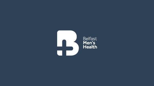
We created a device using the B for Belfast, removing the counters and replacing with the cross for health. The colours are more of a muted blue, which when in use is quite corporate and masculine. The B+ device could be used as a window what information BMHG has to offer, the logo will work well online, email signatures, on t-shirts, beanies and also work on pop up banners, and flyers for events. The use of blue helps the logo have confidence, and feels trust worthy.
We are also creating a website for Belfast Men’s Health Group which will be their audience’s digital handbook for anything and everything they need to know about Men’s Health and well-being. The website will include a range of videos, podcasts, blogs and links to other websites in a visual and clear manner, to help men understand the importance of good health and uniting together. The site will be launching during Men’s Health Week in September 2018.
It will be great to see how their new logo will be used around Belfast, knowing they are helping Men across Greater Belfast.