Glo – Brand Creation

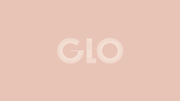
Recently we branded Glo Beauty, a new Beauty Salon in Belfast. This undertaking included: full brand development, logo design website design and social media campaigns.

The client’s ambition was to create a modern beauty salon offering a customer service in Belfast. Bringing a similar feel to other Cities across the globe like Dublin, London, New York and Milan. Glo is based in Kings Square, off Kings Road, Belfast. Offering a variety of services from Manicure & Pedicures, Tanning, Wax & Hair Removal, Eye Enhancements, to Make Up. Building upon the foundation, Glo will deliver a quirky experience, which makes you feel really good about yourself.

Glo Beauty is one of the first Beauty Salons in Belfast, to be funky, modern and appointment only to give you a premium service and only using the Top Market brands. Ireland’s Leading Make up artist Aimee Connolly (Sculpted) has trained Glo’s very own Maria Chesser. Maria is a prodigy in the industry, bringing elements she has learned from across the country into Belfast. As well as running the business Maria wants to get heavily involved with the services, as that’s what she’s being training for. She will be available for appointments as well.

Glo approached Kaizen Brand Evolution to brand their Salon opening in their Flagship Store in Belfast. They asked us to design and develop a new branding system for their salon; it needed to feel welcoming, bright, and luxurious. It should look modern so it could really stand out in Belfast. We wanted to Glo to brighten up the beauty industry in Northern Ireland.

Our research revealed some amazing hair salons and beauty brands across the globe. We explored texture, palette, photography – fashion, landscape and otherwise. We tested and worked with a range of type, and mark making to create something unique. We used “Your skin is Glowing” as the initial concept behind the brand identity. We combined an array of light and eyelashes for beauty with the word GLO. This creates a beautiful mark, which becomes the GLO Ray device that can be used to highlight the subject and used throughout the branding collateral. The colours used in Glo Beauty are natural colours, which will work in contrasting colours across the brand.

We incorporated ‘Glo’ into the language. This helped with the photography direction used within the brand. We created Glo’s brand language and tone of voice to offer her services. Statements like “You Glo Girl and “Glo on your Day” were created during the creative writing process for the brand. Glo Beauty Is the place where you’ll feel better every time, your skin will Glo and to really make the brand shine we had to show the brand could be used to motivate women and feel positive about the way they look. Using this brand language will help Glo in the future for marketing campaigns and advertising and will across the services Glo offers.  We married together the brand language and the logo mark to successfully to show Glo’s brand.

Following the identity and language creation, we implemented the branding across a number of deliverables. We visualised how the brand can be used across everything Glo will need from coffee cups to uniforms to help with the overall experience at Glo. These visuals will help show the direction on how the brand can be used for the signage to branded collateral for when Maria goes to beauty events. Having a strong visual brand with a clear message will help her stand out amongst the big competitors within the industry.

It was great to work on the branding for Glo and we look to seeing the brand will be rolled out across their social media, uniforms and in the salon itself as Glo continues to evolve.
The Skinny Sauce Company

The Skinny Sauce Company approached Kaizen Brand Evolution to create an engaging brand identity and packaging strategy for the launch of their exciting new Skinny Sauce product range. The brand story begins with the owner and entrepreneur Maria Doran. Maria’s passion for sauce has been long standing; from ketchup to curry she has always loved adding flavour to her meals to enhance the eating experience. Maria also embraces the healthy lifestyle, going to the gym, eating right and taking care of herself. She soon realised that despite eating healthy she craved the added flavour that the sauces and dips brought to her meals and the sauces available on the market were full of sugars, additives and unhealthy ingredients in general. Maria’s mission is to revolutionise the sauce market and make healthy dips and sauces for the health conscious consumer.

With this in mind be researched the industry and developed a strategy for the business with the tagline ‘skinny dip more often.’ This strapline acted as the foundation for the creation of her brand identity and packaging. Keeping the target audience (health conscious shoppers who crave sauce) in mind we designed a bold, eye-catching brand that highlights the good ingredients that go into Skinny Sauces. In a world of Heinz and other well-known sauce brands we aimed to reach Maria’s ambition of becoming a household name and compete and stand out on the shelves in major retailers.

The first point of call was the brand mark. We crafted a ‘handmade’ type based logo with a bright, youthful colour palette, which immediately stands out from the competitors. The logo is a reaction to modern brand styles and trends utilising hand drawn type and illustration to reflect the fun skinny sauce experience. The brand mark leads nicely into how we visualise the brand narrative ‘skinny dip more often’ – using the hand drawn script and bold palette to emphasise the text. The language plays an important role in communication the values and vibrancy of the product. Aimed at an audience of 25-35 we have tailored the brand to fit in with that demographics lifestyle. As well as the language and the brand mark we proposed a photographic and typographic direction that would spark an emotional and aspirational connection with the target audience, using young, happy, healthy models to communicate this rings true in the Skinny Sauce marketing strategy and in their brand collateral.

Following the identity, strategy and narrative and artistic direction we began work on the packaging for the Skinny Sauces themselves. Each bottle and flavour introduces a fresh colour palette creating an engaging, eye-catching suite of products. One ambition for the packaging was to make it look suited alongside the likes of high-end sauces within M&S or Waitrose. This ambition was easily realised following the identity and artistic direction for the brand. We were able to utilise the type direction and layout to suit such retailers and realise the ambition for future growth and perhaps buyer in such retail environments. As well as the colour palette for each flavour of Skinny Sauce we introduced hand-drawn illustrations to reflect the core ingredients inside the bottle – beautiful hand-drawn chilli’s, peppers, tomatoes were included to create an all round flavour focussed packaging piece.

In preparation for the Skinny Sauce Company brand launch we worked alongside Maria to ensure that the values set out from the beginning would be strengthened and represented fully in the collateral and packaging. Working as brand guardians for Skinny Sauces we continue to develop and evolve this unique, beautiful brand to ensure the businesses ambitions are realised. We thoroughly enjoyed working on this project and look forward to working more with the Skinny Sauce Company in the future.

Punchestown Racecourse

Punchestown approached Kaizen Brand Evolution to perform a re-brand for their established and celebrated racecourse and entertainment venue. We re-positioned the Punchestown brand by creating an engaging narrative and strategy for the business. With focus on the new ‘Town’ campaign we developed a suite of versatile straplines to use across the new brand roll out and marketing campaigns.

The Punchestown Festival is considered amongst the Racing community as the equivalent to the Wimbledon of Tennis and the Augusta of Golf. The best of the best from far and wide and the entire annual racing season compete at Punchestown. The sheer audience and exposure of the Punchestown brand provided the need to keep their identity and advertising fresh and representative of their unique offering.

There is a deep history at Punchestown Racecourse, which helped immensely in the craft of the brand narrative, from the famous horses, trainers and events that have taken place there is much more than meets the eye at Punchestown. The racecourse is not only synonymous with racing, there is so much more to the venue, from music festivals, corporate catering, family days, hospitality and new years celebrations to name a few.

We felt that the best way for us to communicate the wider offering was to generate a campaign that’s going to be immediately representative of the brand and evoke the emotions and sense that you feel when attending events at the racecourse. This is where the “TOWN” campaign was born. Developing the campaign narrative from the courses namesake, presented potential mileage for the brand and its campaigns immediately and it seemed like an organic development for the branding. With the TOWN campaign decided upon we generated a suite of potential Irish colloquialisms, sayings and relative straplines that would become the driving force behind the new brand identity. ‘Get out of town’ was a saying that marries a few points at once, which we explored on launch.

The idea of getting out of Dublin Town to visit Punchestown is the initial response to this phrase, however we’ve blended a traditional Irish colloquialism in the messaging “get out of town’ also gets used when you’re surprised to hear or see something. i.e. ‘I got a new Ferrari handed to me by my boss’ – the response would be “get out of town’. So the narrative bar was set, to communicate on two levels and engage vocally through the brand materials.

With the narrative and strategy in place we could work the craft of the logo and brand materials. The logo, which features the Punchestown Fox (identifiable through the years across each variation their brand history) has been brought into the 21st century with the use of a fresh new type family and custom fox mascot, who sits neatly above the TOWN letters, harking back to the narrative and campaign messaging.

We introduced a contemporary colour palette for the brand, keeping yet improving on the notorious Punchestown red we added a seasonal suite of colours to be used across the festival graphics, easily identifiable with the likes of Spring, Summer, Autumn Winter festival days. The colour flexibility has really strengthened the brand materials and creates an immediate association with a time of year at Punchestown. Primary colours explore pairings that compliment the Punchestown red, gold and a deep navy.

Once the brand elements are married together it is clear to see the visual results of the successful re-brand, which now addresses the ambition of Punchestown as a business. The new brand identity and campaigns stand out from their local and national competitors. Everything from the strategy, narrative, identity, implementation and management of the brand has been considered and carefully treated to ensure absolute success as the brand evolves. We absolutely loved working on this brand as a studio and we continue to work with Punchestown as brand guardians and as the racing seasons come around.

Join us for our next Brand Masterclass

A few months ago we hosted our first ever brand masterclass in association with Women in Business NI.

It was so successful that we’ve decided to host a few more masterclass sessions, starting with our “3 Steps to a Successful Brand” workshop on 29th September. Our masterclass will take place at the Thinking Cup on Lisburn Road from 9am to 10.30am, and tickets are free! Tickets are available to book now, just visit our event page here to book your place.

Whether you’re an aspiring entrepreneur or a long established business, having a strong brand presence and strategy will set you apart from the competition and help you grow your business. Our workshop will take you though the key elements of a successful brand, from logo and language through to longevity across all channels.

This session will cover:

  • What a brand is and why it’s so important
  • The key difference between a logo and a brand
  • The importance of a brand strategy for business growth
  • How language can impact and shape your brand perception
  • Key tools for building your brand online

This masterclass is perfect for those with a new business who need guidance to build their brand from the ground up. It is also helpful for businesses who have been established for a few years but who would like to evolve their brand and take their business to the next level.

We’ll be providing tea, coffee and refreshments from 8.30am if you’d like to come along early for a bit of breakfast and networking. We hope to see you there!

Mozilla – Open Source Logo Design

‘Open sourcing’ or perhaps ‘open publicity’, we couldn’t help but be curious to see the concepts being considered and there annotations on reasoning. Whilst we appreciate a much greater strategy may be propping up the concepts behind the scenes and the notes may be to provide justification to the masses, ‘there’s a touch of the optical illusion about the design’ might not be sound reasoning to divert a brand image. (PS if we had to pick one, that would be it, but not for those reasons).

At Kaizen Brand Evolution our team of seven creatives are brand strategists who utilise design thinking to resolve problems presented at brief. The refinement process is critical and rarely to never sees seven responses being appropriate resolves. We believe in the courage of our convictions when it comes to creative, confidently standing by presented concepts in response to brief with the weight of clear strategy.

However, we applaud the marketing aspect of this post, it does indeed succeed in tying into an open source community approach promoting inclusion in the change making process to bring current users along with the process and tease newbies to the brand. Will it help create the best outcome? Doubtful. But it will engage and create reach, and as we are talking about it, the marketing is working!

See them for yourself here: blog.mozilla.org/opendesign/now-for-the-fun-part/


Shebelle’s Brand Identity

Shebelle required a brand identity to reflect high end, ethically sourced hair extensions and associated beauty products. During a temple ritual in India women donate their hair to the gods. The temples used to burn this high quality human hair but now they auction it on the open market and channel the profits back into community projects. The hair is locally made into wefts and Shebelle only chooses product from companies with proven ethical standards in manufacture, employee relations and charity work, especially the education of women and girls. The products that enrich the hair are derived from andiroba oil found wild in South and Central America and in Africa. This blend of quality ingredients and ethical sourcing was the foundation for a strong branding position.


We designed a luxurious, contemporary brand identity that sets Shebelle apart from their competitors. Patterns, photography and colour play their part in telling the story with each product having a separate, localised illustration. Traditional Indian, African and South American patterns weave through the packaging and marketing materials. The product launch is set for launch in late Summer 2016.

Brand evolution of White’s Tavern

The owners of the White’s Tavern came to us with an idea to brand the floor above the traditional Irish pub into a one of a kind bar/eatery. Stepping away from the long-standing tradition of White’s the new addition was to be tailored to a young professional audience, which would become a place of nostalgia and happiness with an edge.

We delivered a striking brand identity for the new venture titled ‘Vandal.’ Vandal’s identity is a nod to nineties street art and culture. Through considered graphic design, the bright colours, patterns and hand drawn typeface are tributes to the 90’s theme with a contemporary treatment. The theme continues throughout signage, menus, wall graphics and online.

Mourne Mountains Brewery

The Mourne Mountains Brewery approached the team at Kaizen Brand Evolution for some creative concepts for the up and coming launch of their festive spiced lager. Naturally we jumped at the chance to pitch for the client, working with such a brand that you yourself has passion for is extraordinarily rewarding. Mourne Mountains Brewery are a relatively new Brewery specialising in brewing techniques that produce some of the tastiest beers in the land. The brief was to create a new label design and marketing materials for the launch of The First Noel – their winter brew. The First Noel is a famous Christmas Hymn and the brew itself is a spiced lager the perfect mix for some great design concepts. We created a full red wrap label that stands out amongst the array of craft beers on the shelves, with a snowy Mourne scene of the labelling. This concept was then rolled out across draft labels, marketing materials, invitations and posters with the message ‘be merry’ as the call to action. A fantastic, delicious project for the Kaizen Brand Evolution team and a wonder to see our designs on the shelves across the province.

Brand creation For Friends Daycare & Nursery

Watching our customers move into different markets and business ventures is amazing and we’re always happy to assist with their own business development. The owners of Friends Daycare & Nursery, Belfast approached us to develop the brand for their new daycare based on the Saintfield Road, Belfast. Understanding their approach to childcare it was clear we were to develop an identity of the highest level, that would appeal to the parents and of course the children of south/east Belfast.

Presenting a selection of concepts that embodied the business and retained the core ethos, we created this unique brand that will position Friends Daycare and Nursery among the highest regarded businesses in their sector. We are now in turn building the supplementary marketing and business materials required for the launch, alongside a bespoke website for the brand.