Whiterock Finance – Website design & development

Working with businesses across almost every conceivable market sector, we get to understand and learn from many of the most innovative business people across the country. We also get to work within Industries that support this development and innovation within each of these market sectors. Today we’re delighted to publicly launch the Whiterock finance website design and development that has been undertaken following our recent branding project for the organisation.

Who are Whiterock Finance?

Whiterock finance are Northern Ireland premier alternative funding provider for entrepreneurs and businesses focused on growth and require funding between £500k and £2 million. 

Located in Belfast, Whiterock Finance are a locally owned fund manager who have been operating in Northern Ireland since 2012. They understand NI business and what factors are needed for successful implementation of their deployed loans. Initially managing the £55m Growth Loan Fund, Whiterock Finance now has £115m of funds under management through three funds; the Growth Loan Fund, the Growth Loan Fund II (successor to the Growth Loan Fund) and the Growth Finance Fund.

With the launch of the Whiterock Finance Brand, the managers identified the difficulties in accessing suitable finance, and so they set up a Property and Commercial Finance Division to act as a relationship broker and help identify funding opportunities if ineligible for either of their Funds.

We’re in a great position to support the web design and development project for Whiterock Finance. Not only do we know the Whiterock Finance team through multiple past projects, but many of our customers are theirs also. Understanding the needs of entrepreneurs across Northern Ireland, we are able to tailor the website development to them.

Website Design Technical Elements

The Whiterock Finance website was built in WordPress. The ease of usability of the CMS is something that cannot be ignored. With many stakeholders contributing to the site, we need to supply and provide an easy access and management of the back-end. WordPress does this effortlessly. 

With a little focus on search engine optimisation, coupled with best practice user experience and development techniques, the Whiterock Finance website is designed and coded for the web today and in the future.

We’re absolutely delighted with the brand and website as a suite of assets for the Whiterock Finance team to grow their organisation and helping more of Northern Ireland’s entrepreneurs to reach their own business ambitions.

To start a branding or web development project with our team, please get in touch with us via the contact form or call us on 028 9507 2007.
BeyondHR – Brand identity

BeyondHR focus on a relationships based approach to Human Resources, their headquarters are based in Ballymena, Northern Ireland, with another office based in Glasgow, Scotland. Previously named Personnel and Training Services (PTS), our rebranding project was undertaken to reposition the business within the market.

Their name PTS, was out-dated for the marketplace, we took this opportunity to rename, to allow the company to engage with its audiences in today’s world. Starting wide, we went through over 50 names each with reasoning on why the name was relevant. We then refined, short-listing down to seven.

The chosen name ‘BeyondHR’ was a fantastic metaphor for the business with lots of branding potential.

Understanding the Brand

We looked at the industry landscape and noticed the majority were very corporate, and didn’t seem very approachable for a business which dealt with people. A lot of the logos didn’t give you much of a hint of what they do. We seen this as one of the challenges we had for BeyondHR, as we needed the business to look approachable, friendly and tell you what they do.

Our goal within the BeyondHR rebranding was to create a trustworthy brand, which kept inline with their core values of focusing on relationship.

Brand Audit – Brief

To create a brand identity for BeyondHR incorporating the new name with a clever, friendly visual direction. The new identity would become the face for the brand and reflect the core values of BeyondHR. The brand will position the business as the go to HR company when you need them the most. The brand allows flexibility to evolve over time. BeyondHR wanted to reach out to smaller businesses, as they want to make Human Resources more approachable.

Like many brands we create at Kaizen Brand Evolution we have created a branding system which makes it simple for anyone in the business to be able to use. We show the client how the brand works and how it can be utilised. BeyondHR’s brand was developed from research we gathered from multiple sources to make sure we understood the industry we are designing for. We took elements from our research and we created three independent brand concepts that fully reflected the marketplace BeyondHR operate in. Each had a unique value proposition so BeyondHR could visualise their brand potential, after refinement of the chosen brand concept, we are rolling this out across a range of deliverables both offline and across digital media.

The Logo Build

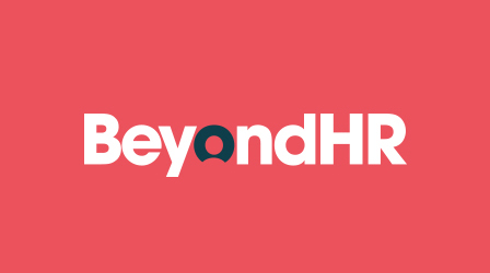
The logo type was created using elements ‘BeyondHR’ + ‘Support’ + ‘Eye’ + ‘People’. From this we built a clever device, which houses a person in the negative space of the ‘O’. This represents that BeyondHR are people centric in everything that it does. We wanted people to smile when they discover the person in the logo, and hopefully smile when they engage with BeyondHR. The device will be used throughout the branding system from housing different icons depending on the sub-brands/services they offer.

Each element of the brand has been thoroughly looked at, from brand campaigns to lanyards to how the coffee mugs would look like.

We introduced a vibrant colour palette to use against a contrasting navy, the colours used per sub-brand each have their purpose in the brand, the red is used as it shows leadership and suggests stability; the teal is used as it’s more softer for training purposes and represents knowledge; the yellow is used as its friendly and approachable, perfect for recruiting; and finally the green is associated with healing and protection.

Brand Language

We created the approachable brand, we needed a tagline which helps define what BeyondHR does as the brand language is just as important as the visual identity. “We’re People People”.