Westville Hotel – brand identity

The Westville Hotel is a longstanding boutique hotel situated in the heart of Enniskillen. For many years the Westville has grown in popularity for its diverse range of high spec rooms, service and entertainment, not to mention food outlets across the town. With success comes change and the owners at the Westville realised that now was the time to re-state exactly who the Westville are and what it means to stay there. So they approached Kaizen about doing a new Brand Identity for them.

In their own words:

A Superbly Stylish Boutique Hotel in Fermanagh

Perfectly located in the heart of Enniskillen’s waterside historic quarter, The Westville Hotel is a sophisticated, yet understated, boutique destination – offering everything to the contemporary, discerning guest, including a Terrace restaurant, beautifully spacious and comfortable rooms, a stylish WV Bar matched with the warmest, welcoming service.

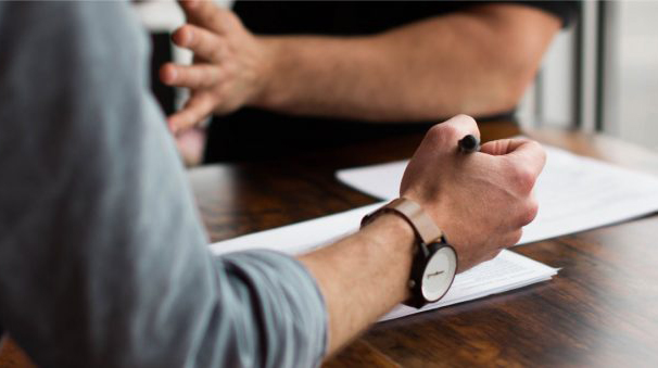
A great focus for the Hotel was to attract the Instagram generation, making the boutique experience much more in tune with key experiences across Enniskillen all the while having a hotel where you want to stay in, eat drink and Instagram! This brief for the designers was a dream for some of our keen city breakers and self -proclaimed hipsters within the studio. This was an opportunity to create a really ‘cool’ and unique brand identity for the type of people that, well… we are. Adventure seekers, young professionals with a genuine passion for where they stay and what they do at the weekend, interested in their surroundings, food, drink and experiences.

Language

First-off we re-stated exactly what it was the Westville offered. Through language we we’re able to set the scene on how the brand identity would develop throughout the hotel’s communications. We introduced the line ‘Stay and Explore’ as the overall purpose of the Westville. This strapline opened up a world of visuals both for the hotel and Enniskillen with a lovely link to the tourism opportunity for the area surrounding the Westville, from the caves to the lakes we’ve got this covered.

Typography

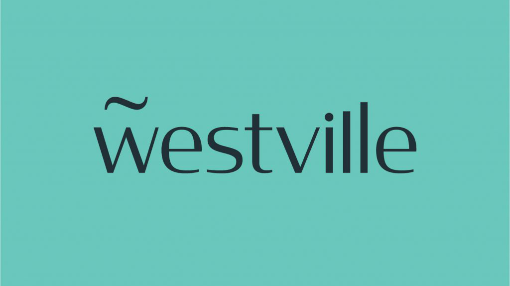
The brand identity takes its form from a classic but very modern type family ‘Condor’. With a series of customisations, cuts, raises, kerning and craft in the type we created the unique word mark for the Westville. The type is a natural evolution from their previous logo but completely simplifies the identity for 2020 and beyond, making it a lot more flexible and removing a lot of the previous symbols, stars and even the word ‘hotel’ was removed with the aim of producing a modernised version of the mark. As well as the language we really wanted to introduce a symbol that reflected the strapline and purpose – hence the ‘Westville wave’ was introduced. A simple glyph, taken and customised which sits beautifully above the W. The wave is reflective of the lakes, the water and the fact that Enniskillen is in fact an island locked in by water. This opportunity to tell this story was a no-brainer for the design and roll out of the brand. The wave is utilised as a pattern system throughout the interior, brand assets and marketing as you will see. This symbol also made way for 3 beautifully drawn badges that feature across the brand, all three highlighting the Stay and Explore message. 

Art Direction

Art direction for the Westville was as important as the new brand mark. We introduced a stylised, hipster photography direction and colour palette which pair beautifully with the mark and bring an air of freshness to the brand which is reflected in the interior and brand accents across the hotel. We provided concept across the entire hotel offering, from website to door hangers, bottled water and towels, this project has been a real passion project for the studio and we love to continue to work on the brand as it develops, rolls out and evolves. We love seeing brands we work on out in the wild and cannot recommend enough paying the newly branded Westville.

At Kaizen Brand Evolution we understand the difficulties that brands face in evolving their brand and in keeping it fresh. If you’d like to find out more about what we can offer you can visit our brand identity page. Alternatively, you can get in touch via our contact form or by calling 028 9507 2007

Boundary CrossFit – brand identity

Understanding the Brand

The newest player in the CrossFit arena, ‘Boundary CrossFit’ came to us to create create a unique brand identity and system to showcase their brand new high-end facility, to help them prepare it for launch and growth within the industry. Their ambition was to achieve a modern, bold narrative that would pay homage to the raw industrial nature of the sport but also the physical interiors within the gym itself.

The Logo Build

The vast majority of us have heard of or have some kind of idea about what CrossFit is. For those who don’t CrossFit in recent years has become much more than just a choice of exercise. The growing CrossFit brand has become a culture amongst likeminded passionate individuals. We felt that this was a primary message we needed to get across through the Boundary Brand Identity Narrative. We needed to pay homage to the people who commit and support these gyms. We wanted to capture the spirit of these individuals and their culture and lifestyle.

The brandmark was created with the brand name at the soul of its direction. The term ‘ Boundary’ illustrates a conflicting ideology it can reflect a division, a defense mechanism, but also a sense of place, a sense of strength.

The word itself has such a powerful narrative that it was an organic development that the brand mark would be a strong typographic word mark.

The logo is set in a modern Flat-Sided san serif typeface, a style also known as ‘gaspipe’. The modular letters evoke modernity and industrialism. The type led brandmark visualises the feeling of the word ‘Boundary’ and encapsulates the narrative of the brand. To further project the narrative of the brand an organic underline was incorporated to bring a softer contrast to the modular typemark. To amalgamate the strength of the word with the raw passion and commitment to the people who belong within it. 

This notion of a warrior, war paint, the raw grit and dedication associated with the physically experience of the brand. The underline creates a device that can be used throughout the brand roll out as a visual sense of the word ‘bound’ to create metaphors and links through visual assets. The line device also enables ‘Crossfit’ to be neatly combined within the logo but also easily removed when needed and to ensure brand longevity. This strong typographic approach creates a unique typographic identity, which will become a natural association to the ‘Boundary’ brand.

The strength evoked within the logo helps to resonate with the desired audience of the brand. There is an immediate connection to the name ‘Boundary’ and the visual depiction of the meaning of the word throughout the type. This typographic language that will be used throughout the brand roll out creates a direct and powerful connection to audience the brand is trying to attract. A loyal client base who share like-minded goals, who are passionate about being a part of the ‘Boundary’ culture. 

Photography

A creative direction for the photography was developed to further enhance the narrative of the brand. It is people focused to give the audience a true reflection of the ‘Boundary’ culture and to ensure the right people invest in that culture. The imagery depicts loyalty to the brand a common visual trend associated with the sports industry and the nature of the CrossFit community. Promoting through imagery of branded sportswear and to evoke this sense of belonging and passion. To showcase the hard work, dedication and passion valued by the ‘Boundary’ brand. 

An image treatment has also been developed for the brand to create gritty, high contrast visuals that portray movement and energy. Contrast plays a primary role within the narrative of the ‘Boundary’ brand, with the confident stand alone brandmark the physical experience of the brand needed to be further introduced throughout the brand imagery as a storytelling device to stand out within a crowed industry.

Brand Colour

The brand colours will primarily be black and white to reflect a modern and minimal tone of voice. However, to achieve the contrast and successfully reflect the brand values associated with this industry and its audience a warm red palette was introduced as a secondary colour device for the brand to utilise. 

Red is a strong colour that has a direct cultural connotation to passion and love, but also has conflicting meanings of jeopardy or boundaries, and in this case over coming these physical boundaries the blood, the sweat and the tears reflective of the industry and resonates with the target audience.

Brand Language

To further enhance the brand narrative of unity and strength we developed a tagline to define Boundary as its own culture, the unity of the people who experience it ‘Bound by Passion’.

Typography is one of the main devices used within this brand. The modular san serif typeface that not only gives life to the brandmark, will also encapsulate the entire brand story. The large type family allows us to utilize the typeface throughout. 

Kaizen Brand Evolution

At Kaizen Brand Evolution we understand the difficulties that brands face in evolving their brand and in keeping it fresh. If you’d like to find out more about what we can offer you can visit our brand identity page. Alternatively, you can get in touch via our contact form or by calling 028 9507 2007.

What are the aspects of a rebrand?

Taking on a rebrand is a serious commitment. You need to be sure that this is what’s needed for your business to move forward but also that you know what you need before going into it. It may seem daunting, but it doesn’t have to be. It can be made so much simpler by knowing what is required. Within this article, we are going to look at what you as a company and brand need to look at when you are considering a rebrand

Have you determined your brands target audience?

Every brand needs a target audience, no matter what it is you are selling. These are the people that you hope are going to be buying the majority of your products or services. However, after 5, maybe 10 years as a brand evolves, does your target audience change? This is the first question that you need to ask yourself before going through with a rebrand. The current brand that you have will have been created to appeal to certain people, but as you evolve more and more people are going to be buying your products or using your services and as such when your rebrand you can’t focus solely on those you did before. You need to conduct research into who your current customers are and base your need branding on them.

Have you established a brand mission statement?

As every company or brand begins, it is important that you have a mission statement. This is for telling customers why you are doing what you are doing. What do you want to gain from selling your products or services? It is important that this is often customer focused, as not very many people are going to buy from a company who’s mission statement is ‘we want to make money’, just keep that bit to yourself. But over the years that you are in business, might your mission statement change? As you start to offer new products or services, or gain a new customer base, you might begin to see that what you are selling your products for changes. You need to make sure that when you are going through with a rebrand, you take this into consideration and base it around the new mission statement.

More importantly, does your brand truly reflect your current offerings and product?

As we have previously stated, over the course of 5 or 10 years that your company is in business, the products or services that you sell may very well change. You might change as a brand completely but it is more likely that you will just branch out and offer more products or services than you did at the beginning. With this, you need to reflect on what your brand says against what it is you are selling. If they don’t match, then you know that it is time to think about a rebrand, to ensure your customers don’t get confused, or that the new product you are offering doesn’t fail because no-one knows you are selling it.

Is your brand ready for your future projects and clients?

You may be thinking about a rebrand, but not sure if you should or not. However, one question that we suggest you ask yourself is are you ready for the future? The current direction that you are heading, do you think that this will be enough for 5 or 10 year down the line, when the market that you are in has shifted and new competitors have entered the fray? This is where you need to do further research on the market and your competitors, to see what exactly they are doing and try to build your new rebrand off this.

How has your business changed its values or consumers since the last time you looked at your branding?

There is a fair possibility that you haven’t looked into your businesses values or your consumers in any great depth since you first started your company. However, before going into a rebrand it is very important to do this. Look at how your customers may have changed from when you began to now. Has the age range increased or decreased? What demographic are they coming from? Looking at all of this will help immensely in bringing about your rebrand and making sure that it is what works for you

Here at Kaizen Brand Evolution we want to make sure that when you are undertaking a rebrand it is the best you can get and also one that works for you and where your company is at in the moment. If you feel like you are heading towards a rebrand, please do not hesitate to give us a call on 028 9005 2007 or send us en email to studio@kaizenbrandevolution.com, we’d love to chat.

How important is a Brand?

We’ll start with the obvious: Branding is very, very important for any business. There isn’t any ‘might’ or ‘could be’, it just IS. But why is it important? What does a brand do for you and your business exactly? Within this article we are going to take a look at exactly that, helping to give you a better understanding of why Brands are important and why you need one if you haven’t already.

Firstly, what exactly is a Brand? What is Branding? In the conventional sense, branding is where a company creates everything that will identify them, from their name to their logo and colours that will be encompassed within this. A brand is something that makes a business easily identifiable from others that work within the same industry as them. But a brand is also so much more than this, as it becomes everything you do as a business. All of your actions will be viewed not as individuals, but as a whole under one BRAND.

A Brand is important because, as previously stated, it helps set you apart from your competitors and tells customers why they should do business with you, over someone else who is offering more or less the same product or service. You build your brand from the ground up, not only the way you see it but also in the way that you want to be perceived by others, because due to how much your brand encompasses of your business, it is how you will become recognised and viewed by everybody, not only those within your industry.

One of the most important aspects of your brand is that of your logo, so it is vital that you get it right, but also that it makes sense in the message you are trying to get across. Your logo will essentially become the face of your company before you ever employees. The logo that you choose therefore needs to be professional, as people will immediately begin to view you in a professional manner, someone that they can trust and want to do business with. It is important at this stage that you put the investment in and get a professional graphic designer to do this for you, instead of someone who might be able to give you what you want. A professional will be able to take everything that you already have and everything that you want to achieve and bring this into a logo that is going to match your business, help to bring you success and ultimately help to bring you a positive ROI.

What you will ultimately want to achieve from your business, is for it to bring in customers and for them to buy your products or use your services. A strong brand will undoubtedly help with this. It will help to generate new customers because it instantly creates a positive impression of you. Again, similar to having a professional logo, having an excellent overall brand means people are more likely to do business with you. From this, begins the word of mouth process as the popularity of your brand spreads from person to person, helping to increase the number of customers that you have and ultimately the amount of profit you are pulling in.

A great brand isn’t just for the benefit of customers, however, as you will immediately notice that it benefits your employees, or that they show improvement, especially if you have recently rebranded and are showing a renew sense commitment to your brand, your goals and your cause. Employees will have greater satisfaction and sense of pride in saying that they work for you, making them happier to come to work and making the workplace a better place overall.

Finally, another advantage of having an excellent brand is the fact you will be given respect in the market you are involved in. You are more likely to get business again from those you have worked with, but also more likely to be taken seriously by competitors, as they can see that you are serious about what you are doing. Strong branding will help to give the impression that you are an industry expert, even if you are only starting out.

We hope that by reading this you have seen the importance of a brand and just how much it can help nearly every aspect of your business, both day to day and long term. To follow up on this, we are holding an an event on the 22nd of February titled, “When is the right time to rebrand” this will aim to show you when is the perfect time and help you through the process. Tickets can be purchased right here for only £5: https://www.eventbrite.co.uk/e/when-is-a-good-time-to-rebrand-tickets-54847035961

If you feel that you are in need of some branding work, feel free to give us a call on 028 9507 2007 or send us an email at studio@kaizenbrandevolution.com, we’d love to have a chat.

Apples & Mermaids Round-Up

At the end of January, we here at Kaizen Brand Evolution held our first event/workshop of the year, titled Apples & Mermaids. This was a workshop detailing the importance the logos play in our lives and just how important they are to businesses everywhere, no matter what industry they are in. The event took place in The Mac, Belfast which we can only say had a fantastic set-up for us.

Ryan Stanfield, our very own Design Director, was the speaker during the event, taking us through what logos mean to us and also how we are influenced by them. For example, is there a brand that you are faithful to and won’t deviate from even if someone else is offering a similar product at a cheaper price? Think perhaps shoe or trainer manufacturers. If you are always buying Adidas trainers, you are less likely going to buy anything that Nike might have to offer. The same can be said for Vans and Converse. It is usually one or the other. However, if you remove the logo from these products and do a test, you might find that your loyalties change. This is because it is all to do with the brand and logo that we see, the logo that we feel a connection with.

Those that attended the event were also given the opportunity to put their own design skills to the test, being given an exercise where they had to try and figure out what symbol, font and colours best suited a certain company. The point of this was to show those in attendance the process that goes into creating a logo for a company and how much else there is involved, rather than just sketching something and saying it is okay. It is vital to look at what industry you are in and see what would go well. But it is also important to look at what other people in the same industry are doing.

At the end of the morning, guests had the chance to ask Ryan some questions, getting further insight into his knowledge and also help with understanding some of their own projects that they are undertaking. As well as this, they had the opportunity to chat with some other team members who were in attendance.

It was a great morning had by all and we can’t thank everyone who came enough, helping to make it so. We are now in full preparation mode for our next upcoming event, “When is a good time to rebrand” taking place on 22nd of February in The Academy Restaurant. If you would like to buy tickets, you can do so right here: http://bit.ly/rebrandtime

If you feel that you are in need of some inspiration and help with your current branding project or perhaps you are a company just starting out, then please do not hesitate to contact us either by email at studio@kaizenbrandevolution.com or else by phone on 028 9057 2007 to get your next project underway.

Town – brand development, website design & social media

When branding a new venue, whether restaurant, hotel, nightclub or bar, thee are considerations we must make as your branding partner. Our initial discussion will focus on customer demographics, market opportunities and the heritage of the business in the case of a bran audit or brand refresh. After meeting with the owners of Town, Leixlip we were blown away by their passion and drive within the hospitality trade in Co.Kildare. They had a vision for the bar / restaurant and we were engaged to bring that vision to life through: Brand Strategy, Brand Identity Design, Logo Design, Menu Design, Website Design and a social media launch campaign.

About Town, Leixlip

Town is a bar based in Leixlip, Co. Kildare, Ireland. They loved the idea of being the ‘Talk of the Town’ bar as this would be great for a ‘Town’ campaign they can work with and evolve over time. We explored diffident uses for brand language, which could easily evolve over time. Their target audience would be locals who would head into Dublin for a night out. They were inspired by well known neighbourhood bars in the likes of Dublin and Manchester and aimed to bring it back to Leixlip so punters could get the same experience and not having to travel as far, back in their home town. A place you can go for your coffee meetings, family dinners to having a night out partying on the dance floor with your friends. 

Town is “More than just a bar”.

Town approached Kaizen Brand Evolution to create a brand for their bar because they wanted to create a bar for everyone in the local community. Town’s approach was creating a friendly bar for all generations of the Leixlip community. They needed a branding system, which worked for everyone. It had to feel homely after it all it was a Town in their hometown. Town is a bar that would rely heavily on their social media to advertise their events each night and mid week offers. The Brand would have to work particularly well on social media platforms as most of their audience would be on these, to create a social media friendly brand we looked at how other bars across the globe used social media to promote their business. 

We created the branding system in way, so it’s simple for Town to use. It had to also stand out from their competitors but mainly be consistent. To get the brand identity for Town, we gathered our research of places the owners of Town liked. We took elements from our research then we crafted 3 concepts, which were all unique created to tell the story of Town. 

We Partner Your Interiors Team

We worked closely with the interior designer to make sure the brand worked with the interiors and to complement the building. We introduced a contemporary colour palette for the brand, using a rich blue, teal and gold with contrasting pinks from the floral elements used to add more depth to the brand.

Crafting the TOWN mark had to represent a place for everyone with some character. The Mark had to feel established, friendly and Town had to you make you feel like you belong, a place where you can go for a morning coffee, or grab a bite to eat or have a really good time with your mates, it had to feel like a place you never have to leave as it’s all under one roof. This is where it ties back to he underpin for Town, “More than just a bar”. 

Brand Language is Critical

The brand language had to be simple, but unique to Town. “Fancy a G&T”, “It’s T-time” and “Down to a-T” using the T mark, which can easily evolve for future adverting promotions. The language is playful, and it’s simple. 

Brand Development Is Just The Start

As well as the branding system we produced a range of visuals to show them how the brand could be used across different mediums; including work uniform, menus, hand stamps, glassware, and online presence. When you see how all the brand elements are brought together it’s clear to see how well the brand works as a whole. With this brand structure, Town will stand out from the rest of competition.

Website Development

With any branding project we must further consider its reach beyond the conceptualisations presented. We look at all manner of print and digital mediums the brand is to shown on and develop these further in line with the brand strategy. For most in the hospitality sector, the main focus of attention moves from brand to website development. As you can see from the graphic above, we have captured the essence of the brand and brought to life a new website for the thriving business.

We enjoyed working with Town on this branding project and we look forward to seeing the branding used across social media, the branding paired with the interiors of the bar and we are excited to be part of the Town evolution.

Start a Branding Project

Want to start a bar, restaurant or nightclub branding project of your own? We’d be delighted to have a chat. You can get in touch with us on +44 289507 2007 or you can get in touch with us via the contact form below

[contact-form-7 id=”2934″ title=”Blog Post – Branding Blog Post”]

United Wines – Brand Identity

United Wine Merchants approached the brand team at Kaizen Brand Evolution with the objective of repositioning their brand identity and communications to be more in line with their unique service, product and reputation. With over 36 years in business, United Wines have moved with the times in terms of their product portfolio and brand associations, however, their own brand has remained unchanged. Today the company is modern, forward-thinking, and upholds a formidable reputation. With this said it deserved an identity to truly represent them.

In their own words:

United Wine Merchants incorporating HEINEKEN NI is a dedicated Agency led wholesale business within the Licensed Trade servicing the entire On and Off Trade.  As a subsidiary of HEINEKEN IRELAND, we are the licensed wholesale company responsible for developing the HEINEKEN portfolio including Orchard Thieves across Northern Ireland. Now in our 34th year of operation, we pride ourselves on our market leading and award-winning portfolio of Beers, Wines, Spirits, and Soft Drinks. Beyond timely supply and reliable delivery, we have got a range of marketing support and an experienced sales team to help you select the right range for your customers. We can design your wine lists, supply POS and provide your staff with product training as our Sales and Marketing team are all WSET qualified.

The team at Kaizen Brand Evolution created 3 unique brand designs for United Wine Merchants, each one exploring separate USP’s and reflections of their current standing in the marketplace. From colour variation, negative space, wine hints and some contemporary type styles we aimed to flex our creative skills in this brand audit, after all, it has been 30 years since the current branding, time for us to show potential. The new, chosen brand mark incorporates modernity, negative space and a clear, focused typestyle. The colour palette is reflective of their current ‘wine palette’ with a great balance of a highlight and base ‘berry purple.’ Each element of the logo represents truthfully the ambition United Wines set us from the outset. You will also notice that the word “merchants’ has been removed from the primary, simply for simplicity. When referring to the company people tend to drop the Merchants, so we dropped it.

Language plays an important role in the new brand direction for United Wines.  We put together a language style for the brand to take forward, one which highlights their USP’s but one that has an almost tongue in cheek wordplay. Statements such as ‘from harvest for beer fest’ for ‘forward thinking drink’ set the brand apart from local and national competitors. Setting this tone of voice at the beginning of the new brands journey will pave the way for how the brand communicates on and offline, short and sweet…but engaging. The company and staff at United Wines are extremely personable and friendly so the language guide was set to reflect not only their products and service but their people – something that United Wines pride themselves on.

We directed the artistic and photographic style for the new branding using process, ingredients and the art of creating the products they sell at United Wines – rather that typical product imagery or cheesy stock imagery. The new visual narrative for the company has depth and explores the story of their products.

We are extremely proud of the United Wines rebrand and continue to roll the branding and design out across digital and printed materials. The new United Wines website is under development in the Kaizen Brand Evolution studio as well as the new internal office and vehicle livery which we are excited to see live and kicking. If you feel your business is in need of a rebrand or repositioning to represent your service or product accurately simply get in touch with our award winning brand experts at studio@kaizenbrandevolution.com

How much does a rebrand cost?

How much does a rebrand cost?

This cost of a rebrand is reflective of how much value it can bring to your business. In order for us as brand designers to evaluate this, it is very important to understand what you hope the rebrand can achieve for you. Your ambition and goals will determine the outcome and the cost value. For instance, you may need your rebrand to simply sell more to one specific audience, case in point – a restaurant wishing to attract more vegans – we would perform a rebrand with a clear and direct focus allowing the customer to see immediate results appealing to their new vegan audience. In the same vein, you may wish to increase your turnover by 15%, a clear goal for us as designers to evaluate and analyse your business in great depth to ensure we are targeting and communicating to the right people at the right buying level. This process is far more in-depth and can take place over a number of weeks before we actually begin the design process. Market analysis, client and business profiling exercises as well as gaining a deeper understanding of a company are all part of this. With this higher sense of your company purpose, we can accurately craft a rebrand to suit your goals and ensure success in all communications, paving a clear way for all future marketing and brand activity.

If you have clear goals then we as brand designers can determine a true value that a re-brand can have for your business and intern develop a tailored cost package to suit your needs. Believe it or not, there are no clear ways of pricing a re-brand as every one’s needs and goals are different, from the goal of attracting a new customer to increasing company turnover by 15%, raising the entire bottom line of a business your re-brand will do what you need it to do. Of course we have a fair idea following a brief of how much it could possibly cost to perform a rebrand and to what level to pitch a quote, however we always break down the price against what we have discussed in order to reach your business ambition, so you receive no nasty surprises.

Investment is a business necessity that we are a familiar with. Investing in store/building fit-outs, staff training, product development or vehicle fleets we are comfortable with these investments as of course, they show immediate results right in front of your eyes, instantly. When you hand over money for a car, the car is there in front of you to drive away, you can drive it, smell it and use it as it is supposed to be used. Investing in your brand correctly, by engaging a brand design agency such as Kaizen Brand Evolution who will take time realising the potential and delivering results through creativity will set your business apart from competitors, aid the decision-making process with consumers, increase reputation and be a true reflection of what you have to offer. Branding is an investment that you will always see results from, from year to year, an investment that will continue to evolve and give your business the platform it needs to succeed when faced with tough competition.

If you are interested in finding out how much a rebrand of your company would be, setting your ambitions for the business and reaching your goals talk to one of our team at Kaizen Brand Evolution and we will be able to take you through, step by step how much of an investment you will need to make in order to reach your objectives. Give us a call on +44 (0)28 9507 2007 or get us by email via our contact form

The benefits of the rebrand

One of the most powerful and effective times to re-brand is when a business sees a great change in circumstance, a takeover, a merger a new product line or direction. The benefits of rebranding now are so you have the opportunity to communicate truthfully exactly what the change means to the business and express exactly what it is and how you are going to do it differently. A re-brand can reposition a company’s reputation, re-establish a failing business, make relevant what was a tired product or service and increase or develop a new interest in a business and its purpose. There are many factors but there are three main benefits that a re-brand can have for a company or service.

Refresh

A rebrand completely refreshes a business from the ground up. A new identity and re-brand project with pull the truth out from under the surface and find out what really sets you apart from the competitors and rival companies. With this understanding the re-brand with truthfully express (through logo, language and art direction) what it means to work with you as a business. USP’s are brought to the forefront, how you work differently and what makes you unique as a company can all be expressed in your re-brand. A successful re-brand will not follow design trends but assess who you are, what you do, why you are here and who you are here for. Ambition setting allows a design team to realise your potential through branding and communications. A re-brand is not simply there to impress your customers but also your team, your loyal staff who have been sitting under the same masthead for a number of years now have a voice during the research stage with the brand agency. Involvement and belief from your team will benefit brand culture internally and appeal greatly to those ideal candidates – we all want the best people to work for us and your brand and culture is an important factor in that decision-making process – would you want to drop in a CV to a tired, lacklustre looking brand? Or would it make more sense to engage with a brand that speaks your language?

Relevance

A rebrand can make a tired product or service relevant in today’s marketplace, tap into the mindset of modern consumers and engage relevantly. Your product or service might be the best, the strongest the most efficient, but if the branding, packaging or shop front isn’t relevant to todays consumer or shall we say ‘attractive’ then you can easily lose interest to young, bright and bold competition. Perhaps their product or services isn’t nearly as good as yours but they, of course, are relevant. This is a key attribute of a re-brand – to re-establish your brand/logo/packaging/website – whatever communication or brand exposure you have to become relevant to the right consumer.

Restate

To restate what you ‘now’ do is a fantastic benefit of a rebrand as it gives you a new opportunity to restate all of the lovely new things you have to off that perhaps customers might not know about – your new lines of products, your new technological advance, your new building or premises these are all seismic shifts in your business and through the power or identity, language and artdirectionn – the milestones of a rebrand you can restate your offering to your audience and restate it correctly with intrigue and excitement.

There are many reasons a re-brand can is beneficial, and the proof is in the pudding. Get in touch with the Kaizen Brand Evolution team to talk further if you feel like you might be ready to re-brand.

GB Poultry Brand Development

The family business of GB Poultry contacted Kaizen Brand Evolution wanting to their refresh the identity of their well known brand. GB stands for Gregory Bell which is the family name of the business established since 1982 that has been passed down the generations. In their own words “GB Poultry Ltd is a family owned business based in Crossgar in the rolling countryside of County Down”. There are 7 Directors in the company, all from the Bell family who are personally involved and committed to the general day to day running and operating of the business. An EC Approved Cutting plant and are guided by DAERA (Department of Agriculture, Environment and Rural Affairs). Supplying a wide range of Whole Chicken, Flash Fried Chicken, Sauces, Cooked Chicken, Turkeys and other meat products. GB Poultry wanted to modernise their brand and bring it into the future as they are leading in their field of poultry in Ireland. Supplying to outlets such as Boojum, Pallas Foods and Henderson a refresh of brand is what they wanted to align with their customers aspirations.

One of the main USPs that GB Poultry wanted to bring across is that they are from Crossgar, a small village in County Down, we travelled down to their offices and were met by fields upon fields! They are very proud of where they come from therefore we have come up with the tagline ‘A Taste of Crossgar’ as an important part of narrative of their brand. This brings in the origin of the product and also links to the taste of which is also developed in Crossgar.

The previous logo consisted of a cooked chicken and a wreath, similar to your traditional styled butchers, our creative studio updated this with a modern rounded typeface which gives connotations of friendly and approachability. We created a custom vector illustration of a chicken to match the rounded typeface. We have selected the colour scheme of a dark grey and light blue palette which gives a refreshing difference from their usual red and green branding. We have used the colour separation of the blue and white two toned logo for the GB and the Poultry text.

When we travelled to Crossgar we noticed the beautiful landscape around it, we captured this by creating a custom illustration of fields with trees, tractors and chickens in it that can be rolled across their branding. We used textures and muted colour palette for this to utilise the brand and the modern logo, they bring across the farm aspect of the brand. GB Poultry have several products requiring packaging design, this includes sauces, flash fried chicken and cooked chicken which flavours they create themselves. The flash fried chicken products are readily available from most local shops, make sure you try them out. We have visualised up three different types of products, sauces, salt & chilli chicken goujons and breaded chicken burgers using three different colour schemes to define the different products. The packaging is a sticker on the products which sit on shelf with all of their competitors therefore the bright colours of blues will stand out. The brand roll out includes tone of voice, business stationery, packaging, vehicle graphics and signage.

We greatly enjoyed working with Bell family on their brand refresh for GB Poultry and we are looking forward to seeing the packaging roll out and the well known vans on the road.

Belfast Mens Health Logo Design

Belfast Men’s Health Group (BMHG) is made up a group of people across the community of Belfast and volunteer organisations across Northern Ireland, all with a strong interest in the health and well being of men, by raising awareness of all the main health issues relevant to men and sharing events of interest across Greater Belfast.

BMHG provide a range of information shared by experts who really are experts in their fields. Organising meet up events, provide videos, podcasts and even hosting competitions, they want men to really feel good about themselves and to look after others. BMHG want to make sure there is access to all the relevant information where ever you are.

In their words:

“Belfast Men’s Health Group is a made up of representatives across statutory, community and volunteer organisations across Belfast with a strong interest in the health and well-being of men. Each year we celebrate Men’s Health Week and International Men’s Health Day by organise events to raise awareness of health issues that are relevant to men. We also work with other agencies at other health events to raise further awareness. We are developing the work of the group and a website to further evidence of our ambitions.”

Initially approaching Kaizen Brand Evolution on a website, designed to help them share a range of media and information to a wider audience, our working relationship grew. After our first studio meeting, BMHG noticed our wall of clients and our portfolio of work, it was at this point they decided to rebrand their logo as they felt it was outdated, and it wasn’t communicating the tone of their current direction.

BMHG wanted a logo that worked along side the Northern Health and Social Care Trust branding, they wanted it look like a sub brand to the Northern Health and Social Care Trust and to feel like a brand you can really trust with some sensitive topics within the health and general well being of men.

Hoping to show people that they were a Belfast based organisation, whilst also hinting at what they stand for. They also didn’t want a logo that was too clinical, so this became our challenge to produce a mark, which would become instantly recognisable, corporate and memorable to men across Belfast.

We created a device using the B for Belfast, removing the counters and replacing with the cross for health. The colours are more of a muted blue, which when in use is quite corporate and masculine. The B+ device could be used as a window what information BMHG has to offer, the logo will work well online, email signatures, on t-shirts, beanies and also work on pop up banners, and flyers for events. The use of blue helps the logo have confidence, and feels trust worthy.

We are also creating a website for Belfast Men’s Health Group which will be their audience’s digital handbook for anything and everything they need to know about Men’s Health and well-being. The website will include a range of videos, podcasts, blogs and links to other websites in a visual and clear manner, to help men understand the importance of good health and uniting together. The site will be launching during Men’s Health Week in September 2018.

It will be great to see how their new logo will be used around Belfast, knowing they are helping Men across Greater Belfast.

Day & Age – Brand Development

Day and Age, creators of short films, use video to make sure the little moments are never forgotten. Kathryn approached Kaizen Brand Evolution when she wanted to steer Day and Age in a new direction, when she wanted to hand her brand identity over to safe hands for an all over evaluation, and when she wanted to evolve her business.

Starting from a young age Kathryn was capturing videos for weddings, corporate insights and family events. Day and Age is now pushing forward to new areas of film, looking to create memorable films that become powerful memory aids. Focusing on making memories and treasuring each moment, whether it be for promotion or an event, a memory for someone that may forget, or even just to give as a gift – Kathryn creates the most beautiful and effective videos.

To display this evolution of the business, we took the Day and Age brand and re-focused it. A brand that will appeal to the current, the new, and the expanding target audience. Kathryn and ourselves agreed that that bold and fitting name of the business should remain, everything else we could assess, address and push in the right direction.  

Throughout the process, it was clear what Day and Age represented and what it would bring to each of its clients-memories. A Day and Age film would provide a beautiful memory aid and so much more. With memories, nostalgia and capturing the moment in mind, we came up with the suitable brand language that would surround the brand. The strapline ‘Memory Studio’ helped give definition to the name, explaining exactly what Day and Age is. They create memories and help you ‘Remember each day’.  

The brand identity itself was provided as a wordmark and an abbreviated device ‘D and A’ to apply throughout any brand extensions. We found the connection between the initials of the brand and term ‘DNA’ riveting. Day and Age’s main aim is to celebrate families and individuals, all about the ‘DNA’. Displaying this connection subtly through the abbreviated device meant the ‘Day and Age’ name still held prevalence.  The versatile device can be applied in many different ways to connect you directly back to the Day and Age name while highlighting the ‘DNA’ or ‘D and A’. We used the combination of a rounded and modern font to reflect personality, approachability and style, a brand that you would want to work with and trust.

The colour palette and imagery came naturally from the Day and Age films.  Using all stills from taken footage, we could see how well the brand would work. We applied a soft and neutral colour palette to compliment the brand identity, language and each film. Not to distract, but to honour the nature of the brand and each film. 

We are now seeing the brand come together to display a clear focus and direction, the direction that Day and Age were and are aiming for. The new Identity is tailored to evolving clients, through narrative, identity and finally the implementation, whilst still appealing to a greater audience. Day and Age creates memories, but it can also still cater to and appeal to any possible film seeking client.

We continue to work with Day and Age, rolling out their new brand across various different forms of stationery and promotional materials. The new brand is coming to life and complimenting all the great work that we are seeing from Day and Age. It is a pleasure to work with such elegant content and now a new brand that compliments that content. We look forward to seeing where the business and new brand goes from here.

Graze, Belfast – Brand Audit & Logo Refresh

Graze is a restaurant based in Ballyhackamore, East Belfast. They love serving tasty little dishes (also know as tapas). These dishes are full of flavours using quality local produce, paired with your favourite wines. Graze is a great place to enjoy your tapas as they have created an atmosphere that is comfortable, friendly and the ideal place for people who just love great quality food and drink. Graze has made a name for themselves because of their special fish dishes, which change daily, based on the catch that morning.

In their own words:
“The Graze experience is about more than just food. A sincere effort to educate our staff on all aspects of food and wine culture is the basis for our service philosophy. We take great pride in our relaxed style of service and our welcoming staff at Graze go to great lengths to make diners feel at ease, comfortable and well taken care of.”

As well as the restaurant serving tapas & wine, Graze has the Lounge; soft lighting, with dark interiors and comfortable seating makes the Lounge feel relaxing. It’s known for their range of local Gins, craft beers and ciders.

Graze really know how to make your experience extra special; with their resident mixologist, who will make you some amazing drinks and cocktails.

Graze love their Gins so much they have their own Gin Club. Get involved in their monthly club where you can try 5 new gins, and shown how you can serve them up yourself.

Graze approached Kaizen Brand Evolution to create a brand audit for their restaurant because they wanted a brand which was consistent, and reached a new audience of late 20’s early 30 year olds. Graze’s approach has always been simple, so we felt we needed to create a branding system, which would be easy to use. They will be able to use across all of their marketing for both online and offline. It had to be simple for them to use. It had to stand out from their competitors and it most of all had to be consistent.

To create a brand that really represents Graze and develop a brand identity really needed. The previous brand and the food didn’t pair well so we took inspiration from everything within Graze, from the dishes they serve to the colours used in the interiors of the restaurant.

The Graze brand combines a word mark with a personality, a popping friendly colour palette and referencing the tiles they have in their interior. We developed a tone of voice which is friendly, and sounds familiar, it reminds you to “Enjoy the little things” in life and to cherish those moments with friends, family and to be surrounded by great food and drink.

As well as the branding system we produced a range of visuals to show them how the brand could be used across different mediums; including work uniform (aprons and chef jackets), interior signage, exterior signage and menus.

I enjoyed working with Graze on this branding project; I can’t wait to see the branding all over social media and Ballyhackamore. I’d like to see Graze develop into a restaurant, where people come from all over to try their tapas and gin.

I hope Graze sets the mark for what tapas should really be all about.

Meet our evolutionaries – Dawn

1.What has working in Kaizen Brand Evolution taught you about the design industry?

The main thing it’s taught me is adaptability. The world of design is fast moving and it’s so important to evolve with it and to be able to work on a wide range of projects. It’s also taught me that you can’t just think like a designer making pretty pictures, you have to think like a marketeer, an advertiser, a strategist, an accountant, a business owner and a consumer to ensure you get the best and most effective results for your client. Oh and it has to look good too.

2.Desert Island Design Studio, which typeface would you bring with you?

Burford. It’s not one I use all the time, but it’s a really creative typeface that you use by building layers. It consists of base layers, top layers and bottom layers that you can have a lot of fun with. It would definitely keep me entertained and give me something to do if I was stuck on a desert island!

3.What do you use for motivation inside the studio?

When I’m in need of some serious motivation, there’s nothing for it but headphones and heavy tunes. Anything from ASIWYFA, Daft Punk, Royal Blood, Muse or Biffy Clyro depending on how I’m feeling.

4. Any designers you have been stalking online recently?

I’ve been following/stalking Morag Myerscough on Instagram since I was at her talk in Offset last year. I love her use of bright colours and typography. I really want to decorate my house in this style, but I might need to invest in some super strength sunglasses first.

5. What are you listening to in work today?

Today I’ve had a bit of 6 music with Father John Misty, and The Vaccines, Temples, and um Justin Bieber on Spotify. I have a very eclectic taste in music. Don’t judge.

6.Any exhibitions in Belfast recently that are worth checking out?

The Late Night Art Bus Tour is absolutely brilliant and definitely worth checking out. The bus takes you round various galleries and street art in Belfast, often to places you’d never think of going to. Some of the stops even include a glass of wine, so it’s a super night out, very inspiring and great craic.

7. What’s your pet called? Tell us about them.

Sadly, I’m currently petless. I did have 3 goldfish but it didn’t end well. Nuff said.

Code Fixer – Branding

Codefixer are a small web design and development company based on the Malone Road, Belfast. They design websites for a range of clients  across many different industries all over Ireland. Codefixer are one of the few companies that specialise in Google Ad words, SEO friendly websites and Analytics. Having this all under one roof helps give you the ultimate package for your business. They make the whole experience very easy for your business and needs.

In their own words:

“Codefixer offers a comprehensive range of first class web design and development solutions including e-commerce and WordPress, that coupled with our extensive skillset in SEO and Pay Per Click helps all types of websites punch above their weight.

Whether you are a small to medium sized business, a start-up to a multi million pound online business we’re confident that we can help you improve and get more of out your online business. Our success is due to our hunger to succeed and provide web solutions that exceed client expectations.”

Codefixer came to Kaizen Brand Evolution wanting a new look to their brand. The old brand was out-dated and didn’t match the professionalism and years of experience Codefixer had. It just looked cheap and amateurish and this was so far from the truth. In fact they have been in this industry for just over 15 years. Codefixer wanted a refreshing logo that would set them apart from the industry landscape. They needed to look like a professional web design studio who you want to look after your online presence. As being a company who works with the internet they are potentially competing in global market not just local. The current brand doesn’t do Codefixer and justice.

Our approach was to create a memorable logo, which is future-proof; we wanted it to say exactly what sector they were in without looking like your typical web design company. We created a logo that would easily develop into a brand with sub logos.

In the meantime it had to be a logo that covered all basis of what Codefixer do into an eye-catching design, which prominently worked across all screens from mobile devices to desktop.

The mark is a inspired by the language of code. A main object is written in square brackets ‘code’ followed by an instruction ‘fixer’ in this case. This language is written in lowercase (computers don’t understand uppercase). The [code]fixer mark can easily be written when the logo isn’t present on any device and will become instantly recognisable. The use of azure blue helps reach out to more corporate clients. This blue makes the business feel trust worthing and reliable.

The new logo will be used on social media, Linked In, their own website and possible print materials.

I believe the new mark will help them get the business and clients they want for their business.  The logo will be able to work well for training course and possible coding events in the future in Belfast and across Ireland.


Active Health – Brand Development

Holywood based Active Health Solutions approached the team at Kaizen Brand Evolution to reposition their brand identity to tie in with their plans to build a new website and a re-fit to their facility on Hibernia Street. Investment into their online service and internal facilities sparked the requirement to refresh their entire brand identity from their logo mark to their brand purpose and narrative. Active Health Solutions required a fresh, contemporary brand audit that reflected their ambitions for the business and a brand that spoke to new and existing clientele.

In their own words:

We are a company of passionate health care professionals providing a holistic, multidisciplinary approach to healthcare from our bespoke clinic in Holywood, County Down. Our mix of services include Physiotherapy, Podiatry, Chiropody, Massage Therapy, Pilates, Personal Training, as well as the provision of Occupational Physiotherapy to a number of large companies and organisations across Northern Ireland and Ireland.

Active Health Solutions was started in 2006 by husband and wife team David & Rachel Saligari who are both are highly trained Musculoskeletal Physiotherapy Specialists who met while completing their Masters of Manual Therapy in Perth, Western Australia. They and their clinical staff pride themselves on providing the most up to date and evidence based treatments available. Whatever your requirements, you will be directed to the health care professional within the company with the expertise to solve your problems and achieve your goals.

Utilising their own description of Active Health Solutions we crafted a brand narrative and identity that would help re-position the business as market leaders, experts and forward thinkers. The first port of call was the logo mark itself. In a brand audit we retain and refresh rather that re-invent. This ‘refresh’ was a modern take on their existing mark, a contemporary word mark with considered typographic detailing using the ‘sportier’ glyphs found in ITC Avant Garde along with a simplistic ‘Plus’ brand device that the business can introduce as a nod to the health industry as well as reflecting that they are a physiotherapy business at the core “PLUS’ so much more. A key piece of the audit was also to remove the word ‘solutions’ from the primary brand mark – this decision came into play rather early in the design process, we felt that ‘solutions’ was too generic a word to describe the full set of services on offer at Active Health. This was an easy removal for the business owners as most clients refer to the business as ‘Active Health’.

We introduced the narrative ‘Activate your Health’ to use across all branded touch points both online an in print. Activate your health is a direct call to action for the brand and acts on its own as almost a sub brand for the business to use around the building, on advertising and in any promotional material they produce. With the logo mark and brand language set in place the colour palette and photography direction was next in completion of the brand audit. The colour palette reflects the previous branding, rather than using a primary lime green, we have introduced a pastel scheme to accompany a beautiful blue grey. The colour symbolises renewal and growth, addressing the key selling points of Active Health Solutions. The photography direction is focussed, dramatic and telling of the services carried out at Active Health – we wanted to move away from the traditional stock photography direction of clients smiling in a clinical environment, something that this market is saturated in. The imagery is much more though provoking and speciality focussed.

Active Health are currently working on refreshing their website with us, creating an informative, user friendly experience online, all reflective of their service in store.

Mongey Communications – Branding

Mongey Communications tasked the Kaizen Brand Evolution studio with a full company rebrand of their hugely successful communications business based in Co. Kildare. The work that Mongey carry out is instantly recognisable across the island of Ireland with reach across audio and visual in some of the most prestigious sporting and high profile events across Ireland, not to mention their security communications and audio work. Mongey communications reputation is exceptional, however their brand identity was falling behind. We created a new brand purpose for the business including strong brand narrative, ident and brand vision for future growth and success.

In their own words:

Mongey Communications , founded by brothers David and Cyril Mongey is built on over 30 years worth of experience in the sound and communications market. Operating throughout Ireland, the company has the commitment, resources and experience needed to provide a comprehensive audio-visual and communications solution for any event, project or venue.

We have developed an enviable reputation in providing AV and communications solutions for the event industry in Ireland in the sporting, cultural and entertainment arenas.

We are experts at providing first rate audio-video solutions. This is our job. We have been doing this for the past 20 years at some of the biggest events Ireland has ever witnessed, from the hugely successful Ryder Cup in 2006 to all the rugby and soccer internationals in Landsdowne Road and Croke Park.”

Our first challenge was the name, we believed that the name Mongey stood alone in its own right as a recognisable name, so we decided to drop the ‘communications’ from the brand paving the way for a simple, clever mark. As we investigated further with narrative and storytelling for Mongey we introduced the ‘MORE” concept. More audio, More visual, More CCTV for example. This alliteration makes the Mongey name synonymous with More than communications. This new strapline also aids Mongey for growth and introduction of new technologies, which the company pride themselves on. Any new technique of communicating to audiences Mongey is an early adapter, from Walkie Talkies to drone work they are a progressive, contemporary business with focus on the future. All of these business attributes have been considered in the new branding for Mongey.

The new Mongey mark is very much an audit of the original abbreviation “MC” that they used as their brand identity for many years, we felt this was the best approach for the business, to recognise success by treating the logo mark as a contemporary 21st century brand system with modern values. The M becomes the device for the brand and evokes the sense of the Mongey personal touch. This personal ‘signature’ style was crucial in reflecting how the Mongey business is very much a family business, a subtle but relatable hint. The remaining word mark takes a very modern, structured approach. Increased kerning and valued space between letters in the mark improve its visibility on screen and in print. We have retained the original Mongey red palette and introduced a beautiful Teal palette to work alongside it, as well as a brand image library full of high impact, abstract photos. The photo direction is an important factor in the new Mongey brand as it propels Mongey as a stand out communications company. Competitors traditionally use images of their actual equipment, screens and speakers we have focused on the experience that Mongey brings to a project with bright, dramatic shots of fibre optics, close ups of audio systems and even high impact visuals of the types of events that Mongey has experience of working in.

The brand itself has extensive reach across Ireland which we as a studio are excited about, from Croke Park to Kingspan Stadium the Mongey brand is now prepared to soar across Ireland successfully. It was a pleasure to work on and we look forward to continuing the brand roll out across print and digital.

Poppogoblin

Poppogoblin are a healthy focussed café/juice bar situated on Alfred St, Belfast. They have garnered a reputation for fantastic, delicious healthy alternatives for lunch and for having warm friendly staff that make the entire experience with Poppogoblin one to remember. The owners approached Kaizen Brand Evolution to re-position the branding for plans to refresh the business alongside an interior fit out and a unique Poppogoblin juice range. The businesses reputation an integral part of their offering, which became apparent in our own research into customer, reviews on trip advisor and the broad social media landscape. One thing that was reoccurring was the focus on how the customers where blown away by how friendly and lovely the staff were in Poppogoblin, which immediately set them apart from competitors and highlights their brand purpose. With the brand purpose in mind we made sure to include hints to the unique offering in their brand identity, narrative and tone of voice.

The brand mark itself reveals a smile in the typography, which is paired alongside a re-draw of their infamous lotus flower. The ‘smile’ in the typography immediately triggers a sense of positivity and the experience that Poppogoblin offers as a destination – you’re going to leave smiling. To balance the re-enforce the logo mark we introduced the strapline ‘eat smart, smile more’ – a strapline that sets the tone for the entire re-brand. You can now see as the brand launches in their signage, on their menus and even on their newly launched food truck – ‘eat smart, smile more’ is as dominant in the design as the logo itself, highlighting the power language can play on your brand.

Colour choice was a delight for Poppogoblin, healthy modern pastels we’ll call them help extend the brand reach to the modern diner without isolated a particular gender or mind-set. You can dine in Poppogoblin if you are vegan, veggie, and carnivore – any palette really so we kept the colour scheme open and friendly as to represent the brand purpose fully. Photography plays a role in telling the brand story of Poppogoblin to which we called upon one of our favourite Architectural, interior and food photographers Donal McCann. Donal’s shots extend the brand direction fantastically, capturing the warmth and friendly atmosphere as well as the beautiful food and drinks on offer.

Brand launch began some months ago in the background of the shop façade. Behind the scenes our team were building the full responsive website for Poppogoblin as well as preparing the social media channels for launch. The website utilises Donal McCann’s photo-shoot alongside beautiful typography, layout and brand placement. The full screen imagery on the site play a hug roll in telling the brand story and giving you a taste of the Poppogoblin experience on your desktop, on your mobile, anywhere really. We ensured that the brand roll out kept on track with the vision from the branding exercise. This extended into quality control with signage companies, interior fit out teams, vehicle wrap companies and juice bottle label manufacturers. We always like to keep a close eye on things as roll out happens, acting as full brand guardians as a brand starts to launch. This process and relationship with a brand extends our reach and expertise in the branding process and ensures that your investment in the brand is realised and achieved correctly as agreed.

Poppogoblin is a fantastic case study for us a brand designers, the brand itself highlights how every aspect of your brand can be considered for maximum purpose. The Poppogoblin brand identity, language and brand guidelines are all set in place for a bright future.

Punchestown Racecourse

Punchestown approached Kaizen Brand Evolution to perform a re-brand for their established and celebrated racecourse and entertainment venue. We re-positioned the Punchestown brand by creating an engaging narrative and strategy for the business. With focus on the new ‘Town’ campaign we developed a suite of versatile straplines to use across the new brand roll out and marketing campaigns.

The Punchestown Festival is considered amongst the Racing community as the equivalent to the Wimbledon of Tennis and the Augusta of Golf. The best of the best from far and wide and the entire annual racing season compete at Punchestown. The sheer audience and exposure of the Punchestown brand provided the need to keep their identity and advertising fresh and representative of their unique offering.

There is a deep history at Punchestown Racecourse, which helped immensely in the craft of the brand narrative, from the famous horses, trainers and events that have taken place there is much more than meets the eye at Punchestown. The racecourse is not only synonymous with racing, there is so much more to the venue, from music festivals, corporate catering, family days, hospitality and new years celebrations to name a few.

We felt that the best way for us to communicate the wider offering was to generate a campaign that’s going to be immediately representative of the brand and evoke the emotions and sense that you feel when attending events at the racecourse. This is where the “TOWN” campaign was born. Developing the campaign narrative from the courses namesake, presented potential mileage for the brand and its campaigns immediately and it seemed like an organic development for the branding. With the TOWN campaign decided upon we generated a suite of potential Irish colloquialisms, sayings and relative straplines that would become the driving force behind the new brand identity. ‘Get out of town’ was a saying that marries a few points at once, which we explored on launch.

The idea of getting out of Dublin Town to visit Punchestown is the initial response to this phrase, however we’ve blended a traditional Irish colloquialism in the messaging “get out of town’ also gets used when you’re surprised to hear or see something. i.e. ‘I got a new Ferrari handed to me by my boss’ – the response would be “get out of town’. So the narrative bar was set, to communicate on two levels and engage vocally through the brand materials.

With the narrative and strategy in place we could work the craft of the logo and brand materials. The logo, which features the Punchestown Fox (identifiable through the years across each variation their brand history) has been brought into the 21st century with the use of a fresh new type family and custom fox mascot, who sits neatly above the TOWN letters, harking back to the narrative and campaign messaging.

We introduced a contemporary colour palette for the brand, keeping yet improving on the notorious Punchestown red we added a seasonal suite of colours to be used across the festival graphics, easily identifiable with the likes of Spring, Summer, Autumn Winter festival days. The colour flexibility has really strengthened the brand materials and creates an immediate association with a time of year at Punchestown. Primary colours explore pairings that compliment the Punchestown red, gold and a deep navy.

Once the brand elements are married together it is clear to see the visual results of the successful re-brand, which now addresses the ambition of Punchestown as a business. The new brand identity and campaigns stand out from their local and national competitors. Everything from the strategy, narrative, identity, implementation and management of the brand has been considered and carefully treated to ensure absolute success as the brand evolves. We absolutely loved working on this brand as a studio and we continue to work with Punchestown as brand guardians and as the racing seasons come around.

Branding The Future

We were approached by Adam / Founder and Director of the Future 17 Conference to develop a new brand identity and strategy for the up and coming tech conference for teens. Future was born out of frustration at the lack of tech events aimed at teenagers and was therefore created with the sole aim of inspiring the next generation of tech leaders.

After their first event, which hosted speakers from TIME’s list of most influential teens, they are now hosting Future17, a one-day tech conference and hackathon that aims to inspire Northern Ireland’s teenagers to get more involved in the tech industry. By using a unique model and organising a tech conference around a hackathon, they ensure that attendees get the most from this experience: not only will they be able to develop their skills first-hand by ‘hacking’ together a product, but they will also receive talks from some of the leading people in the technology industry today. The ultimate aim of the event is not only to inspire the next generation of tech leaders but also to make teens see code as more than lines and squiggles on a screen and appreciate it for the magic that it is. This founder has his sights set on a number of high-profile digital superstars to lead the conference to be held in the Titanic Building, Belfast.

We set the new Future 17 tone of voice around the primary mission of ‘developing greatness’ which symbolises the over arching theme of the event, inspiring the future of tech and digital/online developers. In keeping with the younger, teen target audience we aimed to create a brand identity that communicated effectively with this age group as well as potential sponsors. Adam, the founder has already secured solid investment from the likes of Twitter, Kainos and the MCS Group, all championing this growing industry in Northern Ireland. With this in mind, we created a clever brand mark utilising the ascender in the ‘F’ device with it’s own speech bubble mark. This subtle device speaks volumes across all marketing material on and offline. It immediately visualises the essence of the talks at the conference and is easily adapted across the brand.

As well as the primary ‘F’ mark we introduced an additional, more fluid ‘F’ device built from a data map concept. This secondary ‘F’ is used across the brand in more abstract, high impact fashion. The founder of Future 17 thought that this additional device spoke volumes across marketing material and liked how versatile it became when rolled out across the conference graphics on stage and delegate material. All in all, there are two key components to this brand, the contemporary primary brand mark using the speech bubble in the F Ascender and the ‘Data Map’ F which adapts the playful, secondary colour palette.

In keeping with the contemporary brand identity, we introduced Calibre as the brand typeface. The surge of circular typefaces in 2016 has been incredible and this one in particular fitted perfectly with the Future 17 ident, clean, concise, on trend. The supporting imagery with the Future 17 brand was chosen to inspire and intrigue, high impact scenic photography of skylines and the night sky symbolising the potential of the delegates and their future impact in tech.

We are extremely pleased with the final branding of the Future 17 conference and look forward to the roll out as the build up begins for 2017. Here’s to the future of tech in Northern Ireland. If you are interested in attending the Future 17 conference please follow the link below for tickets and any further information. http://www.future17.co/

Top of the Pops this week

Design and Music go hand in hand and we are certainly inspired by the creativity of the music we listen to in and out of the studio. This week we’ve asked the graphic design studio to show us what music has inspired their designs and the brand we have created this week.

Two Door Cinema Club – Game Show EP released 14th October
The shiny and alluring but ultimately empty boxes shown on this cover do a great job at reflecting the themes for this album. The black plastic material hints to things being a little fake while being the perfect backdrop to create patterns with the lighting. The result is a fragmented pattern, that further reflects the themes of a fragmented society The band described the track as “rebelling against [consumerism]”. Guitarist Sam Halliday said: “The lyrics play on that and hating how the world is going in terms of commercialism and how people are addicted to social media and living on their phones.”

Bell X1 – Arms released 14th October
The simplistic doodle represents the simple life, overshadowed by the secondary images, giving the impression of a space age war, leading one to believe there is more dubious things going on behind the scenes. The colours still remain comforting and soothing, while the juxtaposition of the imagery sets it all on edge. “As the world feels like it’s becoming a harsher place (maybe there’s just more damn noise?), we seek out the comfort of the familiar and familial…arms” – Paul.

The chain smokers – Closer – Single released 14th October
This cover has a simplistic and modern look, using the intimate pose the models are in combined with an illustrated story in tattoos of two lovers exploring a relationship together. The reds and pinks representing lust and love, with the imagery also reflecting themes in this vain.

Panacea in Vogue and online

We love seeing a brand do so well from its fruition in the Kaizen Brand Evolution Studio. Working closely with Panacea Drinks in their brand evolution has proven a massive success for the company with features in Vogue magazine, tastings from The Body Coach, Joe Wicks and growth in London and Ireland.

This week we see the launch of the brand new Panacea website. We use a contemporary site design that reflects the needs of the customer through interactive blogs, visually engaging page layouts and insight to the product and lifestyle. The site boasts a straightforward user experience from start to finish, setting Panacea Drinks ahead of their competitors, paving the way for healthy, pro-biotic water-kefir in the United Kingdom and Ireland.

The website follows as a part of Panacea’s brand strategy moving forward. As brand guardians to Panacea we ensure the direction is on point and communicating with the target audience as it grows. We are proud to continue working with this innovative brand as it reaches the masses.

View the new site here: www.panaceadrinks.com

Shebelle’s Brand Identity

Shebelle required a brand identity to reflect high end, ethically sourced hair extensions and associated beauty products. During a temple ritual in India women donate their hair to the gods. The temples used to burn this high quality human hair but now they auction it on the open market and channel the profits back into community projects. The hair is locally made into wefts and Shebelle only chooses product from companies with proven ethical standards in manufacture, employee relations and charity work, especially the education of women and girls. The products that enrich the hair are derived from andiroba oil found wild in South and Central America and in Africa. This blend of quality ingredients and ethical sourcing was the foundation for a strong branding position.


We designed a luxurious, contemporary brand identity that sets Shebelle apart from their competitors. Patterns, photography and colour play their part in telling the story with each product having a separate, localised illustration. Traditional Indian, African and South American patterns weave through the packaging and marketing materials. The product launch is set for launch in late Summer 2016.

Sylvester’s is open

Belfasts’ newest restaurant, Sylvester’s approached Kaizen Brand Evolution to create a contemporary brand identity and logo design which celebrated the owner’s late grandfather ‘Sylvester.’ They required a brand identity that reflected the close knit family atmosphere that the owners pride themselves on. This was to be a completely new venture from the entrepreneurs, who already have an established track record, owning a successful chain of restaurants across Belfast – ‘Manny’s’.

Logo Design Belfast – Restaurants and Cafes

Sylvester’s opened its doors last bank holiday weekend and it was a joy to see it doing so well on opening day. The Antrim Road has been missing a hip little establishment and Sylvester’s really stands out as a leader in the area. The design of the brand identity firmly plans the legacy of ‘Sylvester’ and it’s evident across the restaurant. His image can be seen on signage and branded products throughout, with a custom portrait created in-house.

Aside from the original logo design project, we also undertook a suite of projects including signage, promotional material and menu design.

Sylvesters Cafe, Belfast

The Sylvesters Cafe Kitchen brand has been incredibly well received in the marketplace and this is backed up by an exceptional food, drink and customer service offering. Located on the Antrim Road, Belfast this cafe has become a regular destination for diners from all across Belfast.

Slim’s Healthy Kitchen No.4

From the very inception of the Slim’s Healthy Kitchen idea, Kaizen Brand Evolution have been creative partners providing all manner of brand support from identity and brand language, to marketing and strategic positioning for all stakeholder communications. For many clients, our service goes far beyond graphic design and Slim’s Healthy Kitchen is certainly one this holds true for.

Last month, Slim’s opened their 4th store in Belfast and true to form, they wanted to make a huge statement to mark their arrival in Dundonald. A 25ft x 7ft mesh banner will do just that! The design takes the already strong Slim’s Healthy Kitchen branding and moves this towards our Spring/Summer campaign stylings which you will see visually rolled out across the brand over the coming months.

Babble Brand Identity

Babble required a forward thinking brand identity that showcased them as the one stop shop for a career in the call centre industry. As well as the launch of their Babble Jobs brand (online jobs board) they required an accompanying brand that would speak to the user across social media, for ‘Babble Social.’

We developed a contemporary, playful brand identity for Babble Jobs and Babble Social. Introducing ‘Barry’ – The Babbling Parrot, Babble’s Brand Mascot. Barry encompasses the user of the jobs board and social, he’s a well-travelled, chatty high flyer. Barry is seen across all collateral and acts as the voice of the company. A pleasure to work on and as the brand evolves Barry really starts to come to life.

Nuovo Ristorante

Jordanstown Village will soon boast a nuovo ristorante! Working closely with the team at Bureau by the Lough to expand their offering and launch an Italian experience, we conducted a naming process incorporating some design thinking picked up at the IBM workshop at Offset this year. The new Italian Restaurant specialising in pizza, pasta & seafood with an in-restaurant pizza oven, and spectacular view needed to tell a story. The translation of Little Blue to Poco Blu became the narrative for the branding process. Immersing ourselves in Mediterranean patterns and colours the brand story unfolds to share the Italian experience. Collaborating with Brill Design on interiors we eagerly anticipate tasting the delights at launch this summer!

Boojum, Cinco De Mayo

Boojum approached us to create a concept for the launch of their new ‘Win a trip to Mexico’ Campaign for Cinco De Mayo. We developed an online and printed campaign strategy that revolved around a ‘holiday tag.’ Using the tag as the device to drive the campaign it was clearly linked to the Holiday theme and strategically, ‘Tagging friends’ on social media became the staple of the competition. The tag also appears at the final stages of the competition where Boojum hold a special night where finalists have the chance to find a printed ‘Boojum Tag’ inside a Burrito on the night of the draw. Corona where the main partner in the holiday give away and we introduced some hashtag’s to coincide with the competition #boojum5demayo and #boojum&corona. The competition has proved very successful in driving new traffic to the main site www.boojummex.com (design by us) and raising brand awareness across Ireland.

Brand evolution of White’s Tavern

The owners of the White’s Tavern came to us with an idea to brand the floor above the traditional Irish pub into a one of a kind bar/eatery. Stepping away from the long-standing tradition of White’s the new addition was to be tailored to a young professional audience, which would become a place of nostalgia and happiness with an edge.

We delivered a striking brand identity for the new venture titled ‘Vandal.’ Vandal’s identity is a nod to nineties street art and culture. Through considered graphic design, the bright colours, patterns and hand drawn typeface are tributes to the 90’s theme with a contemporary treatment. The theme continues throughout signage, menus, wall graphics and online.

Talking Brand

Senior designer Ryan Stanfield popped into BBC Radio Ulster ‘Good Morning Ulster’ this morning to talk brand.

How it’s come about

It has been built on a solid foundation of 6 years of creativity, the studio was producing work across the island of Ireland and beyond, but was an unsung hero. We wanted to give the creative team and our clients a voice, a brand that could tell the story of who we are and what we do.

Why is what you do important

I believe it is important to effect change for the better. That is what design does. It intervenes to create a preferred state. It’s the ethos of Kaizen Brand Evolution and how we help our clients in business.

What will Kaizen Brand Evolution offer?

“In two words creative change. The ability to evolve in an ever changing and competitive marketplace. To continually engage with both internal and external audiences both visually and through brand language. We offer ideas and thinking on brand that can find output both in print and digital formats to reach the most fitting solution to the design problem. We offer a way forward.”

“We have recently converted our first floor into a studio space, allowing collaborative thinking from the designers, a break out meeting area, and reception to ask how you’d like your cuppa.”

“We are currently fortunate to work with a wide spectrum of clients, from charities to media moguls and everything in between. Our designers find themselves getting under the skin of many industries, believing that the value of design comes in knowing how businesses work in order to help find the right solutions to make creative change.”

“In terms of recruitment, we have just welcomed a new account manager, as well as someone to look after the numbers, and are in the process of sourcing a highly talented designer to join our gang.”

Why are brands important

Brand are incredibly important. Ultimately they are visual story tellers, they build consumer confidence and speak on behalf of your company. The visual language and tone of voice crafted for your brand will engage with your audience, build that audience and sell to that audience.

BBC Digital

Connecting Homes Roadshow

Here’s one you don’t get everyday! Lizi Daley from our Digital team has been working with BBC Digital and Farset Labs to create an interactive roadshow showing the evolution of digital technology in the home. The walk in mini home has everything from doorbells that operate lights to DIY Raspberry Pi solutions. Our job was to make what would arrive as a mobile on home on wheels to a cosy home that could display the technology and make the unit a domestic environment for the three day roadshow. Lizi had the task of mixing kitsch, shabby chic 70s style interiors with the corporate BBC Digital branding. Liaising with Farset Labs Lizi made sure online styling matched the environment she was creating that would take to the road. After a lot of wallpaper swatches, lighting research and door hunting, the vision came to life. The roadshow will be outside Belfast City Hall as well as Northern Ireland Science Park, designed, print managed and fitted by our team.

Relax… you’re almost there

The next time you are travelling from Belfast international airport we hope you are well Fed & Watered! Our brief was to inject some soul into the outlet whilst protecting the balance of the customers perception of a high end offering at BIA. Expressing personality and character was key. The name, logo and colour palette was to remain, but our role was to evolve the brand to next level.

The project was progressed in line with the interior designers vision and also liaising with the signage supplier on materials to meet the clients timelines and budget for the project.

Firstly, we researched other restaurants to help benchmark the project visually. We created mood boards of materials and layout styles to make sure both designer and client were in agreement on the overall look and feel. Once we were exposed to the architects plans we adapted the mood boards to align the brand.

This resulted in chosen fonts, colour palettes and textures that informed the menus, signage and printed communication in the outlet. The brand now talks to the customer with humour at each touch point, maintaining a quality standard yet opening dialogue to build a longer lasting relationship with the customer. From a commercial point of view, it was important to visualise the food deals to reduce customer decision time and make the menu more simplistic to increase sales and upsell products.

The brand assets are solid, and can now be rolled out across other Fed & Watered outlets nationally, strengthening brand confidence and consistency across the portfolio.

Client Quote from press link

“Since its conception the brand has gone from strength to strength, with further outlets opening in Exeter Airport and the landmark Obel Building in Belfast. While the brand and the offering have evolved over the past four years, we took the decision earlier this year to execute a more significant brand refresh. The first part of the project was to work with our designers to reconsider the logo and associated corporate livery.” The updated brand assets have future-proofed this part of our business, and will now be rolled out across our other Fed & Watered outlets, thus strengthening brand confidence and consistency across the portfolio,” she added.

Press Links – http://www.nibusinessnow.co.uk/enhanced-offering-at-fed-watered-takes-off-at-belfast-international/

http://www.newsletter.co.uk/news/ni-business-news/mount-charles-wins-major-international-airport-contract-1-7080977

http://www.belfastairport.com/blog-news/2015/november/mount-charles-wins-major-contract-at-international-airport

Bakehouse Belfast – Branding

Bakehouse Belfast approached Kaizen Brand Evolution for a branding project to set them apart as the top B2B supplier of baked goods across Ireland. Already established in some of the countries top hotels they required a fresh brand that would be rolled out across packaging, marketing materials, menus and eventually plans to open a café/patisserie. We pitched 3 contemporary brand directions for the company to which they chose the wheat’ mark with accompanying distressed text logo, echoing the hand made aspect of the business. We designed the packaging for their initial stand alone protein bar using a mix of bold raspberry and mint green colour palette. The brand personality cam in the naming of some of their best selling products, for instance their apple pie was re-named ‘Granny’s hand made apple tart.’ We wanted to use ‘Belfast-ism’s’ for each product and reflect the companies Belfast heritage. All copy going forward would use this approach and set them apart from their competitors.