Harlow Brand Identity
The client’s ambition was to supply top of the line Italian and Scandinavian fashions online with an eventual ‘bricks and mortar’ store in Northern Ireland. The brand had no name, identity, narrative or visual strategy. It was our job to sculpt and direct the branding from naming to delivery.
We chose a name that reflected the company’s ambitions, high-end, one with an abstract meaning and a subtle hint to a landscape in which the clothes are made. The name Harlow was a great driver for the identity creation and overall styling of the brand collateral, as it reflects elegance, subtly and confidence. The naming process was approached with the same rigour as any brand identity project. Firstly with research and investigation, looking at hundreds of colloquial, European meanings and names, names that echoed style, femininity, and confidence, all brand pillars of what is now known as Harlow Clothing Company.
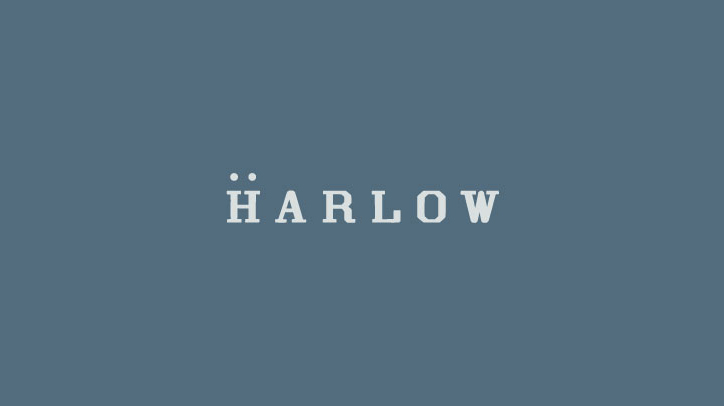
With the company name to hand, we could now focus on creating the brand identity. Our research revealed some really outstanding fashion outlets and quirky retailers across the globe. We explored texture, palette, photography – fashion, landscape and otherwise. We tested and worked with an array of type, symbolism and mark making. We used the stem ‘passion led us here’ as a backbone narrative for the project – this language opened up the door for passionate photography, and an overall ‘chill’ – ‘hippy’ lifestyle vibe for the brand – something that the client was immediately connected with. The narrative paved way for an ‘airy,’ modern use of type with wide spacing between letters. The font used for the primary type mark is a Grecian typeface, one that screams ‘foreign contemporary’ to keep in line with the business ambition and to suit the product. The type in the mark now decided upon we wanted to introduce a simple device to enhance the overall identity. Traditionally when thinking to European or foreign language we expect to see accents or glyphs that derive from foreign alphabets, so how do we introduce this – cleverly. Taking inspiration from the missing holes inside a button we introduced an “umlaut”-style device above the H in Harlow. This addition creates a unique brand identity and creates a new brand atmosphere to begin to use dots and the separated H as part of the brand material and roll out.
The colour palette is subtle, confident and modern reflective of the 3 pillars of Harlow Clothing Company. The greys and blues echo the denim and highbrow fashion on sale. Pairing the colour palette with fashion photography enhances the brand personality, solidifying the clients’ expectations and price ticket of some of the brands on sale at harowclothing.co. Harlow’s initial brands are Italian denim magnates Freddy and Scandinavia’s SVEA – two unique, stylish brands that radiate quality and fashion. Harlow sits confidently in this brand landscape and showcases the products on sale fantastically. The photography brings another element of landscape to the identity, transporting its customers to the origins of the garments on sale. The photography is a welcome addition to the brand pack, it’s storytelling ability enhances the experience and establishes the new business as an already market leader in this field. I must highlight that Harlow is the first business in Northern Ireland to stock and sell the Freddy and SVEA brands.
We designed all brand material from online e-commerce site to tags, labels, packaging and signage. All brand elements adapt the same brand tone, minimal yet impactful. The brand is now live and boasts an already impressive online following on Instagram. As Harlow’s reputation builds we continue to work with them, acting as brand guardians, as they evolve so do we.