Apples & Mermaids Round-Up

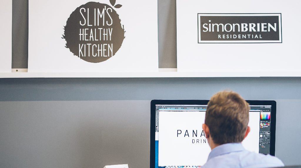
At the end of January, we here at Kaizen Brand Evolution held our first event/workshop of the year, titled Apples & Mermaids. This was a workshop detailing the importance the logos play in our lives and just how important they are to businesses everywhere, no matter what industry they are in. The event took place in The Mac, Belfast which we can only say had a fantastic set-up for us.

Ryan Stanfield, our very own Design Director, was the speaker during the event, taking us through what logos mean to us and also how we are influenced by them. For example, is there a brand that you are faithful to and won’t deviate from even if someone else is offering a similar product at a cheaper price? Think perhaps shoe or trainer manufacturers. If you are always buying Adidas trainers, you are less likely going to buy anything that Nike might have to offer. The same can be said for Vans and Converse. It is usually one or the other. However, if you remove the logo from these products and do a test, you might find that your loyalties change. This is because it is all to do with the brand and logo that we see, the logo that we feel a connection with.

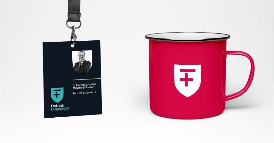
Those that attended the event were also given the opportunity to put their own design skills to the test, being given an exercise where they had to try and figure out what symbol, font and colours best suited a certain company. The point of this was to show those in attendance the process that goes into creating a logo for a company and how much else there is involved, rather than just sketching something and saying it is okay. It is vital to look at what industry you are in and see what would go well. But it is also important to look at what other people in the same industry are doing.

At the end of the morning, guests had the chance to ask Ryan some questions, getting further insight into his knowledge and also help with understanding some of their own projects that they are undertaking. As well as this, they had the opportunity to chat with some other team members who were in attendance.

It was a great morning had by all and we can’t thank everyone who came enough, helping to make it so. We are now in full preparation mode for our next upcoming event, “When is a good time to rebrand” taking place on 22nd of February in The Academy Restaurant. If you would like to buy tickets, you can do so right here: http://bit.ly/rebrandtime

If you feel that you are in need of some inspiration and help with your current branding project or perhaps you are a company just starting out, then please do not hesitate to contact us either by email at studio@kaizenbrandevolution.com or else by phone on 028 9057 2007 to get your next project underway.

Join us for our next Brand Masterclass

A few months ago we hosted our first ever brand masterclass in association with Women in Business NI.

It was so successful that we’ve decided to host a few more masterclass sessions, starting with our “3 Steps to a Successful Brand” workshop on 29th September. Our masterclass will take place at the Thinking Cup on Lisburn Road from 9am to 10.30am, and tickets are free! Tickets are available to book now, just visit our event page here to book your place.

Whether you’re an aspiring entrepreneur or a long established business, having a strong brand presence and strategy will set you apart from the competition and help you grow your business. Our workshop will take you though the key elements of a successful brand, from logo and language through to longevity across all channels.

This session will cover:

  • What a brand is and why it’s so important
  • The key difference between a logo and a brand
  • The importance of a brand strategy for business growth
  • How language can impact and shape your brand perception
  • Key tools for building your brand online

This masterclass is perfect for those with a new business who need guidance to build their brand from the ground up. It is also helpful for businesses who have been established for a few years but who would like to evolve their brand and take their business to the next level.

We’ll be providing tea, coffee and refreshments from 8.30am if you’d like to come along early for a bit of breakfast and networking. We hope to see you there!

Jane McClenaghan

Jane McClenaghan owner of Vital Nutrition – Northern Irelands leading nutrition and healthy lifestyle brand approached Kaizen Brand Evolution to create an identity for herself in preparation for Jane’s evolution as a leading, national healthy lifestyle consultant. Jane has featured as part of Centra’s most recent influencer campaign and has appeared on BBC and numerous Food events across the province. Jane’s ambition is to be the figurehead for healthy living and nutrition, increasing her media coverage and crafting her ‘influencer’ brand presence.

The first step in the creative process was to fully understand the industry landscape that Jane aims to position herself as a stand-alone influencer. We researched and developed clear brand narratives based on Jane’s ambition and potential competitors in the healthy living/eating arena. Learning what is working and not necessarily working for some of the top brands was extremely important in the creation of Jane’s brand. As well as retaining the brand name ‘Jane McClenaghan’ we wanted to explore further options for her as a business, much like the way some influencers use nick names or brand names to trade under. Names such as Zoella, I Quit Sugar and Little Green Spoon have achieved major success from this approach. As one branding option we renamed Jane and presented her with “Nutrijane” as a potential brand direction – using this naming we seen potential for a clever brand strategy which would position her brand alongside the ‘quirky’ engaging names out there. In the end we stuck with Jane McClenaghan and plan to use Nutrijane throughout the brand emails and possible URL for her new website – so no idea un-used.

We designed a contemporary brand system for Jane McClenaghan to use across all of her marketing material both on and offline. We introduced a leaf to the word mark using negative space in the A to achieve instant brand recognition – summing up Jane’s offering and business objectives. Simplicity is the best policy here and when applied to type the negative space really speaks volumes for the entire brand identity. The logo itself positions the brand on the higher end of online influencers such as HEMSLEY + HEMSLEY, and Deliciously Ella which immediately resonates with Jane’s target audience. The unique blend of classic typography and clever brand language pulls the brand together in an engaging, visual fashion. We introduced a bold colour palette that reflects Jane’s colourful personality as well as the visually attractive meal plans she creates at events and on her online webinars. Taking influence from the bright palette of some of the key ingredients she like to use mirrors throughout the brand not just in her logo but in her very own, custom brand iconography set which will feature as a way finding system throughout her cookbook design and her website.

We created Jane’s brand language and tone of voice to reflect her offering in a clever concise way. Statements like “Health to thrive” and “I’m here for the good of your health” have spawned from the creative writing process for the brand. When married together the brand language and logo mark successfully tell her brand story.

Following the identity and language creation we implemented the branding on a number of deliverables that Jane has plans to release over the coming months as the brand is launched. From cookbook designs to event design and branded collateral for conferences we visualised how successful the identity can be across all of her needs with the colour palette and brand language constantly making an appearance, strengthening the identity as a whole.

It was a pleasure to work on the branding for Jane and we look forward to the roll out as she continues to evolve and increase her brand reach. Next phase is realising her new website and social media channels.

Branding The Future

We were approached by Adam / Founder and Director of the Future 17 Conference to develop a new brand identity and strategy for the up and coming tech conference for teens. Future was born out of frustration at the lack of tech events aimed at teenagers and was therefore created with the sole aim of inspiring the next generation of tech leaders.

After their first event, which hosted speakers from TIME’s list of most influential teens, they are now hosting Future17, a one-day tech conference and hackathon that aims to inspire Northern Ireland’s teenagers to get more involved in the tech industry. By using a unique model and organising a tech conference around a hackathon, they ensure that attendees get the most from this experience: not only will they be able to develop their skills first-hand by ‘hacking’ together a product, but they will also receive talks from some of the leading people in the technology industry today. The ultimate aim of the event is not only to inspire the next generation of tech leaders but also to make teens see code as more than lines and squiggles on a screen and appreciate it for the magic that it is. This founder has his sights set on a number of high-profile digital superstars to lead the conference to be held in the Titanic Building, Belfast.

We set the new Future 17 tone of voice around the primary mission of ‘developing greatness’ which symbolises the over arching theme of the event, inspiring the future of tech and digital/online developers. In keeping with the younger, teen target audience we aimed to create a brand identity that communicated effectively with this age group as well as potential sponsors. Adam, the founder has already secured solid investment from the likes of Twitter, Kainos and the MCS Group, all championing this growing industry in Northern Ireland. With this in mind, we created a clever brand mark utilising the ascender in the ‘F’ device with it’s own speech bubble mark. This subtle device speaks volumes across all marketing material on and offline. It immediately visualises the essence of the talks at the conference and is easily adapted across the brand.

As well as the primary ‘F’ mark we introduced an additional, more fluid ‘F’ device built from a data map concept. This secondary ‘F’ is used across the brand in more abstract, high impact fashion. The founder of Future 17 thought that this additional device spoke volumes across marketing material and liked how versatile it became when rolled out across the conference graphics on stage and delegate material. All in all, there are two key components to this brand, the contemporary primary brand mark using the speech bubble in the F Ascender and the ‘Data Map’ F which adapts the playful, secondary colour palette.

In keeping with the contemporary brand identity, we introduced Calibre as the brand typeface. The surge of circular typefaces in 2016 has been incredible and this one in particular fitted perfectly with the Future 17 ident, clean, concise, on trend. The supporting imagery with the Future 17 brand was chosen to inspire and intrigue, high impact scenic photography of skylines and the night sky symbolising the potential of the delegates and their future impact in tech.

We are extremely pleased with the final branding of the Future 17 conference and look forward to the roll out as the build up begins for 2017. Here’s to the future of tech in Northern Ireland. If you are interested in attending the Future 17 conference please follow the link below for tickets and any further information. http://www.future17.co/

Design of the Boojum Food Truck

This month in Kaizen Brand Evolution we had the pleasure of working on the concepts and design of Boojum’s brand new offering –The Boojum Food Truck. The Food truck is now available for bookings across the whole of Ireland for events, festivals, weddings and pretty much any party you can think of. The food truck craze has taken America by storm and the owners of Boojum felt that Ireland was the perfect place to launch their own!

We created the campaign, additional web pages and Food truck design itself for the launch and already it has had major bookings for festivals and events across the province. ‘You see me rollin’ is the lead campaign for the food truck encompassing the rolling of the burrito and the food truck rolling down the road. The vehicle design is big, bold and extremely eye catching. The branding was also ‘rolled’ out across video, print and digital campaigns. We are, as always very proud of the work done and wish the Boojum food truck all the success it deserves.

Mozilla – Open Source Logo Design

‘Open sourcing’ or perhaps ‘open publicity’, we couldn’t help but be curious to see the concepts being considered and there annotations on reasoning. Whilst we appreciate a much greater strategy may be propping up the concepts behind the scenes and the notes may be to provide justification to the masses, ‘there’s a touch of the optical illusion about the design’ might not be sound reasoning to divert a brand image. (PS if we had to pick one, that would be it, but not for those reasons).

At Kaizen Brand Evolution our team of seven creatives are brand strategists who utilise design thinking to resolve problems presented at brief. The refinement process is critical and rarely to never sees seven responses being appropriate resolves. We believe in the courage of our convictions when it comes to creative, confidently standing by presented concepts in response to brief with the weight of clear strategy.

However, we applaud the marketing aspect of this post, it does indeed succeed in tying into an open source community approach promoting inclusion in the change making process to bring current users along with the process and tease newbies to the brand. Will it help create the best outcome? Doubtful. But it will engage and create reach, and as we are talking about it, the marketing is working!

See them for yourself here: blog.mozilla.org/opendesign/now-for-the-fun-part/


Shebelle’s Brand Identity

Shebelle required a brand identity to reflect high end, ethically sourced hair extensions and associated beauty products. During a temple ritual in India women donate their hair to the gods. The temples used to burn this high quality human hair but now they auction it on the open market and channel the profits back into community projects. The hair is locally made into wefts and Shebelle only chooses product from companies with proven ethical standards in manufacture, employee relations and charity work, especially the education of women and girls. The products that enrich the hair are derived from andiroba oil found wild in South and Central America and in Africa. This blend of quality ingredients and ethical sourcing was the foundation for a strong branding position.


We designed a luxurious, contemporary brand identity that sets Shebelle apart from their competitors. Patterns, photography and colour play their part in telling the story with each product having a separate, localised illustration. Traditional Indian, African and South American patterns weave through the packaging and marketing materials. The product launch is set for launch in late Summer 2016.

Vandal opening night

Nothing gives us more pleasure than to see a brand created in the Kaizen Brand Evolution go live. Working with the management at White’s Tavern we designed the brand identity for Vandal.

On Friday night the Kaizen Brand Evolution team had the pleasure of being invited to Belfast hottest new bar/eatery. Vandal is located on the first floor of White’s Tavern and boasts a brand new type of crowd that you wouldn’t usually associate with the lovely, traditional surroundings of White’s Tavern. Vandal taps into the glory years with a cool twist – 90’s throwback design echoed through the branding, interior and whole experience really. Nostalgia is a powerful thing. You immediately associate with the Vandal brand, it transports back to a time when mortgage payments and car insurance meant nothing and all you cared about was your high score in Donkey Kong on the Super Nintendo and the Fresh Prince of Bel Air. Great alcoholic shakes and deep-dish pizza making the experience a full circle success. We can’t wait to go back.

Babble Brand Identity

Babble required a forward thinking brand identity that showcased them as the one stop shop for a career in the call centre industry. As well as the launch of their Babble Jobs brand (online jobs board) they required an accompanying brand that would speak to the user across social media, for ‘Babble Social.’

We developed a contemporary, playful brand identity for Babble Jobs and Babble Social. Introducing ‘Barry’ – The Babbling Parrot, Babble’s Brand Mascot. Barry encompasses the user of the jobs board and social, he’s a well-travelled, chatty high flyer. Barry is seen across all collateral and acts as the voice of the company. A pleasure to work on and as the brand evolves Barry really starts to come to life.

Brand creation For Friends Daycare & Nursery

Watching our customers move into different markets and business ventures is amazing and we’re always happy to assist with their own business development. The owners of Friends Daycare & Nursery, Belfast approached us to develop the brand for their new daycare based on the Saintfield Road, Belfast. Understanding their approach to childcare it was clear we were to develop an identity of the highest level, that would appeal to the parents and of course the children of south/east Belfast.

Presenting a selection of concepts that embodied the business and retained the core ethos, we created this unique brand that will position Friends Daycare and Nursery among the highest regarded businesses in their sector. We are now in turn building the supplementary marketing and business materials required for the launch, alongside a bespoke website for the brand.

Changing markets!

‘St George’s Market Bar & Grill’ becomes ‘George’s of the Market’
Our creative team relish creating brands as much as turning around inherited brands. George’s of the Market logo was presented to us as a blank canvas to create the brand story to deliver a signage and way finding system as well as a range of menu offerings. Our initial presentation included heritage market images sympathetic to the character of the market and its traders, as well as simple graphic interpretations to build assets from the new logo. With input and feedback from the client we developed the visuals mixing the Victorian iron work illustrations with neutral contemporary colour palettes. Fonts that were reflective of the era and simple black and white styling was mixed with brown paper and craft cards synonymous of the packaging found on the market floor below. Stamps are created to brand the paper that would pack the fresh bread into on special nights such as the Twilight Market. Transforming the almost invisible upper level restaurant, to a modern airy eater that gives a nod to the historic market below.

Buns on the Run!

French Village Bakery Delivery Fleet

French Village Bakery are expanding their fleet of livery to deliver their tempting treats from the bakery to their Botanic Bistro and across Northern Ireland to their hospitality clients. Our brand team worked on concepts to translate the French Village Bakery style across the vehicles. After a site visit witnessing the bakers at their craft, delicately placing each embellishment by hand, we knew it was important that this art was not lost. The blue striped treatment with logo ribbon holder is a nod to traditional patisserie packaging to communicate the fresh handmade goods that French Village Bakery create daily. It’s subtle placement, not overpowering the vehicle, is the professional feel that the client required when arriving at corporate catering events and weddings. Our senior design Ryan Stanfield visualised and created artwork across a range of vehicle sizes, liaising with the vinyl print and applicator for quality control. We think they look très bon!

Ooh & Aah Bakery

Little Treats NI were an established baking company with plans to re-launch a cookie-based company known as ‘Ooh & Aah’. Their tastes for brand direction lay in contemporary French design and with this we pitched 3 brand concepts. The Ooh & Aah brand uses contemporary typography as their mark and is housed in a number of badges and devices across their product range. Clean, minimal and pastille colours were the flavour of the brand and high end baking utensils acted as the backdrop. The owners launched the brand at the Balmoral Show 2015 where we created ambient printed materials showcasing the brand direction and messages. They created custom cookies which were sold in a ‘pizza box’ style packaging all designed in Kaizen Brand Evolution. The success of their products and branding has now led them to commissioning an eCommerce website with Kaizen Brand Evolution where you can select any cookie topping for any cookie occasion. A tasty project that continues to grow with us.

Slim’s Healthy Mini Kitchen – Victoria Square

Slim took on the pod in Victoria Square Belfast as a brand new venture. His plan was to turn the old Victoria square kiosk and transform it into a one-stop juice bar for shoppers. The idea was great and we created the new ‘Slims Healthy Mini Kitchen branding for the POD. Mini Slims needed a new logo with a full vinyl wrap of the entire area below the Victoria Square dome. Our approach was to create a summer festival experience for shoppers in the heart of the city. The graphics featured a field, wooden directional signage, festival lights which sit with picnic tables, teardrop flags and parasols, the full works. The till area was transformed into a wooden hut with the bright, bold colours of Slims brand surrounding the POD. Slims Healthy Mini Kitchen reinforced the brand values in the centre of Belfast’s retail sector and in tern drove more customers to the larger store beside Top shop. A great project for the Kaizen Brand Evolution team.


Bakehouse Belfast – Branding

Bakehouse Belfast approached Kaizen Brand Evolution for a branding project to set them apart as the top B2B supplier of baked goods across Ireland. Already established in some of the countries top hotels they required a fresh brand that would be rolled out across packaging, marketing materials, menus and eventually plans to open a café/patisserie. We pitched 3 contemporary brand directions for the company to which they chose the wheat’ mark with accompanying distressed text logo, echoing the hand made aspect of the business. We designed the packaging for their initial stand alone protein bar using a mix of bold raspberry and mint green colour palette. The brand personality cam in the naming of some of their best selling products, for instance their apple pie was re-named ‘Granny’s hand made apple tart.’ We wanted to use ‘Belfast-ism’s’ for each product and reflect the companies Belfast heritage. All copy going forward would use this approach and set them apart from their competitors.