Fusion Antibodies – Brand identity

A refresh of one of the world’s most recognised Antibody Humization brands with updates to the iconic antibody mark and a design language that allows the brand to live outside of the lab.

Fusion Antibodies is one of the world’s most trusted and leading Humization brands. Kaizen Brand Evolution has refreshed the Fusion Antibodies visual identity, reasserting and amplifying the brand’s visual expression. The project sought to re-assert the antibody logo, introduced many years before becoming a PLC, and to derive a typographic language that could communicate effectively. The refresh was initiated as part of a larger branding project that covered a full re-design of the Fusion Antibodies website, internal and external facing brand.

One of the primary goals was to reinvigorate the brand identity and optimise the brand for online customers across the world. Fusion Antibodies has a global reach that is viewed on multiple digital platforms and the identity refresh allows for this expansion and scale. The new visual identity brings strength and simplicity to the brand enabling Fusion Antibodies to voice their experience and services.

Kaizen Brand Evolution worked closely with on the project with senior management and stakeholders at Fusion Antibodies. The challenge for the designers was to translate results from a series of workshop answers created from multiple team members on what the business means to them. The designers had to strengthen a recognised brand for a global audience, crossing language barriers in a digital world.

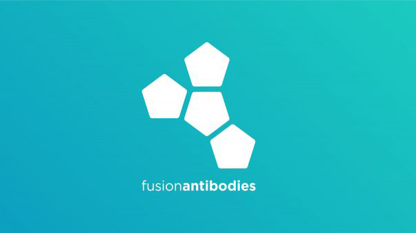
The logo and secondary brands have been redrawn to thrive across brand areas on and offline, at different sizes and scales. The brand typography has been carefully resolved to be more legible and effective across contexts such as the Fusion Antibodies website on desktop and mobile, signage and conference stands. The graphic system along with the colour palette is flexible, engaging and highlights the personality of the brand. The pentagons extend through the applications, including brand stationery, signage, marketing material and the website. The supporting typography is set in the modern sans serif Gotham Pro.

Throughout the branding the use of gradients and pentagons allows information to breathe and be digested, this is especially useful on the website where content is plenty. Kaizen Brand Evolution developed the brand messaging, which was created to engage key clients and create a cohesive voice for services and future activity as the business grows. 

The team created the Fusion Antibodies website from the ground up, utilising creative elements for the refreshed brand identity and typographic system. The colour palette and pentagon shapes enhance the brand expression in digital platforms. Each page on the site has been meticulously designed to suit the content and talk to the customer on their level without any confusion. We sought out to create a useable, informative customer journey from enquiry to sale. The team worked closely with senior marketing at Fusion Antibodies in the customer journey, sitemap and pipeline. 

As Fusion Antibodies continues to evolve so does our creative relationship with them. Antibody Humization is an extremely important field for human kind and we are grateful to have created this important identity.

Best accessories for designers

When it comes to graphic design, obviously the main tools you are going to be using are your software, for example, the Adobe Creative Cloud software package and your choice of machine, whether it is a laptop or desktop computer.

But, believe it or not, that isn’t the be all and end all as there are numerous accessories out there that can make your experience as a designer and the creations that you produce that much more impressive. Within this article, we are going to take a look at a few of what we think are the most important ones.

Graphics Tablet:

What exactly is a graphics tablet you ask? One of the best tools a designer or even just a digital artist for that matter can own. It’s basically a drawing pad that will connect to your machine, allowing you to draw like you would on paper. This makes it so much easier to produce your creations, especially those with curvature than with a standard desktop mouse, or worse still, a trackpad…

There are plenty of options out there for these, however personally we would recommend anything from Wacom. There cheapest will set you back a modest £50 while the most expensive is upwards of £2000, but is a machine in and of itself, coming with a 24” screen built in.

With these, you often get great software that will let you create entire pieces of art digitally such as Art Rage, Sketchbook and of course using the Adobe Illustrator software.

Sketch Books:

Where would any designer be without their sketchbook? That goes for even digital designers, as more often than not it is good to get a good sketch down on paper before bringing your ideas to life digitally. Obviously, there are loads of different types of sketchbooks out there, so it all depends on what it is you are working on for which one you choose. And the size is also something that you should consider. Do you plan on sitting down for a couple of hours to draw something out? Then something like A4 or A3 is the way to go. But if you are more akin to being out and about and sketching for 5-10 minutes at something you’ve seen, then maybe an A5 or A6 one is good for you. Again, it is entirely a personal preference, but a sketchbook is something we feel no designer should be without  

Colour/Pantone Books:

Knowing your colours is absolutely vital when you are a designer, as you need to be able to spot the slightest difference between one colour and the other. This is why it is handy to have a Colour Book or perhaps a set of Pantone colours to hand when you are creating. These will be a great help especially if you are working with a brand that can’t quite decide what their colour scheme should be or even if you are rebranding someone. With these to hand, you can beat determine what goes well with other colours and also what colours beat suit their mission statement as a brand. It will also help with the explanation of why those colours are chosen, as it is sure to be a question that is asked.

Note Pads:

Coinciding very well with the sketchbooks that we mentioned previously in this article, are Notepads. It’s the worst thing for a designer, when perhaps you are out and about or even if you’re in the office and come up with a great idea, but don’t have some paper to write it down. You say “It’s okay, I’ll remember it later” but you never do and half the time that idea is lost. This is where always having a good notepad handy is a great idea. It allows you to capture all of your great ideas and then implement them into your designs. If a writer is never without one, why should you be?

We hope that this article has not only provided some insight into the life of a designer away aside from their computer, but also helped those of you out there that might be looking to kick things off in their design career, and want to know where the best place is to start.