Boundary CrossFit – brand identity

Understanding the Brand

The newest player in the CrossFit arena, ‘Boundary CrossFit’ came to us to create create a unique brand identity and system to showcase their brand new high-end facility, to help them prepare it for launch and growth within the industry. Their ambition was to achieve a modern, bold narrative that would pay homage to the raw industrial nature of the sport but also the physical interiors within the gym itself.
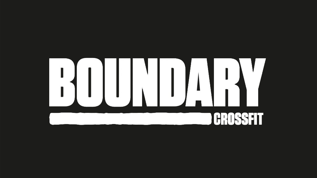
The Logo Build

The vast majority of us have heard of or have some kind of idea about what CrossFit is. For those who don’t CrossFit in recent years has become much more than just a choice of exercise. The growing CrossFit brand has become a culture amongst likeminded passionate individuals. We felt that this was a primary message we needed to get across through the Boundary Brand Identity Narrative. We needed to pay homage to the people who commit and support these gyms. We wanted to capture the spirit of these individuals and their culture and lifestyle.

The brandmark was created with the brand name at the soul of its direction. The term ‘ Boundary’ illustrates a conflicting ideology it can reflect a division, a defense mechanism, but also a sense of place, a sense of strength.

The word itself has such a powerful narrative that it was an organic development that the brand mark would be a strong typographic word mark.

The logo is set in a modern Flat-Sided san serif typeface, a style also known as ‘gaspipe’. The modular letters evoke modernity and industrialism. The type led brandmark visualises the feeling of the word ‘Boundary’ and encapsulates the narrative of the brand. To further project the narrative of the brand an organic underline was incorporated to bring a softer contrast to the modular typemark. To amalgamate the strength of the word with the raw passion and commitment to the people who belong within it. 

This notion of a warrior, war paint, the raw grit and dedication associated with the physically experience of the brand. The underline creates a device that can be used throughout the brand roll out as a visual sense of the word ‘bound’ to create metaphors and links through visual assets. The line device also enables ‘Crossfit’ to be neatly combined within the logo but also easily removed when needed and to ensure brand longevity. This strong typographic approach creates a unique typographic identity, which will become a natural association to the ‘Boundary’ brand.

The strength evoked within the logo helps to resonate with the desired audience of the brand. There is an immediate connection to the name ‘Boundary’ and the visual depiction of the meaning of the word throughout the type. This typographic language that will be used throughout the brand roll out creates a direct and powerful connection to audience the brand is trying to attract. A loyal client base who share like-minded goals, who are passionate about being a part of the ‘Boundary’ culture. 

Photography

A creative direction for the photography was developed to further enhance the narrative of the brand. It is people focused to give the audience a true reflection of the ‘Boundary’ culture and to ensure the right people invest in that culture. The imagery depicts loyalty to the brand a common visual trend associated with the sports industry and the nature of the CrossFit community. Promoting through imagery of branded sportswear and to evoke this sense of belonging and passion. To showcase the hard work, dedication and passion valued by the ‘Boundary’ brand. 

An image treatment has also been developed for the brand to create gritty, high contrast visuals that portray movement and energy. Contrast plays a primary role within the narrative of the ‘Boundary’ brand, with the confident stand alone brandmark the physical experience of the brand needed to be further introduced throughout the brand imagery as a storytelling device to stand out within a crowed industry.

Brand Colour

The brand colours will primarily be black and white to reflect a modern and minimal tone of voice. However, to achieve the contrast and successfully reflect the brand values associated with this industry and its audience a warm red palette was introduced as a secondary colour device for the brand to utilise. 

Red is a strong colour that has a direct cultural connotation to passion and love, but also has conflicting meanings of jeopardy or boundaries, and in this case over coming these physical boundaries the blood, the sweat and the tears reflective of the industry and resonates with the target audience.

Brand Language

To further enhance the brand narrative of unity and strength we developed a tagline to define Boundary as its own culture, the unity of the people who experience it ‘Bound by Passion’.

Typography is one of the main devices used within this brand. The modular san serif typeface that not only gives life to the brandmark, will also encapsulate the entire brand story. The large type family allows us to utilize the typeface throughout. 

Kaizen Brand Evolution

At Kaizen Brand Evolution we understand the difficulties that brands face in evolving their brand and in keeping it fresh. If you’d like to find out more about what we can offer you can visit our brand identity page. Alternatively, you can get in touch via our contact form or by calling 028 9507 2007.

Town – brand development, website design & social media

When branding a new venue, whether restaurant, hotel, nightclub or bar, thee are considerations we must make as your branding partner. Our initial discussion will focus on customer demographics, market opportunities and the heritage of the business in the case of a bran audit or brand refresh. After meeting with the owners of Town, Leixlip we were blown away by their passion and drive within the hospitality trade in Co.Kildare. They had a vision for the bar / restaurant and we were engaged to bring that vision to life through: Brand Strategy, Brand Identity Design, Logo Design, Menu Design, Website Design and a social media launch campaign.

About Town, Leixlip

Town is a bar based in Leixlip, Co. Kildare, Ireland. They loved the idea of being the ‘Talk of the Town’ bar as this would be great for a ‘Town’ campaign they can work with and evolve over time. We explored diffident uses for brand language, which could easily evolve over time. Their target audience would be locals who would head into Dublin for a night out. They were inspired by well known neighbourhood bars in the likes of Dublin and Manchester and aimed to bring it back to Leixlip so punters could get the same experience and not having to travel as far, back in their home town. A place you can go for your coffee meetings, family dinners to having a night out partying on the dance floor with your friends. 

Town is “More than just a bar”.

Town approached Kaizen Brand Evolution to create a brand for their bar because they wanted to create a bar for everyone in the local community. Town’s approach was creating a friendly bar for all generations of the Leixlip community. They needed a branding system, which worked for everyone. It had to feel homely after it all it was a Town in their hometown. Town is a bar that would rely heavily on their social media to advertise their events each night and mid week offers. The Brand would have to work particularly well on social media platforms as most of their audience would be on these, to create a social media friendly brand we looked at how other bars across the globe used social media to promote their business. 

We created the branding system in way, so it’s simple for Town to use. It had to also stand out from their competitors but mainly be consistent. To get the brand identity for Town, we gathered our research of places the owners of Town liked. We took elements from our research then we crafted 3 concepts, which were all unique created to tell the story of Town. 

We Partner Your Interiors Team

We worked closely with the interior designer to make sure the brand worked with the interiors and to complement the building. We introduced a contemporary colour palette for the brand, using a rich blue, teal and gold with contrasting pinks from the floral elements used to add more depth to the brand.

Crafting the TOWN mark had to represent a place for everyone with some character. The Mark had to feel established, friendly and Town had to you make you feel like you belong, a place where you can go for a morning coffee, or grab a bite to eat or have a really good time with your mates, it had to feel like a place you never have to leave as it’s all under one roof. This is where it ties back to he underpin for Town, “More than just a bar”. 

Brand Language is Critical

The brand language had to be simple, but unique to Town. “Fancy a G&T”, “It’s T-time” and “Down to a-T” using the T mark, which can easily evolve for future adverting promotions. The language is playful, and it’s simple. 

Brand Development Is Just The Start

As well as the branding system we produced a range of visuals to show them how the brand could be used across different mediums; including work uniform, menus, hand stamps, glassware, and online presence. When you see how all the brand elements are brought together it’s clear to see how well the brand works as a whole. With this brand structure, Town will stand out from the rest of competition.

Website Development

With any branding project we must further consider its reach beyond the conceptualisations presented. We look at all manner of print and digital mediums the brand is to shown on and develop these further in line with the brand strategy. For most in the hospitality sector, the main focus of attention moves from brand to website development. As you can see from the graphic above, we have captured the essence of the brand and brought to life a new website for the thriving business.

We enjoyed working with Town on this branding project and we look forward to seeing the branding used across social media, the branding paired with the interiors of the bar and we are excited to be part of the Town evolution.

Start a Branding Project

Want to start a bar, restaurant or nightclub branding project of your own? We’d be delighted to have a chat. You can get in touch with us on +44 289507 2007 or you can get in touch with us via the contact form below

[contact-form-7 id=”2934″ title=”Blog Post – Branding Blog Post”]

Why is typography important

Here in the Kaizen Brand Evolution studio, we use typography every single day in our work. In every brand that we generate, on every website that we design and in every logo that we create, it’s always there and always important to us.

Typography is described as being “the study of the design of typefaces and the way in which type is laid out on a page to best achieve the desired visual effect and to best convey the meaning of the reading matter”. It may seem like something very simple, and like it may not make much of a difference when it comes to design, however, this couldn’t be further from the truth. In fact, Typography can often be the element that either makes or breaks the main design, whether it is a logo or just a piece of packaging.

But why is it that important you might be asking? Surely the way in which an image looks is going to be more important than what is written there? Well within this article we are going to look at just why Typography is so important, and hopefully, after reading this you will understand it a little better.

Catches The Attention Of The Reader

The type that you put on your marketing material is your message. This is going to be the part that tells the customers exactly what it is that you are offering. As such it is important that it catches the eye of the reader. It needs to draw them in so that they begin looking at your marketing material, and then they can begin noticing everything else, such as the design. It is important in this sense then to have what is called a ‘type hierarchy’ on your marketing material. This means that when there is more than one piece of type, one takes dominance over the others, becoming the main body. This is the piece that will catch the eye of the reader and draw them in. Once they are in, they will begin to notice the smaller bits of type, where the rest of the details about your message are being conveyed.

Conveys The Feeling and Mood Of Your Message

Typography is just as great for helping to set the feeling and tone of your message as your design is, and it all depends on which font you choose and also the typeface that you choose. There are thousands, if not hundreds of thousands of fonts and typefaces out there for you to choose from. However, it is important that you make sure and choose one which suits the message your brand is trying to convey. It is often evident a mile off when the type on a brands marketing material doesn’t fit, and even if it is only small, it puts the whole thing off.

Shows Professionalism

Good typography not only helps your immediate design and marketing material look good, but it is also helping to look your and your business look good, by showing the professionalism you carry. It shows that you take care when designing your marketing material and that you want people to notice what you are trying to say.

Build up recognition

Consistency is key to recognition, and recognition is exactly what you want from your branding and marketing. If you start using one type of font and make it distinct to you, customers will begin to immediately associate this with you and your brand. All the biggest brands in the world are consistent throughout all of their marketing when it comes to type because their typography and font have become a staple of their overall brand.

Hopefully, by reading this article you can start to see just how and why Typography is important to your brand, often becoming just as big a part of the brand as the logo.

Watch out for these pitfalls when designing brochures

When it comes to Brochures, they can often be one of the best pieces of marketing material that you can own. For something being quite small, it can be so important, as they can carry a lot of important information, that perhaps you couldn’t quite get across in a meeting, for example, due to a lack of time or a need for further information, brochures expand on what you have already said in greater detail, or give you the choice to let it do the talking for you.

However, it isn’t just a matter of including all of this information and expecting it work from there, as well as getting across vital information your brochures also need to look good. If they don’t no one is going to want to pick one up and read it, as more than likely they won’t even notice it. Here’s what exactly to avoid when it comes to designing your brochures, and how you can get the most out of them.

Visually Pleasing

Brochures need to be visually pleasuring, there isn’t any denying that. It’s the first thing that is going to attract someone into lifting up your brochure, whether you happen to have left them behind after a meeting, or else you’ve sent some along to a trade show, as mentioned before if it doesn’t look good, no one is going to be enticed to pick it up. In that sense, it’s a good idea to make your brochure look exciting. While it may be a temptation to produce them quickly, and you might think it will look professional, this will not be the case. It will end up just being walked by and not noticed, as there is nothing there to make it stand out from the rest of the brochures that happen to be sitting on a table, for example in a waiting room, or at a show. There is a fine line between being too boring and also being too over the top when it comes to designing of brochures, and it is the middle ground that you want to be on. “don’t judge a book by its cover” is a phrase thrown about but the reality is people usually do.

Easy to Read

With all of the information that you are going to be putting in your brochures, it wouldn’t do them or you any good if your target audience can’t read them. There are a few factors that you have to be on the lookout for here, to make sure that they are legible and do what they are supposed to do. Firstly, make sure that you choose a font you can read, for example staying away from scripted fonts unless absolutely necessary or used large enough to be easily read. As well as this, make sure that the font you have chosen isn’t too small on the finished article. A good way to ensure that this doesn’t happen is to print a few tests runs with different fonts and sizes, so that you can see exactly what they look like, instead of printing a large batch, only for them all to be unreadable. Another thing to keep in mind is the colours which you choose, both for the overall design and also the font itself. Using a font colour that contrasts with your background colour is the best way to go, for example using a darker font colour with a lighter background and vice versa.

Good Quality

The job of a brochure is for it to be lifted, held and read in someone’s hands. This means that it is going to be moved around a good bit. Therefore, they need to be good quality. Don’t think that by going for a cheaper paper stock you will get the same brochure but you are saving money. It won’t turn out like this, as the cheaper quality will eventually show through. The more the brochure is read and handled, the more it will start to fall apart and therefore be discarded, meaning you don’t get anywhere near the same marketing coverage that you were hoping for. They need to be durable and feel good in the hand, meaning even if the better quality paper stock is slightly more expensive, it’s a good idea to choose it, as you will reap the benefits in the long run.

Hopefully, by reading this article today, you have a better idea of what to watch out for when you are designing your brochures or getting them designed for you.

In that regard, if you are need of some help designing your brochures, we can help you here at Kaizen Brand Evolution. Our team of professional designers have been designing them for years, so know exactly what they are talking about. Give us a call on 028 9507 2007 or get us by email via our contact form.

Sports Medicine NI – Branding

Sports Medicine NI approached Kaizen Brand Evolution wishing to create a new brand to go with their new premises in Windsor Park. In their own words “Sports Medicine NI offers a comprehensive management service for athlete injury and health. Using our in-house sports science and medicine experts, we are able to provide a holistic team approach to guide the athlete on their journey to health and performance. Whether you are an international athlete, a coach, sports club/association or simply someone who enjoys being active, we are able to provide tailored support to recover from injury, regain health and remain healthy to achieve your sporting goals. Our specialists have experience in working with athletes and teams at the highest level and can bring that expertise to address your specific problem in one venue, simplifying the process, increasing the communication and reducing the cost.”

Sports Medicine NI target market is anyone who has been injured through physical activity or someone who takes part in physical activity or competitive sport. Their ideal customer would be a regular gym player or an amateur sports player, coach or schools player. Sports Medicine NI provides expert advice on all athlete injury, illness and performance. The aim of Sports Medicine NI is to get the player back into the game and for them to stay in the game. They specialise in physiotherapy, exercise physiology, sports psychology, sports nutrition, strength and conditioning and sports medicine, with touch points also in radiology, surgery and other specialities.

From this excellent brief from the client we were able to use this terminology for the language and strapline, this came as the key brand pillars of “Injury, Health, Performance”. For the key narrative, “Getting you back in the game” ‘helping you stay in the game’ and ‘succeed in the game’ was thought of as it covers all of the key touch points for the clients ideal market. The positive messaging shows what Sports Medicine NI can do for you throughout your sporting career. This is paired up with an inline font to highlight the words, back and stay and also in keeping with the logo design.

The Sports Medicine NI logo is made up of lines symbolising the many lines on a track or pitch, and an arrow is crafted in the M to show positivity and moving forward. The logo used a friendly soft san serif font – Effra – which is approachable and corporate at the same time. A key element in the rebrand was to have a smaller version of the logo using the SM only which can be used with and without Sports Medicine NI to the right-hand side. The colour scheme used is a cobalt blue, bright yellow and turquoise as the brand colours. The colours are bright, they stand out and are also current, as well as being representative of a sports brand such as Nike and Adidas. Additional colours of navy, pink and red are used to highlight six key sections within the brand. Throughout the brand rollout, the arrow is used in the M in the SM NI logo to denote the forward thinking and moving forward, which is very important in a athletes life, especially if they have suffered from injury.

The photography used within the brand is bright and full of colour, showcasing athletes taking part in their chosen sports, as Sports Medicine NI has clients from all manner of different sports. We have used a diverse range from swimming to karate, as well as the most popular sports such as football, boxing and rugby.

The brand rollout has been visualised on a number of different deliverables including billboards, website and social media, business stationery, flyers, signage and uniform. We enjoyed greatly working on this project and we look forward to continuing working with Sports Medicine NI as their brand rolls out.

McQuillan Companies – Brand Identity

McQuillan companies approached the branding team at Kaizen Brand Evolution to re-position and revitalise their brand identity. The family-owned business is well established across Northern Ireland and is specialists in civil engineering, quarrying, waste management and outdoor cleaning services to name a few. McQuillan Companies have a large presence on the road, their vehicles being instantly recognisable, a lot of which is down to their unique colour palette, something that the branding team had to keep in mind throughout the brand audit. Auditing a brand is our way of truthfully expressing the business offering today, whilst retaining loyal clients brand understanding and improving brand touchpoints (such as vehicle livery) we aim to create a brand purpose that keeps the business relevant and exciting for new and potential future clients.

McQuillan Companies – in their own words:

McQuillan Companies are a Northern Ireland based family run business which incorporates a diverse range of activities including civil engineering, demolition, quarrying, hazardous and non-hazardous waste management, outdoor cleaning services and analytical chemistry. A fourth generation business operating for over 100 years through the parent company John McQuillan Contracts, the McQuillan Companies name is synonymous with quality and excellence throughout our various divisions.

Getting started we focussed our research and investigation to forward-thinking, modern brands in the engineering, construction and land service industry – looking to London, New York and further afield. With brand learning’s from across the globe we built a solid understanding of what branding was working and not working in this industrial landscape. Following initial research and mood boarding, we filtered the findings down into 3 solid directions and began brand planning.

We initially developed the narrative before jumping into the design for McQuillan Companies. The narrative on this occasion was ‘Here for tomorrow’ – a modern, forward-thinking strapline for a modern, forward thinking business who are, in effect working on making tomorrow a better, safer place to live. We purposely avoided building or construction clichés so that the narrative was widespread across the entire company intern breeding a positive brand culture – essentially this narrative has legs to be flexible across different business facets.

We now needed a logo mark that reflected what we were talking about in the narrative. The McQuillan monogram stems from the idea of engineering and overall solid work that the company undertake. The new logo is a strong, trustworthy mark that brings together the initials of the family name and visualises the industry – simply. Our goal for any brand undertaking is to simplify, make brands that people get, without the use of selfish design techniques or trends. The logo proves successful when used across brand materials and especially in the brand livery and uniforms. Alongside the new mark, we introduced a structured contemporary typeface that suits the tone of voice and industry of McQuillan Companies. The flexibility of the new identity becomes apparent across the different business sectors where the company sector is simply introduced to the stacked lettering in each instance. Throughout the new branding, we have directed the new photography style, using modern dramatic images of the work in progress as well as team members in situ.

The crescendo of the brand audit was the re-design and use of the new branding across the vehicles. The vehicles that define a McQuillan job have been reinvented for future use and business growth, utilising the flexibility of the new logo mark and brand narrative they suitably stand out on the roads and truthfully represent the businesses heritage and future.

It was a pleasure working on the brand audit for McQuillan Companies and we look forward to rolling out the brand collateral in the not too distant future.

Poppogoblin

Poppogoblin are a healthy focussed café/juice bar situated on Alfred St, Belfast. They have garnered a reputation for fantastic, delicious healthy alternatives for lunch and for having warm friendly staff that make the entire experience with Poppogoblin one to remember. The owners approached Kaizen Brand Evolution to re-position the branding for plans to refresh the business alongside an interior fit out and a unique Poppogoblin juice range. The businesses reputation an integral part of their offering, which became apparent in our own research into customer, reviews on trip advisor and the broad social media landscape. One thing that was reoccurring was the focus on how the customers where blown away by how friendly and lovely the staff were in Poppogoblin, which immediately set them apart from competitors and highlights their brand purpose. With the brand purpose in mind we made sure to include hints to the unique offering in their brand identity, narrative and tone of voice.

The brand mark itself reveals a smile in the typography, which is paired alongside a re-draw of their infamous lotus flower. The ‘smile’ in the typography immediately triggers a sense of positivity and the experience that Poppogoblin offers as a destination – you’re going to leave smiling. To balance the re-enforce the logo mark we introduced the strapline ‘eat smart, smile more’ – a strapline that sets the tone for the entire re-brand. You can now see as the brand launches in their signage, on their menus and even on their newly launched food truck – ‘eat smart, smile more’ is as dominant in the design as the logo itself, highlighting the power language can play on your brand.

Colour choice was a delight for Poppogoblin, healthy modern pastels we’ll call them help extend the brand reach to the modern diner without isolated a particular gender or mind-set. You can dine in Poppogoblin if you are vegan, veggie, and carnivore – any palette really so we kept the colour scheme open and friendly as to represent the brand purpose fully. Photography plays a role in telling the brand story of Poppogoblin to which we called upon one of our favourite Architectural, interior and food photographers Donal McCann. Donal’s shots extend the brand direction fantastically, capturing the warmth and friendly atmosphere as well as the beautiful food and drinks on offer.

Brand launch began some months ago in the background of the shop façade. Behind the scenes our team were building the full responsive website for Poppogoblin as well as preparing the social media channels for launch. The website utilises Donal McCann’s photo-shoot alongside beautiful typography, layout and brand placement. The full screen imagery on the site play a hug roll in telling the brand story and giving you a taste of the Poppogoblin experience on your desktop, on your mobile, anywhere really. We ensured that the brand roll out kept on track with the vision from the branding exercise. This extended into quality control with signage companies, interior fit out teams, vehicle wrap companies and juice bottle label manufacturers. We always like to keep a close eye on things as roll out happens, acting as full brand guardians as a brand starts to launch. This process and relationship with a brand extends our reach and expertise in the branding process and ensures that your investment in the brand is realised and achieved correctly as agreed.

Poppogoblin is a fantastic case study for us a brand designers, the brand itself highlights how every aspect of your brand can be considered for maximum purpose. The Poppogoblin brand identity, language and brand guidelines are all set in place for a bright future.

Belfast Central Business District

We successfully won the Belfast City Centre Management pitch to create a brand identity for the new Belfast Central Business District. Following the success of Belfast City Centre Management establishing Belfast One as Belfast’s first Business Improvement District (BID) on 1st of April 2016, Belfast Central Business District (BID) is now in development for the BT2 area of Central Belfast. This area of the city centre functions as Belfast’s ‘square mile’ with many large offices in the finance, technology, professional services and government sectors.  The area is also home to many reputable restaurants, historic bars, quality hotels and a range of independent retailers.

After a year of preparation Belfast Central Business District (Belfast CBD) has now reached the ballot phase. The publication of the final Business Plan for the business improvement district on the 14th of September formally launches the six week long campaign to secure a ‘yes’ result on 27th of October. The ballot involves over 420 votes from 350 businesses across 10 sectors. Businesses have an opportunity to secure an investment of over £2.4 million in a wide range of money-saving and promotional projects over a five-year period in the BT2 postcode area south of City Hall.

The identity and brand system that we created for the project brings to life the area involved in the Belfast Central Business District, visualising the footprint that it will have in the city in a contemporary, almost architectural way. The brand encompasses the area as well as the nature of the businesses and residence in the zone allocated to the BID. As you can see in the brand visuals the device is flexible when addressing different streets in the area, becoming the talking point for the likes of Adelaide Street or Linen hall Street. The colour palette is reflective of a forward thinking, corporate area in Belfast.

We needed to address and connect with the businesses and tenants that currently occupy the Belfast Central Business District, as they would be the ones ultimately sealing the fate of the Bid. We provided a trustworthy, corporate identity that the businesses could get on board with. The ownership comes from the craft of the ‘MAP’ logo to which the businesses can almost point out where they are located. The identity and type family used solidifies the positioning of the BID with a forward thinking approach and timeless brand direction. We used Omnes as the brand typeface, a soft, corporate face that has a big personality when used throughout brand collateral and business materials. As you will see on social media we created a series of props and point of sale items for Belfast Central business District, which really stood out from the crowd at the BID events.

The versatility of the device really comes in to play when housing the likes of ‘VOTE YES’ messages or “I’M IN” statements in their marketing collateral. The strong primary blue palate also helps marry the brand language with the visuals and mark helping the BID take ownership of the area in a contemporary fashion.

We are delighted to say that following the branding project and campaign the BID for the Belfast Central Business District was voted for and passed successfully. We can’t take full credit of course but the brand identity and vision from the offset was always on point with the ambition of the BID providing a solid path to success. We thoroughly enjoyed working on the branding for the Belfast Central Business District and look forward to working with them in the future as the BID formulates and is realised. Another successful corporate identity made for purpose in the KBE studios.

Punchestown Racecourse

Punchestown approached Kaizen Brand Evolution to perform a re-brand for their established and celebrated racecourse and entertainment venue. We re-positioned the Punchestown brand by creating an engaging narrative and strategy for the business. With focus on the new ‘Town’ campaign we developed a suite of versatile straplines to use across the new brand roll out and marketing campaigns.

The Punchestown Festival is considered amongst the Racing community as the equivalent to the Wimbledon of Tennis and the Augusta of Golf. The best of the best from far and wide and the entire annual racing season compete at Punchestown. The sheer audience and exposure of the Punchestown brand provided the need to keep their identity and advertising fresh and representative of their unique offering.

There is a deep history at Punchestown Racecourse, which helped immensely in the craft of the brand narrative, from the famous horses, trainers and events that have taken place there is much more than meets the eye at Punchestown. The racecourse is not only synonymous with racing, there is so much more to the venue, from music festivals, corporate catering, family days, hospitality and new years celebrations to name a few.

We felt that the best way for us to communicate the wider offering was to generate a campaign that’s going to be immediately representative of the brand and evoke the emotions and sense that you feel when attending events at the racecourse. This is where the “TOWN” campaign was born. Developing the campaign narrative from the courses namesake, presented potential mileage for the brand and its campaigns immediately and it seemed like an organic development for the branding. With the TOWN campaign decided upon we generated a suite of potential Irish colloquialisms, sayings and relative straplines that would become the driving force behind the new brand identity. ‘Get out of town’ was a saying that marries a few points at once, which we explored on launch.

The idea of getting out of Dublin Town to visit Punchestown is the initial response to this phrase, however we’ve blended a traditional Irish colloquialism in the messaging “get out of town’ also gets used when you’re surprised to hear or see something. i.e. ‘I got a new Ferrari handed to me by my boss’ – the response would be “get out of town’. So the narrative bar was set, to communicate on two levels and engage vocally through the brand materials.

With the narrative and strategy in place we could work the craft of the logo and brand materials. The logo, which features the Punchestown Fox (identifiable through the years across each variation their brand history) has been brought into the 21st century with the use of a fresh new type family and custom fox mascot, who sits neatly above the TOWN letters, harking back to the narrative and campaign messaging.

We introduced a contemporary colour palette for the brand, keeping yet improving on the notorious Punchestown red we added a seasonal suite of colours to be used across the festival graphics, easily identifiable with the likes of Spring, Summer, Autumn Winter festival days. The colour flexibility has really strengthened the brand materials and creates an immediate association with a time of year at Punchestown. Primary colours explore pairings that compliment the Punchestown red, gold and a deep navy.

Once the brand elements are married together it is clear to see the visual results of the successful re-brand, which now addresses the ambition of Punchestown as a business. The new brand identity and campaigns stand out from their local and national competitors. Everything from the strategy, narrative, identity, implementation and management of the brand has been considered and carefully treated to ensure absolute success as the brand evolves. We absolutely loved working on this brand as a studio and we continue to work with Punchestown as brand guardians and as the racing seasons come around.

A Year in the life of KBE

One year on from my graduation and finishing final year of BA Hons Graphic Design and Illustration in Ulster University Belfast, I find myself working in Kaizen Brand Evolution for one full year. The time has truly flew in! I have learnt so much I begin to wonder how I little I actually knew this time last year. When leaving university I knew that I wanted to work in branding straight away. I particularly like packaging design, as in Northern Ireland the food and hospitality industry is thriving and I knew this is where I wanted to progress my career in graphic design, therefore getting a job in Kaizen was the perfect fit.

Starting in Kaizen Brand Evolution I asked myself the question what is brand? Branding is everything associated with your service that you provide, it is what people say about you when you’re not there. I have been lucky to take part in producing creative branding concepts for start-up businesses and also evolution of top established brands and providing creative concepts. When I first started I took part in small projects to get started, but now I am able to manage my own clients and solve creative solutions for a brief and I have the confidence to do so. I find it very rewarding working one on one with clients and coming up with a outcome that their business can be proud of also when you see the work you have done out in the public domain.

I have been able to take part in brand presentations where we as a studio would get together and do research on the industry and then we would pick out three strong directions to pursue that meet the brand strategy. I have been able to design brands from scratch with a logo, language, art direction, social media consideration and website concepts. It was my brand submission that was chosen by the client is Couture Effects, a costume designer for clients such as ‘Game of Thrones’ who wanted a brand to reflect the work that they do as well as sit with the top global brands. For the brand presentation I designed a modern classic logo an adaption from their previous logo incorporating the C and E with an aspect of stitching and cutting. I also produced language and art direction in advertising concepts, stationery, uniform and garment tags. I particularly enjoyed working on this project and I believe it has helped me develop as a designer.

Working in Kaizen Brand Evolution has allowed me to learn about print and production as their sister company Kaizen Print is close by to help. I have learnt about printing techniques and setting up jobs for print, including cut contours and the importance of bleed, and when and when not to use CMYK printing. This has helped me grow as a designer and be able to assist a client on their project to ensure the best possible outcome is delivered.

I have had the opportunity take part in many events with Kaizen, including Culture Night Belfast last year and I look forward to participating in it again this year. In February I was able to travel to Dublin to go to OFFSET 2017 the design festival and found it very influential as a young designer.

One of the things I have enjoyed working in KBE is being a member of the team and working with others. Being able to learn from others and their experiences is fulfilling. I have also been able to pass my own knowledge on to others in the studio and we all can help each other to be the best! Last week I went to go see the final year show with the studio it brought back memories of what it felt like to be in their shoes. I found it interesting to visit some of my old classmates and view their work only this time I was coming from a design company a year on.

I look forward to continue to develop my knowledge and learning in Kaizen Brand Evolution for the next years to come and I hope to progress as a graphic designer to work on many other projects. Watch this space!


Branding The Future

We were approached by Adam / Founder and Director of the Future 17 Conference to develop a new brand identity and strategy for the up and coming tech conference for teens. Future was born out of frustration at the lack of tech events aimed at teenagers and was therefore created with the sole aim of inspiring the next generation of tech leaders.

After their first event, which hosted speakers from TIME’s list of most influential teens, they are now hosting Future17, a one-day tech conference and hackathon that aims to inspire Northern Ireland’s teenagers to get more involved in the tech industry. By using a unique model and organising a tech conference around a hackathon, they ensure that attendees get the most from this experience: not only will they be able to develop their skills first-hand by ‘hacking’ together a product, but they will also receive talks from some of the leading people in the technology industry today. The ultimate aim of the event is not only to inspire the next generation of tech leaders but also to make teens see code as more than lines and squiggles on a screen and appreciate it for the magic that it is. This founder has his sights set on a number of high-profile digital superstars to lead the conference to be held in the Titanic Building, Belfast.

We set the new Future 17 tone of voice around the primary mission of ‘developing greatness’ which symbolises the over arching theme of the event, inspiring the future of tech and digital/online developers. In keeping with the younger, teen target audience we aimed to create a brand identity that communicated effectively with this age group as well as potential sponsors. Adam, the founder has already secured solid investment from the likes of Twitter, Kainos and the MCS Group, all championing this growing industry in Northern Ireland. With this in mind, we created a clever brand mark utilising the ascender in the ‘F’ device with it’s own speech bubble mark. This subtle device speaks volumes across all marketing material on and offline. It immediately visualises the essence of the talks at the conference and is easily adapted across the brand.

As well as the primary ‘F’ mark we introduced an additional, more fluid ‘F’ device built from a data map concept. This secondary ‘F’ is used across the brand in more abstract, high impact fashion. The founder of Future 17 thought that this additional device spoke volumes across marketing material and liked how versatile it became when rolled out across the conference graphics on stage and delegate material. All in all, there are two key components to this brand, the contemporary primary brand mark using the speech bubble in the F Ascender and the ‘Data Map’ F which adapts the playful, secondary colour palette.

In keeping with the contemporary brand identity, we introduced Calibre as the brand typeface. The surge of circular typefaces in 2016 has been incredible and this one in particular fitted perfectly with the Future 17 ident, clean, concise, on trend. The supporting imagery with the Future 17 brand was chosen to inspire and intrigue, high impact scenic photography of skylines and the night sky symbolising the potential of the delegates and their future impact in tech.

We are extremely pleased with the final branding of the Future 17 conference and look forward to the roll out as the build up begins for 2017. Here’s to the future of tech in Northern Ireland. If you are interested in attending the Future 17 conference please follow the link below for tickets and any further information. http://www.future17.co/

Staying Healthy by Working Together

Slim’s Healthy Kitchen is one of the longest standing clients on the Kaizen Brand Evolution roster. Since their fruition, we have developed the brand, from the brand identity, tone of voice and brand personality to their website, social media design, menus and interiors. Our working relationship has strengthened as the business has continued to grow significantly, with the opening of 4 new restaurants in the Belfast area and now a new venture into all of the DW Fitness Clubs. Slim’s Healthy Kitchen continues to develop and evolve their brand with us and the understanding of the brand values is what makes our business, and theirs, truly successful. When we received news that Slim’s garnered a contract with DW Fitness Clubs to open the Express model across all stores in Ireland, United Kingdom and Scotland we were absolutely thrilled for their business.

The past two weeks has seen the launch of the Slim’s Healthy Kitchen brand in DW Fitness Clubs across Northern Ireland and with our help, we have delivered the Slim’s brand experience in this new venue. Brand consistency across the DW roll out was imperative and with the design of Digital menus for screens behind the counter, interior graphics for the restaurant, promotional material such as flyers, pop-up banners and social media posts we have set the standard for future Slim’s Health Kitchen Express roll-outs.

We worked closely with the marketing and management team at Slim’s Healthy Kitchen in the design of the new menu for DW Fitness Clubs. The brief was to attract and engage gym users, parents of children using gym facilities and appeal to personal trainers alike. We designed and developed a series of high impact graphic devices and colour schemes, bringing the screen menus to life. The brand personality is highlighted in the Slim’s Express model, use of contemporary graphic design utilising standout illustrations, high impact photography and personable brand language.

Along with the new menu design, we had to adapt the Slim’s Healthy Kitchen brand to suit the interiors of each DW Fitness Club. We created a series of branded vinyl signage, which can be seen throughout each location on counter fronts, window displays and feature walls. Vinyl signage is a great way of displaying brand identities, language and offers across the store especially on this project we were able to brand the already existing unit rather quickly. In addition to the vinyl signage we created and designed a series of internal posters for the restaurant. For the poster designs, we called upon local photographer Fergus Jordan (Whitecloud Photographic) who produced a beautiful series of stylised food photography showcasing the offering at DW Fitness Clubs. The imagery reflected the brand values for the Express Store fantastically using bright, eye-catching backdrops as well as some extremely creative food styling shots. The mix of high-end photography, graphic design, typographic design and illustration really sets Slim’s Healthy Kitchen apart from their competitors. The introduction of the branding into the DW Fitness Clubs has completely transformed the way healthy food and drink is now offered in this fast paced environment.

With the success of the first four Slim’s Express restaurants opening across DW Fitness Clubs Northern Ireland in Boucher Road Belfast, Bangor, Newtownabbey and Londonderry we are excited to evolve the brand even further as Gary McIldowney prepares to take over the DW Fitness Clubs restaurant offering across the United Kingdom and Scotland. Slim’s Healthy Kitchen is the perfect example of brand evolution, highlighting our own business model that together we are creative change makers, achieving big results from small changes over time well spent with clients. The Slim’s Healthy Kitchen brand has never been as strong as the business continues to grows, so do we.

The power of Snapchat

Snapchat is one of the most powerful ways of communicating today, short and sweet bursts of messages between you and a friend on your phone that disappear before you have a chance to react, it’s the fast-paced engagement and the exchange of information keeping us hooked. From Snapchat’s origin in quick fire picture exchange, its has significantly evolved offering text exchange between users, highly interactive and engaging video filters, story telling video diaries, worldwide event coverage and most prominent – Brand advertising. Just as the evolution of social media channels like Facebook, Twitter and Instagram, Snapchat has quickly overruled as the leader in brand awareness. The user interaction analytics secure Snapchat as the most used social media platform and with this information comes a responsibility as a business to jump on board and get your brand out there.

There are many tiers of Snapchat advertising that can be easily achieved at any business level and what makes it better is Snapchat advertising is surprisingly affordable. For instance, our first use of Snapchat advertising at Kaizen brand Evolution was a simple Geofilter (interactive branding watermark over the top of the live feed camera) at Culture Night Belfast 2016. For this, we simply created a mobile sized, branded template, which could be used on the night of the event. The brilliant thing about Snapchat is that you set your location; timings and radius reach to pinpoint exactly where you want the Snapchat Geofilter to appear. What an unbelievably personal, in the moment and engaging form of advertising. It was so exciting seeing people interact and use our own Kaizen Brand Evolution filter on the night, and it appeared on your selections just after the main Snapchat filters. Following the interactions and success of the evening at Belfast Culture Night 2016, we reviewed the analytics of our simple Geofilter design and the stats were staggering. Let me put this into perspective, we set the location radius to an area of Belfast about the size of a football stadium, we had it running on Snapchat for 6hours and we told maybe 100 people who came to our stall at Belfast Culture Night 2016 about its existence and how we were testing the new medium. Our analytics report on user engagement was staggering: We had 17.3k views of our filter and 346 uses.

This only sets to prove my point on how powerful Snapchat is as a brand awareness tool. Following our first use of Snapchat we have been providing the branding service for our clients. Most notably for Boojum and their Halloween campaign. The premise of the campaign was to draw customers to each of the 3 locations of Boojum restaurants in Belfast City Centre. We created and designed 3 separate Snapchat filter designs for Boojum to use across their Great Victoria Street, Chichester Street and Botanic Avenue sites. Each design is different and alongside a Facebook and Twitter post we encourage customers to attend each Boojum location to essentially ‘catch ‘em all’ (not to paraphrase the Pokemon Go craze, but you get my point). There are two key points to this campaign, brand awareness, and brand engagement. Alongside the fantastic Halloween themed design the plans to involve their customers and locations will certainly prove successful. This forward thinking brand medium provides a new platform for brands to showcase their business in a new way, and the results speak for themselves. If we can achieve 17.3k views with hardly any marketing or build up, imagine the possibilities for your brand.

We now specialise in the design, creation, and customisation of Snapchat Geofilters and advertising. If you believe in your business and would like some design intervention online, engaging and interacting with more potential customers that ever, get in touch and we’ll be happy to set up a meeting.

Top of the Pops this week

Design and Music go hand in hand and we are certainly inspired by the creativity of the music we listen to in and out of the studio. This week we’ve asked the graphic design studio to show us what music has inspired their designs and the brand we have created this week.

Two Door Cinema Club – Game Show EP released 14th October
The shiny and alluring but ultimately empty boxes shown on this cover do a great job at reflecting the themes for this album. The black plastic material hints to things being a little fake while being the perfect backdrop to create patterns with the lighting. The result is a fragmented pattern, that further reflects the themes of a fragmented society The band described the track as “rebelling against [consumerism]”. Guitarist Sam Halliday said: “The lyrics play on that and hating how the world is going in terms of commercialism and how people are addicted to social media and living on their phones.”

Bell X1 – Arms released 14th October
The simplistic doodle represents the simple life, overshadowed by the secondary images, giving the impression of a space age war, leading one to believe there is more dubious things going on behind the scenes. The colours still remain comforting and soothing, while the juxtaposition of the imagery sets it all on edge. “As the world feels like it’s becoming a harsher place (maybe there’s just more damn noise?), we seek out the comfort of the familiar and familial…arms” – Paul.

The chain smokers – Closer – Single released 14th October
This cover has a simplistic and modern look, using the intimate pose the models are in combined with an illustrated story in tattoos of two lovers exploring a relationship together. The reds and pinks representing lust and love, with the imagery also reflecting themes in this vain.

Babble Brand Identity

Babble required a forward thinking brand identity that showcased them as the one stop shop for a career in the call centre industry. As well as the launch of their Babble Jobs brand (online jobs board) they required an accompanying brand that would speak to the user across social media, for ‘Babble Social.’

We developed a contemporary, playful brand identity for Babble Jobs and Babble Social. Introducing ‘Barry’ – The Babbling Parrot, Babble’s Brand Mascot. Barry encompasses the user of the jobs board and social, he’s a well-travelled, chatty high flyer. Barry is seen across all collateral and acts as the voice of the company. A pleasure to work on and as the brand evolves Barry really starts to come to life.

Talking Brand

Senior designer Ryan Stanfield popped into BBC Radio Ulster ‘Good Morning Ulster’ this morning to talk brand.

How it’s come about

It has been built on a solid foundation of 6 years of creativity, the studio was producing work across the island of Ireland and beyond, but was an unsung hero. We wanted to give the creative team and our clients a voice, a brand that could tell the story of who we are and what we do.

Why is what you do important

I believe it is important to effect change for the better. That is what design does. It intervenes to create a preferred state. It’s the ethos of Kaizen Brand Evolution and how we help our clients in business.

What will Kaizen Brand Evolution offer?

“In two words creative change. The ability to evolve in an ever changing and competitive marketplace. To continually engage with both internal and external audiences both visually and through brand language. We offer ideas and thinking on brand that can find output both in print and digital formats to reach the most fitting solution to the design problem. We offer a way forward.”

“We have recently converted our first floor into a studio space, allowing collaborative thinking from the designers, a break out meeting area, and reception to ask how you’d like your cuppa.”

“We are currently fortunate to work with a wide spectrum of clients, from charities to media moguls and everything in between. Our designers find themselves getting under the skin of many industries, believing that the value of design comes in knowing how businesses work in order to help find the right solutions to make creative change.”

“In terms of recruitment, we have just welcomed a new account manager, as well as someone to look after the numbers, and are in the process of sourcing a highly talented designer to join our gang.”

Why are brands important

Brand are incredibly important. Ultimately they are visual story tellers, they build consumer confidence and speak on behalf of your company. The visual language and tone of voice crafted for your brand will engage with your audience, build that audience and sell to that audience.

International Society of Typographic Designers 2016

I travelled to DIT (Dublin Institute of Technology) Grangegorman last weekend, 5 March 2016 for the Annual ISTD (International Society of Typographic Designers) Student Assessment. Every year design students from across Ireland take part in what Erik Spiekermenn described ‘The Most rigorous and honest assessment in the world. No personal likes/dislikes can affect the outcomes.’ The students answer one of 5 ISTD briefs to which they may use a number of mediums and outcomes. When assessing we look for strong concept with comprehensive typographic exploration.

On arrival we have a chance to grab some breakfast and catch up before beginning the assessments. This year I was paired with Jamie Murphy from Salvage Press, a typographer and letterpress printer and all round great guy. The briefs are outlined below.

Project 1: A life’s work

Celebrate the life’s work of Adrian Frutiger. Create a prestigious ‘publication’ (digital/physical or both) that celebrates the life and work of Adrian Frutiger.

Project 2: The Undiscovered Country…

‘Stare death in the face’ and find out everything there is to know about it. Consider international, societal, scientific, religious, historical, statistical, cultural, literary and poetic touch-points within your research, before determining your approach.

Project 3: Visualising Music

Using Philip Glass’ opera Einstein on the Beach as your source material, you are asked to investigate different ways of making visual typographic notations in order to create a music score for this work.

Project 4: Eye Witness

Your task is to translate a written, first person account of a significant event, into a typographic experience that is designed as a site-specific installation in the gallery of your choice.

Project 5: And the winner is…

Celebrate the Nobel Prize. You may wish to propose the design for a suite of publications that highlight the various categories of awards; perhaps a prestigious publication that investigates the life and work of a selection of Nobel Laureates; or a very focused approach looking at a specific category e.g. the prize for literature.

Yet again the standard of work for Ireland is exceptional with a number of students passing the bar and one merit awarded from myself and Jamie. I thoroughly enjoy the assessments and believe that this institution greatly benefits the design community, raising standards in typographic practice across the globe.

BBC Digital

Connecting Homes Roadshow

Here’s one you don’t get everyday! Lizi Daley from our Digital team has been working with BBC Digital and Farset Labs to create an interactive roadshow showing the evolution of digital technology in the home. The walk in mini home has everything from doorbells that operate lights to DIY Raspberry Pi solutions. Our job was to make what would arrive as a mobile on home on wheels to a cosy home that could display the technology and make the unit a domestic environment for the three day roadshow. Lizi had the task of mixing kitsch, shabby chic 70s style interiors with the corporate BBC Digital branding. Liaising with Farset Labs Lizi made sure online styling matched the environment she was creating that would take to the road. After a lot of wallpaper swatches, lighting research and door hunting, the vision came to life. The roadshow will be outside Belfast City Hall as well as Northern Ireland Science Park, designed, print managed and fitted by our team.

Harry Pearce Pentagram

On Dec 10 2015 the design team at Kaizen Brand Evolution took a trip to the Connor Lecture theatre at Ulster University for a talk by Pentagram’s Harry Pearce. The University of Ulster Design department really pulled it out of the bag with this booking. Pearce gave an awe-inspiring talk through his life’s work with a look through the window to how it is to be a partner in Pentagram. Pearce’s work with the Royal Academy of Arts stood out for me, his dedication to Ai Weiwei’s up and coming show really highlighted the importance of getting involved with a client and learning from them on a personal level improves the end result. A fantastic night that left the KBE team hungry for more.

Slim’s Healthy Kitchen Cookbook

Kaizen Brand Evolution created the branding and designed every touch point you will see from Slims Healthy Kitchen, Slims being one of our longest standing clients, a client that is constantly growing, succeeding and as Slim grows in business as do we. When Slim came to us with the idea of designing a cookbook for the Christmas shelves in November, we were extremely excited and a little scared at the deadline! Our relationship with Slim and his team is incredibly tight and we knew, no matter what, we were going to produce the most exciting cookbook working together. Shout out to Chris Love (love PR) and Kate Magill who worked on the content and Khara Pringle for her outstanding photography. The Kaizen Brand Evolution team worked tirelessly with the Slims team in creating this wonderful healthy cookbook. The design approach was contemporary, straight forward and high impact. The imagery and text had to sit well together, be functional as people needed to follow the recipes and be visually stimulating. We succeeded in the delivery of Slims first Cookbook with plans for a follow up in 2016 which we cannot wait to get stuck into. The success of the book has increased the brand reach and interest in the healthy eating movement happening in Northern Ireland, with Slim being the captain of the ship. If you would like a copy of the book you can find it in Waterstones and most book retailers across the land but be quick they’re selling fast.

Visit slimskitchen.com for more info. Here’s to the next instalment. #choosebalance

Brand creation For Friends Daycare & Nursery

Watching our customers move into different markets and business ventures is amazing and we’re always happy to assist with their own business development. The owners of Friends Daycare & Nursery, Belfast approached us to develop the brand for their new daycare based on the Saintfield Road, Belfast. Understanding their approach to childcare it was clear we were to develop an identity of the highest level, that would appeal to the parents and of course the children of south/east Belfast.

Presenting a selection of concepts that embodied the business and retained the core ethos, we created this unique brand that will position Friends Daycare and Nursery among the highest regarded businesses in their sector. We are now in turn building the supplementary marketing and business materials required for the launch, alongside a bespoke website for the brand.

Slim’s Healthy Kitchen, Belmont Road – Design Belfast

Gary came to us for the launch of his new Belmont Road Store in Belfast, the third Slims Healthy Kitchen in Belfast. Gary was approaching on new territory and we prepared a number of brand progression scenarios for him. The brand is continuously growing, with the growth our involvement in the brand direction has stepped up a notch. The Belmont Road store was a complete refurbishment, including interiors, exteriors, menus, window graphics and a full wall mural. We created the new design direction for the Belmont Road Menus, a more minimal design which lets the food speak for itself, with this we dressed the windows with Festival style graphics. All of the design collateral in the build up to the launch we produced in Kaizen Brand Evolution. We also worked with local artists in the creation of wall mural you will see as you walk into Slims Belmont Road.

Changing markets!

‘St George’s Market Bar & Grill’ becomes ‘George’s of the Market’
Our creative team relish creating brands as much as turning around inherited brands. George’s of the Market logo was presented to us as a blank canvas to create the brand story to deliver a signage and way finding system as well as a range of menu offerings. Our initial presentation included heritage market images sympathetic to the character of the market and its traders, as well as simple graphic interpretations to build assets from the new logo. With input and feedback from the client we developed the visuals mixing the Victorian iron work illustrations with neutral contemporary colour palettes. Fonts that were reflective of the era and simple black and white styling was mixed with brown paper and craft cards synonymous of the packaging found on the market floor below. Stamps are created to brand the paper that would pack the fresh bread into on special nights such as the Twilight Market. Transforming the almost invisible upper level restaurant, to a modern airy eater that gives a nod to the historic market below.

Relax… you’re almost there

The next time you are travelling from Belfast international airport we hope you are well Fed & Watered! Our brief was to inject some soul into the outlet whilst protecting the balance of the customers perception of a high end offering at BIA. Expressing personality and character was key. The name, logo and colour palette was to remain, but our role was to evolve the brand to next level.

The project was progressed in line with the interior designers vision and also liaising with the signage supplier on materials to meet the clients timelines and budget for the project.

Firstly, we researched other restaurants to help benchmark the project visually. We created mood boards of materials and layout styles to make sure both designer and client were in agreement on the overall look and feel. Once we were exposed to the architects plans we adapted the mood boards to align the brand.

This resulted in chosen fonts, colour palettes and textures that informed the menus, signage and printed communication in the outlet. The brand now talks to the customer with humour at each touch point, maintaining a quality standard yet opening dialogue to build a longer lasting relationship with the customer. From a commercial point of view, it was important to visualise the food deals to reduce customer decision time and make the menu more simplistic to increase sales and upsell products.

The brand assets are solid, and can now be rolled out across other Fed & Watered outlets nationally, strengthening brand confidence and consistency across the portfolio.

Client Quote from press link

“Since its conception the brand has gone from strength to strength, with further outlets opening in Exeter Airport and the landmark Obel Building in Belfast. While the brand and the offering have evolved over the past four years, we took the decision earlier this year to execute a more significant brand refresh. The first part of the project was to work with our designers to reconsider the logo and associated corporate livery.” The updated brand assets have future-proofed this part of our business, and will now be rolled out across our other Fed & Watered outlets, thus strengthening brand confidence and consistency across the portfolio,” she added.

Press Links – http://www.nibusinessnow.co.uk/enhanced-offering-at-fed-watered-takes-off-at-belfast-international/

http://www.newsletter.co.uk/news/ni-business-news/mount-charles-wins-major-international-airport-contract-1-7080977

http://www.belfastairport.com/blog-news/2015/november/mount-charles-wins-major-contract-at-international-airport

Content is King!

Chartered Institute of Marketing’s Annual Ireland Board Chair’s Lunch

Exploring the phenomenon that context is replacing content as King of the Digital Marketplace, Lynsay Spence and Connor McAuley attended the event hosted at Malmaison Hotel Belfast. Guest speaker, Chris Fielding-Martin, Head of E-Commerce at Malmaison and Hotel du Vin gave us an insight to his own company’s marketing and content strategy. Touching on copy lines, sales and marketing the Q&A also offered advise on dealing with customer service online. In 2014 nearly 22 million questions were posted on Facebook and Twitter making this a platform that companies in the new age of marketing need to be equipped to manage effectively. It was inspiring to hear how a corporate company communicated at a customer level and how they reacted when they didn’t always get it right first time. We also heard from Gavin Walker, Managing Editor of Business First, who has eight years experience in editing for the online magazine. It was encouraging to know how much we are already doing right and how we can make adjustments to do things better. This reflection was made sweeter over afternoon tea at Malmaison following the discussion as part of a networking opportunity.

Simon Brien, Belfast – Website Launch Design

Simon Brien Estate Agents approached Kaizen Brand Evolution to design the advertising campaign for the Launch of their brand new website. Simon Brien are a forward thinking company with an extensive history in the Northern Ireland real estate industry and they required a fresh approach to their brand direction. Welcome Home’ was the campaign – which successfully communicates the web launch with the real estate industry, we featured the new video based ‘Home’ page on the ad with the copy top left in the design. The launch campaign featured in the Belfast telegraph as well as social media and proved very successful across all media. Each campaign we create for Simon Brien now has a play on words, the brand direction has really came to life over the past year.

University of Ulster Degree Shows 2015

The team at Kaizen Brand Evolution had the opportunity have a sneak preview of the 2015 student submissions for the graphic design and illustration courses final year exhibitions at the University of Ulster Belfast in the afternoon before the big event. Walking around the array of skill sets ranging from illustration, branding, typography and design it is clear to see that this years awards shows are destined for success. Illustration was a large part of the shows, which is a slight change from my days at Ulster University, it’s refreshing to see a discipline with more focus in the course. We were treated to some olives and bread as we perused the students final year projects which paired well with the level of maturity in some of the stalls, notably Emma Kenny and Tiernan Delargy. Being huge type fans we were drawn to these two students areas. Emma’s level of understanding a project from fruition to completion was a breath of fresh air while Tiernan’s attention to detail and obvious non-stop work ethic was inspiring. A great success for the 2015 degree shows. Roll on 2016.

Ministry of Sound Pitch – CD Cover Design

Kaizen Brand Evolution were asked to develop design concepts for the release of two of Ministry of Sounds new CD releases – Throwback and the Ibiza Sessions 2015. We designed the concepts from brief and were successfully awarded positioning of the design roster for Ministry of Sound, a global client with extensive reach. CD cover design has always been a sort of Holy Grail in the design industry and working with such a big player in the music industry is a pleasure. Featured are the design concepts supplied by the team at Kaizen Brand Evolution, contemporary, detailed scenes echoing the themes of each CD. The artwork had considerations for small size outlets such as iTunes and other mobile retail outlets, so big type was a must The designs were rolled out across TV advertisements and featured in all of the top music retailers including the big supermarkets. Ministry of Sound are an absolute pleasure to work with, keep an eye out for the Kaizen Brand Evolution stamp of excellence in any of their future releases.

Boost – St Patrick’s Day

Boost St Patricks Day Graphic Design

With Boost Energy Drinks being a market leader in independent retailers across Ireland they approached Kaizen Brand Evolution to develop an advertising campaign to link St Patrick’s Day with Boost. We set out to develop a campaign based around luck. From this idea ‘Boost your luck’ was born. This campaign message has the positive connotations that derive from essence of Boosts Brand, the idea of luck is already set in stone with the Irish Holiday and how do you make the day better? With a Boost of course. The typography and imagery was then designed in the bright green / a change of pace from the blues that are usually associated with Boost, and rolled out across in store printed materials and online campaigns. The success of the campaign has secured Boost Energy Drinks as one of Kaizen Brand Evolution’s top clients.

Slim’s Healthy Mini Kitchen – Victoria Square

Slim took on the pod in Victoria Square Belfast as a brand new venture. His plan was to turn the old Victoria square kiosk and transform it into a one-stop juice bar for shoppers. The idea was great and we created the new ‘Slims Healthy Mini Kitchen branding for the POD. Mini Slims needed a new logo with a full vinyl wrap of the entire area below the Victoria Square dome. Our approach was to create a summer festival experience for shoppers in the heart of the city. The graphics featured a field, wooden directional signage, festival lights which sit with picnic tables, teardrop flags and parasols, the full works. The till area was transformed into a wooden hut with the bright, bold colours of Slims brand surrounding the POD. Slims Healthy Mini Kitchen reinforced the brand values in the centre of Belfast’s retail sector and in tern drove more customers to the larger store beside Top shop. A great project for the Kaizen Brand Evolution team.


Bakehouse Belfast – Branding

Bakehouse Belfast approached Kaizen Brand Evolution for a branding project to set them apart as the top B2B supplier of baked goods across Ireland. Already established in some of the countries top hotels they required a fresh brand that would be rolled out across packaging, marketing materials, menus and eventually plans to open a café/patisserie. We pitched 3 contemporary brand directions for the company to which they chose the wheat’ mark with accompanying distressed text logo, echoing the hand made aspect of the business. We designed the packaging for their initial stand alone protein bar using a mix of bold raspberry and mint green colour palette. The brand personality cam in the naming of some of their best selling products, for instance their apple pie was re-named ‘Granny’s hand made apple tart.’ We wanted to use ‘Belfast-ism’s’ for each product and reflect the companies Belfast heritage. All copy going forward would use this approach and set them apart from their competitors.

NI Design Alliance – Making Things Better

with NI Design Alliance

We are proud to be part of Northern Ireland Design Alliance, a group of practising professionals who believe that great design makes things better for people. That’s what we do at Kaizen Brand Evolution, we pride ourselves in being creative changemakers. Both with our clients as well as cultivating talent in our internship and links with design courses to make a real difference in our commercial and social landscape. A forum for change, as well as a voice through key partnership with the UK Design Alliance, facilitated by the Design Council they provide an opportunity to engage with all kinds of organisations and representatives from society. You’ll find us on their directory and as avid attenders of the Anatomy of Design’ series, you’ll see us amongst the great and the good at the next event.