When branding a new venue, whether restaurant, hotel, nightclub or bar, thee are considerations we must make as your branding partner. Our initial discussion will focus on customer demographics, market opportunities and the heritage of the business in the case of a bran audit or brand refresh. After meeting with the owners of Town, Leixlip we were blown away by their passion and drive within the hospitality trade in Co.Kildare. They had a vision for the bar / restaurant and we were engaged to bring that vision to life through: Brand Strategy, Brand Identity Design, Logo Design, Menu Design, Website Design and a social media launch campaign.
About Town, Leixlip
Town is a bar based in Leixlip, Co. Kildare, Ireland. They loved the idea of being the ‘Talk of the Town’ bar as this would be great for a ‘Town’ campaign they can work with and evolve over time. We explored diffident uses for brand language, which could easily evolve over time. Their target audience would be locals who would head into Dublin for a night out. They were inspired by well known neighbourhood bars in the likes of Dublin and Manchester and aimed to bring it back to Leixlip so punters could get the same experience and not having to travel as far, back in their home town. A place you can go for your coffee meetings, family dinners to having a night out partying on the dance floor with your friends.
Town is “More than just a bar”.
Town approached Kaizen Brand Evolution to create a brand for their bar because they wanted to create a bar for everyone in the local community. Town’s approach was creating a friendly bar for all generations of the Leixlip community. They needed a branding system, which worked for everyone. It had to feel homely after it all it was a Town in their hometown. Town is a bar that would rely heavily on their social media to advertise their events each night and mid week offers. The Brand would have to work particularly well on social media platforms as most of their audience would be on these, to create a social media friendly brand we looked at how other bars across the globe used social media to promote their business.
We created the branding system in way, so it’s simple for Town to use. It had to also stand out from their competitors but mainly be consistent. To get the brand identity for Town, we gathered our research of places the owners of Town liked. We took elements from our research then we crafted 3 concepts, which were all unique created to tell the story of Town.
We Partner Your Interiors Team
We worked closely with the interior designer to make sure the brand worked with the interiors and to complement the building. We introduced a contemporary colour palette for the brand, using a rich blue, teal and gold with contrasting pinks from the floral elements used to add more depth to the brand.
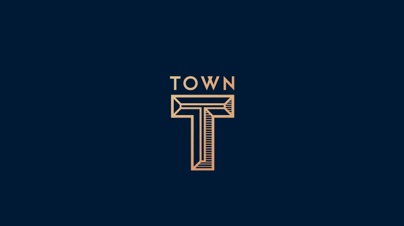
Crafting the TOWN mark had to represent a place for everyone with some character. The Mark had to feel established, friendly and Town had to you make you feel like you belong, a place where you can go for a morning coffee, or grab a bite to eat or have a really good time with your mates, it had to feel like a place you never have to leave as it’s all under one roof. This is where it ties back to he underpin for Town, “More than just a bar”.
Brand Language is Critical
The brand language had to be simple, but unique to Town. “Fancy a G&T”, “It’s T-time” and “Down to a-T” using the T mark, which can easily evolve for future adverting promotions. The language is playful, and it’s simple.
Brand Development Is Just The Start
As well as the branding system we produced a range of visuals to show them how the brand could be used across different mediums; including work uniform, menus, hand stamps, glassware, and online presence. When you see how all the brand elements are brought together it’s clear to see how well the brand works as a whole. With this brand structure, Town will stand out from the rest of competition.
Website Development
With any branding project we must further consider its reach beyond the conceptualisations presented. We look at all manner of print and digital mediums the brand is to shown on and develop these further in line with the brand strategy. For most in the hospitality sector, the main focus of attention moves from brand to website development. As you can see from the graphic above, we have captured the essence of the brand and brought to life a new website for the thriving business.
We enjoyed working with Town on this branding project and we look forward to seeing the branding used across social media, the branding paired with the interiors of the bar and we are excited to be part of the Town evolution.
Start a Branding Project
Want to start a bar, restaurant or nightclub branding project of your own? We’d be delighted to have a chat. You can get in touch with us on +44 289507 2007 or you can get in touch with us via the contact form below
[contact-form-7 id=”2934″ title=”Blog Post – Branding Blog Post”]