Tonic Pharmacy – Branding

Tonic is a friendly, caring Pharmacy based in the heart of Derry/Londonderry. The Pharmacy began in February 1987 with John MacCafferty (originally with the name MacCafferty’s Chemist) with a belief that focusing on the delivery of a personal customer experience. They offer a variety of pharmaceutical services to meet the health needs of the local community.

They are the first in the area to provide a 24-hour prescription ordering app and messaging service. You can also order popular health and beauty products from their online shop.

In their own words:

“We are dedicated to providing a friendly, caring pharmacy experience with an emphasis put on delivering a quality, efficient healthcare service to our community. In November 2007, we purchased the Pharmacy and by following the same ethos the business has continued to grow.

Tonic pharmacy is a trusted e-commerce platform for anyone to purchase quality skin care and health care products, which help people feel better about themselves. Tonic in a sense means rejuvenating/ up-lifting/ invigorating/ replenishing. We sell only products that we feel have these properties and help ailments and treat concerns. We try to focus on natural products, which are not tested on animals and contain only natural ingredients. We offer an e-commerce service to collect in store with 48 hours: ‘pick-me-up’ service or an e-commerce delivery experience option for any of our products. What sets us apart from other retailers is that we have a dedicated pharmacist available to guide and advise on suitability and choice of products via an online chat/email conversation.”

Tonic approached Kaizen Brand Evolution to rebrand their pharmacy of 31 years. They asked us to design and develop a new branding system for a pharmacy, skincare, well-being store and e-commerce business that needed to be contemporary, bright, striking and clean. It should look modern so it could really stand out in Derry/Londonderry, or in any city if they decided to branch out. We wanted Tonic to set a new standard for how modern pharmacies should look.

They wanted to reach a new target audience of Men and Women aged 35+ and Parents. People who really wanted to feel good and really look after themselves would be the type of people Tonic wanted to be their customers.

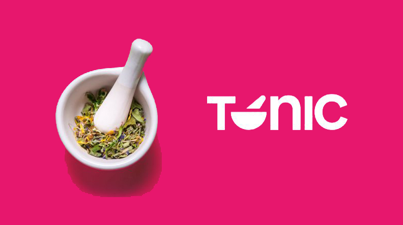
The new Tonic Pharmacy wordmark consists of the word Tonic and a mortar & pestle (as it’s a tool used to crush, grind and mix solid substances into a powder). Tonic wanted to promote more of their natural medicines. We felt people know Tonic is a medicine, which has a general effect of making you feel good and the mortar and pestle best sums up their natural products.

We developed a tone of voice, which feels really positive, friendly and trustworthy. We wanted people to feel reassured, “Heal & Soothe” knowing Tonic is always there for you, 24-hours a day in-store or online. You can always rely on Tonic, they want you to feel good.

As well as the branding system we had created illustrations of what they stand for; a flower (for natural remedies), a clock (for 24-hour service) and Derry’s Guild Hall (for Trusting Local) using the elements of the mortar & pestle. It would be fun to work on other illustrations. We also created some visuals on how the brand could work across different mediums including their delivery van, packaging, business cards/stationery, signage and their website.

Over time when Tonic has become more established, the T and the Mortar & Pestle could be used stand-alone, and it will still be recognized as Tonic Pharmacy.

We enjoyed working with Tonic Pharmacy on this branding project; we can’t wait to see the brand being rolled out across their vans, social media and perhaps a visit to their store. I would like to see Tonic expand and set the bar for modern pharmacies.

Blast 106 FM Brand Development

Belfast’s most music station Blast FM approached Kaizen Brand Evolution to design and develop a new brand identity system for their group of radio stations across the UK and Ireland. Blast FM has been live on air for a number of years and reached a point of significant growth, and they needed a brand identity that was going to help propel them to even greater heights, appealing to more listeners. The market of radio is highly competitive and the team at Blast FM needed a unique identity to truly reflect what they offer and stand out in their industry landscape.  Blast Fm’s brief was to create a modern, recognisable identity that spoke to their core audience correctly as well as being bright and bold. They wanted something that was going to stand out within the market, showing them as one of the leading players within the industry. A unique request was to include a WAV file of an important figurehead from Blast FM talking who had recently passed, a touching piece of communication now represented forever in their brand mark. Blast FM as a group own 7 further stations and a part of the challenge was to create their identity so that it could become a flexible mark, easily recognisable across all markets, as well as being easily adapted in colour and name for other stations whilst retaining the group look and feel.

We designed a flexible identity system around the concept of the play button. The play button represents radio, music, playfulness and fun so we thought it was the perfect symbolism for the group identity. We also introduced a secondary keyline surrounding the play button to represent movement, volume and radio signal. Utilising the play button’s shape we were able to house the frequencies of each station and the WAV file from the brief. The play button acts as the boilerplate brand mark for the set of group marks, on each of the different stations identities the colours change as well as the frequencies of the related station. The name of each station and it’s geographical location sits to the left of the button and is easily interchangeable as the brand rolls out across the remaining stations – Blast Fm Belfast, Iur Fm Newry & Mourne, ABC across the ABC region, Blast Digital Glasgow, Your Fm Stockport, Blast Blackburn and Blast Northwest. Each station adopts its own unique colour system, each palette as bright and eye-catching as the last. This approach keeps the group brand profile true across all business areas and reinforces the brand personality across the UK and Ireland.

Along with the play mark, we introduced black and white art direction for the brand imagery. The choice for black and white imagery was primarily to place further emphasis on the identity and its bold colour palette. The two, when designed together, marry very well and create an over well rounded, bright and modern identity with a considerable and noticeable change from their previous brand identity. The photography is primarily portraiture of key musicians featured on playlists from the respective radio station. Each set of images is put together in a concertina format for use across social media, advertising and in print. We also introduced a set of geometric 3-dimensional backgrounds for the Blast FM brand rollout which can be seen on their social media channels. The geometric shapes and 3D effect simply adds depth to the brand mark and creates a more modern corporate brand world for the new mark to thrive in.

As the brand rollout continues across the entire group we look forward to creating further digital and printed collateral. As brand guardians for each of the business facets, we have a clear understanding of how the branding should be treated across all mediums. We thoroughly enjoyed the design and developments of the brand system for Blast FM and look forward to seeing the branding out in the real world as it begins to evolve.

Harlow Brand Identity

The client’s ambition was to supply top of the line Italian and Scandinavian fashions online with an eventual ‘bricks and mortar’ store in Northern Ireland.  The brand had no name, identity, narrative or visual strategy. It was our job to sculpt and direct the branding from naming to delivery.

We chose a name that reflected the company’s ambitions, high-end, one with an abstract meaning and a subtle hint to a landscape in which the clothes are made. The name Harlow was a great driver for the identity creation and overall styling of the brand collateral, as it reflects elegance, subtly and confidence.  The naming process was approached with the same rigour as any brand identity project. Firstly with research and investigation, looking at hundreds of colloquial, European meanings and names, names that echoed style, femininity, and confidence, all brand pillars of what is now known as Harlow Clothing Company.

With the company name to hand, we could now focus on creating the brand identity. Our research revealed some really outstanding fashion outlets and quirky retailers across the globe. We explored texture, palette, photography – fashion, landscape and otherwise. We tested and worked with an array of type, symbolism and mark making. We used the stem ‘passion led us here’ as a backbone narrative for the project – this language opened up the door for passionate photography, and an overall ‘chill’ – ‘hippy’ lifestyle vibe for the brand – something that the client was immediately connected with.  The narrative paved way for an ‘airy,’ modern use of type with wide spacing between letters. The font used for the primary type mark is a Grecian typeface, one that screams ‘foreign contemporary’ to keep in line with the business ambition and to suit the product. The type in the mark now decided upon we wanted to introduce a simple device to enhance the overall identity. Traditionally when thinking to European or foreign language we expect to see accents or glyphs that derive from foreign alphabets, so how do we introduce this – cleverly. Taking inspiration from the missing holes inside a button we introduced an “umlaut”-style device above the H in Harlow. This addition creates a unique brand identity and creates a new brand atmosphere to begin to use dots and the separated H as part of the brand material and roll out.

The colour palette is subtle, confident and modern reflective of the 3 pillars of Harlow Clothing Company. The greys and blues echo the denim and highbrow fashion on sale. Pairing the colour palette with fashion photography enhances the brand personality, solidifying the clients’ expectations and price ticket of some of the brands on sale at harowclothing.co. Harlow’s initial brands are Italian denim magnates Freddy and Scandinavia’s SVEA – two unique, stylish brands that radiate quality and fashion. Harlow sits confidently in this brand landscape and showcases the products on sale fantastically. The photography brings another element of landscape to the identity, transporting its customers to the origins of the garments on sale. The photography is a welcome addition to the brand pack, it’s storytelling ability enhances the experience and establishes the new business as an already market leader in this field. I must highlight that Harlow is the first business in Northern Ireland to stock and sell the Freddy and SVEA brands.

We designed all brand material from online e-commerce site to tags, labels, packaging and signage. All brand elements adapt the same brand tone, minimal yet impactful. The brand is now live and boasts an already impressive online following on Instagram. As Harlow’s reputation builds we continue to work with them, acting as brand guardians, as they evolve so do we.