The importance of design in leaflets and flyers

Leaflets and flyers are used by many businesses across the world, whether they are advertising a new product or talking about the services that they offer. However, when it comes to a flyer it is important to make sure that it looks good. This is due to the limited amount of space that you sometimes have to get across the message that you want, but also because more often than not people are being handed them as they are making their way to a certain destination, so have other things on their mind. This means that you need to capture their attention as soon as they are handed it and this is where the design comes in. Within this article, we are going to look at the importance of design when creating flyers and some tips for getting the best design on them.

Eye-Catching Design

Let’s start with the most obvious; the design. Whatever it is you are trying to sell or inform people of, the design on your flyer HAS to be eye-catching. Without an eye-catching design, people are either going to walk straight past your flyer, or take one and throw it out immediately as they think they won’t be interested in it. Obviously, this is exactly what you want to avoid. When designing your flyers, make sure that whatever you are putting on the front can be seen immediately and as such is the right size, instead of either being too small or too big and people can’t figure out what it is. In this instance, it’s probably alright to assume that you are going to include some form of text on your flyers. Make sure that you don’t cover your design in loads of text. Whatever you have to say, keep it short and snappy, as if the first thing that someone sees on a flyer they have been handed is loads and loads of text, they are sure not to want to read it, no matter if they are in a rush or not.

Use Colour to your advantage

Nobody wants to see a drab flyer. Instead of helping to bring out the design of the flyer, it will only dampen it and as a result, those who see it won’t want to read it at all. So make sure that the colour you use, compliments the design that you have chosen, but also makes people look at the flyer. By all means still use dark colours in your flyers, as they can really help to get across the message that you want, depending on what you are talking about. If you are using a theme in your flyer, do some research beforehand and pick colours from that era or topic. For example, if you are designing a flyer advertising an 90s disco party, research what colours would have been popular during this time, such as bright colours, possibly some neon and big lettering to accompany this. Doing some research beforehand will really help bring your flyer to life.

Organise

Before you start putting your flyer together, it is important that you have all of the information gathered that you want to be there. There is nothing worse than having something designed and then printed only to realise that some key piece of information is missing. So it is good to be organised while the research is being done, but just as important to keep everything organised on the flyer itself. Use an information hierarchy, where the most important pieces of information or text will be the easiest to see, as this is what you will want them to lock their eyes onto almost immediately. As well as this, while it may seem like a good idea to try and be abstract when designing a flyer, sometimes keeping it simple is the best course of action, because if the information is all scattered about it can make it hard to understand and read, leading to people not wanting to.

Hopefully, this gave you a little bit more insight into just why Graphic Design is so important when creating a flyer or leaflet and that one done up in Word, really isn’t going to cut it. However, we do understand that not everyone is a graphic designer. So if you are in need of some design for your next project give us a call on 028 9507 2007 or email us at studio@kaizenbrandevolution.com, we’d love to chat.
Glo – Brand Creation

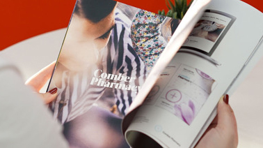
Recently we branded Glo Beauty, a new Beauty Salon in Belfast. This undertaking included: full brand development, logo design website design and social media campaigns.

The client’s ambition was to create a modern beauty salon offering a customer service in Belfast. Bringing a similar feel to other Cities across the globe like Dublin, London, New York and Milan. Glo is based in Kings Square, off Kings Road, Belfast. Offering a variety of services from Manicure & Pedicures, Tanning, Wax & Hair Removal, Eye Enhancements, to Make Up. Building upon the foundation, Glo will deliver a quirky experience, which makes you feel really good about yourself.

Glo Beauty is one of the first Beauty Salons in Belfast, to be funky, modern and appointment only to give you a premium service and only using the Top Market brands. Ireland’s Leading Make up artist Aimee Connolly (Sculpted) has trained Glo’s very own Maria Chesser. Maria is a prodigy in the industry, bringing elements she has learned from across the country into Belfast. As well as running the business Maria wants to get heavily involved with the services, as that’s what she’s being training for. She will be available for appointments as well.

Glo approached Kaizen Brand Evolution to brand their Salon opening in their Flagship Store in Belfast. They asked us to design and develop a new branding system for their salon; it needed to feel welcoming, bright, and luxurious. It should look modern so it could really stand out in Belfast. We wanted to Glo to brighten up the beauty industry in Northern Ireland.

Our research revealed some amazing hair salons and beauty brands across the globe. We explored texture, palette, photography – fashion, landscape and otherwise. We tested and worked with a range of type, and mark making to create something unique. We used “Your skin is Glowing” as the initial concept behind the brand identity. We combined an array of light and eyelashes for beauty with the word GLO. This creates a beautiful mark, which becomes the GLO Ray device that can be used to highlight the subject and used throughout the branding collateral. The colours used in Glo Beauty are natural colours, which will work in contrasting colours across the brand.

We incorporated ‘Glo’ into the language. This helped with the photography direction used within the brand. We created Glo’s brand language and tone of voice to offer her services. Statements like “You Glo Girl and “Glo on your Day” were created during the creative writing process for the brand. Glo Beauty Is the place where you’ll feel better every time, your skin will Glo and to really make the brand shine we had to show the brand could be used to motivate women and feel positive about the way they look. Using this brand language will help Glo in the future for marketing campaigns and advertising and will across the services Glo offers.  We married together the brand language and the logo mark to successfully to show Glo’s brand.

Following the identity and language creation, we implemented the branding across a number of deliverables. We visualised how the brand can be used across everything Glo will need from coffee cups to uniforms to help with the overall experience at Glo. These visuals will help show the direction on how the brand can be used for the signage to branded collateral for when Maria goes to beauty events. Having a strong visual brand with a clear message will help her stand out amongst the big competitors within the industry.

It was great to work on the branding for Glo and we look to seeing the brand will be rolled out across their social media, uniforms and in the salon itself as Glo continues to evolve.

The Skinny Sauce Company

The Skinny Sauce Company approached Kaizen Brand Evolution to create an engaging brand identity and packaging strategy for the launch of their exciting new Skinny Sauce product range. The brand story begins with the owner and entrepreneur Maria Doran. Maria’s passion for sauce has been long standing; from ketchup to curry she has always loved adding flavour to her meals to enhance the eating experience. Maria also embraces the healthy lifestyle, going to the gym, eating right and taking care of herself. She soon realised that despite eating healthy she craved the added flavour that the sauces and dips brought to her meals and the sauces available on the market were full of sugars, additives and unhealthy ingredients in general. Maria’s mission is to revolutionise the sauce market and make healthy dips and sauces for the health conscious consumer.

With this in mind be researched the industry and developed a strategy for the business with the tagline ‘skinny dip more often.’ This strapline acted as the foundation for the creation of her brand identity and packaging. Keeping the target audience (health conscious shoppers who crave sauce) in mind we designed a bold, eye-catching brand that highlights the good ingredients that go into Skinny Sauces. In a world of Heinz and other well-known sauce brands we aimed to reach Maria’s ambition of becoming a household name and compete and stand out on the shelves in major retailers.

The first point of call was the brand mark. We crafted a ‘handmade’ type based logo with a bright, youthful colour palette, which immediately stands out from the competitors. The logo is a reaction to modern brand styles and trends utilising hand drawn type and illustration to reflect the fun skinny sauce experience. The brand mark leads nicely into how we visualise the brand narrative ‘skinny dip more often’ – using the hand drawn script and bold palette to emphasise the text. The language plays an important role in communication the values and vibrancy of the product. Aimed at an audience of 25-35 we have tailored the brand to fit in with that demographics lifestyle. As well as the language and the brand mark we proposed a photographic and typographic direction that would spark an emotional and aspirational connection with the target audience, using young, happy, healthy models to communicate this rings true in the Skinny Sauce marketing strategy and in their brand collateral.

Following the identity, strategy and narrative and artistic direction we began work on the packaging for the Skinny Sauces themselves. Each bottle and flavour introduces a fresh colour palette creating an engaging, eye-catching suite of products. One ambition for the packaging was to make it look suited alongside the likes of high-end sauces within M&S or Waitrose. This ambition was easily realised following the identity and artistic direction for the brand. We were able to utilise the type direction and layout to suit such retailers and realise the ambition for future growth and perhaps buyer in such retail environments. As well as the colour palette for each flavour of Skinny Sauce we introduced hand-drawn illustrations to reflect the core ingredients inside the bottle – beautiful hand-drawn chilli’s, peppers, tomatoes were included to create an all round flavour focussed packaging piece.

In preparation for the Skinny Sauce Company brand launch we worked alongside Maria to ensure that the values set out from the beginning would be strengthened and represented fully in the collateral and packaging. Working as brand guardians for Skinny Sauces we continue to develop and evolve this unique, beautiful brand to ensure the businesses ambitions are realised. We thoroughly enjoyed working on this project and look forward to working more with the Skinny Sauce Company in the future.

Giant serviced apartments

Giant Property approached Kaizen Brand Evolution to brand their Serviced Apartments business. Offering some of the best locations across Northern Ireland and Belfast Giant Serviced Apartments where established online running under the Giant Property brand identity. As the business evolved and reach increased they felt it needed its own brand presence and came into the studio to outline their ambitions for the company.

The first goal of Giant Serviced Apartments was to be instantly recognisable as a standalone serviced apartments brand, standing apart from their competitors and raising confidence in clients who book through the likes of Air bnb and Booking.com so that Giant Serviced Apartments website gives them the confidence that they will receive the same level of service booking directly rather than through a third party.

We created the narrative ‘stay happy’ for Giant Serviced Apartments positioning them as business that provides a positive, friendly, happy service when staying at any of their apartments across Northern Ireland. This narrative was the foundation that we utilised in creating the unique brand identity and logo device. The logo is a bold, contemporary yet soft typeface with the addition of a ‘Giant Smile’ on the loop of the G. The Smile justifies the positive reviews currently featured on trip advisor and Giant Serviced apartments social media channels. This seamless transition of type into simplistic iconography showcases the strength of the brand mark. As part of the marketing collateral and brand rollout we have adapted the smile icon to house messaging, frame imagery and business stationery. Simplistic and versatile branding is always a goal when creating an identity system for a business and we have achieved this through Giant Serviced Apartments new brand positioning. As well as the dynamic logo created for Giant Serviced Apartments we introduced a fresh, engaging colour palette removing the brand from the current industry landscape of Serviced Apartments in Northern Ireland – subdued in corporate tones.

Photography plays a large role in the branding for Giant Serviced Apartments. We collated an image bank of modern, seasonal and fun photographs, which set the scene for tourists and customers wishing to travel to Northern Ireland. The image bank is in keeping with the tourism in Northern Ireland as well as the buzz of our cities and town’s nightlife and hospitality offerings. To coincide with the dynamic imagery for Giant Serviced Apartments we brought together the brand pillars of the business and adapted the ‘Stay’ message to work with them. At Giant Serviced Apartments their goal is for each and every customer to stay happy, comfy and curious. These three pillars immediately connect with the target market and aim to sum up their reasoning for choosing a location like Northern Ireland to travel to and stay with Giant Serviced Apartments. Strategically we are able to introduce this language set into all brand marketing materials, ads, brochures and online collateral – without the hard sell. The language was introduced to connect and engage with travelling clients on their level without screaming from the rooftops about offers or seasonal pricing we have focussed on the offering with an emotional language connection.

From signage to water labelling the new brand purpose flexes its muscles across all collateral in a very visual and engaging way. The language provides the tone of voice that you would connect with when travelling on business or leisure – signing off with the line ‘leave with a Giant smile’ when you are checking out solidifies the brand strategy and showcases its strength and marriage of logo, language and longevity.

It was a pleasure to work on the Branding for Giant Serviced and as it is currently rolling out of the studio keep an eye out for the Giant smile across Northern Ireland.

Watch Tech

Watch Portfolio Management is a well-established business specialising in financial guidance with many clients reaching from the UK to Australia. Watch Portfolio Management is based in Lisburn, Northern Ireland, and is known for their financial advice that leads businesses that have gone into insolvency to find solutions. This, however, is no longer the case! Watch Portfolio Management decided they would approach Kaizen Brand Evolution to create an identity for their cutting edge software, that they primarily would use for daily tasks, as going forward they would like to be seen as a financial software business. This software is to be called Watch Tech. The interface is easy to use and finds information fast making it the best financial insolvency software on the market.

To creating the brands identity we needed to first fully understand the industry landscape that Watch Tech would be positioning itself alongside. We researched and developed clear directions to take our brand ideas based on Watch Tech’s potential competitors in the financial, security and tech sectors. Learning from our research we found what was working and what wasn’t necessarily relevant moving forward with the creation of Watch Tech’s identity. It became clear that a simple, modern identity would be best to represent this brand effectively.

Now that our styling has been determined from our research the identity soon followed. A potential branding direction that we explored was revitalising Watch Portfolio Managements shield to link Watch Tech to it’s heritage, as well as to show the software’s strength and durability when it comes to protecting your financial well being. However, the brand chosen to represent Watch Tech was our identity representing “financial growth”. This mark, illustrating a positive outlook, is a meaningful graphic that lends itself to the company’s primary objective for its clients. The brand mark uses three primary bars linked by two diagonal bars in the background giving a ribboning effect to shape into a “W” ultimately representing Watch Tech. Looking back on our research we decided to use a corporate typeface in a variety of weights to blend with our modern brand mark. This typeface joined with our brand mark comes together to create our Watch Tech Logo.

Following the design of the brands elements we were able to focus more on what our brands message would be. Watch Tech is really the first financial insolvency software to come onto the market and we decided “Pioneering financial insolvency software” would be a good direction for their brand language. Our taglines to follow this direction are “faster, stronger.” and “better, smarter.” to illustrate how superior this software is in comparison to other financial insolvency software’s and its main selling points the software can provide. Leading from this language our imagery shows the idea of exploration and moving forward to illustrate Watch Techs brand message.

With our logo and language already decided the next step in our process is to show our strategy in regards to how the logo would be implemented. The new Watch Tech logo is a strong shape with distinguishing features making it recognisable individually. It’s because of this that we decided to use the outlined shape of the brand mark as a device to house imagery. Imagery on print, signage and online would follow this strategy or be full bleed with the brand mark positioned accordingly alongside our brand messages. We didn’t just create a new brand identity for a piece of software we created a new platform and style for a new business to follow going forward.

Join us for our next Brand Masterclass

A few months ago we hosted our first ever brand masterclass in association with Women in Business NI.

It was so successful that we’ve decided to host a few more masterclass sessions, starting with our “3 Steps to a Successful Brand” workshop on 29th September. Our masterclass will take place at the Thinking Cup on Lisburn Road from 9am to 10.30am, and tickets are free! Tickets are available to book now, just visit our event page here to book your place.

Whether you’re an aspiring entrepreneur or a long established business, having a strong brand presence and strategy will set you apart from the competition and help you grow your business. Our workshop will take you though the key elements of a successful brand, from logo and language through to longevity across all channels.

This session will cover:

  • What a brand is and why it’s so important
  • The key difference between a logo and a brand
  • The importance of a brand strategy for business growth
  • How language can impact and shape your brand perception
  • Key tools for building your brand online

This masterclass is perfect for those with a new business who need guidance to build their brand from the ground up. It is also helpful for businesses who have been established for a few years but who would like to evolve their brand and take their business to the next level.

We’ll be providing tea, coffee and refreshments from 8.30am if you’d like to come along early for a bit of breakfast and networking. We hope to see you there!

GHBranded Culture Night 2016

Thank you to everyone who came down to GHBranded for Culture Night 2016. Super fun night branding your Social Media accounts! Everyone’s photos can be found here:

bit.ly/GHBrandedPhotos

Please tag, link and share your images, and of course use them as your profile pics!

We hope that those who came down enjoyed a taste of the expertise in design and branding offered by Kaizen Brand Evolution at our pop-up studio. The event opened up the experience of branding by offering advice on Social Media, staging a professional profile image with a choice of backgrounds to suit your personality, as well as taglines to suit your aim online. From Facebook, Twitter, Instagram, LinkedIn to Tinder we catered for all. Our own Snapchat Geo Filter on the night received over 17k views, not too shabby!

Our experienced designers in our Lisburn Road studio are here to help on a more permanent basis, to raise companies online profiles with strategic planning and reporting. We hope you keep us in mind for your next brand update, or when you decide to start up your own business.

To learn more about us, or view our portfolio of brands that we have created, pop over to: kaizenbrandevolution.com/portfolio

Shebelle’s Brand Identity

Shebelle required a brand identity to reflect high end, ethically sourced hair extensions and associated beauty products. During a temple ritual in India women donate their hair to the gods. The temples used to burn this high quality human hair but now they auction it on the open market and channel the profits back into community projects. The hair is locally made into wefts and Shebelle only chooses product from companies with proven ethical standards in manufacture, employee relations and charity work, especially the education of women and girls. The products that enrich the hair are derived from andiroba oil found wild in South and Central America and in Africa. This blend of quality ingredients and ethical sourcing was the foundation for a strong branding position.


We designed a luxurious, contemporary brand identity that sets Shebelle apart from their competitors. Patterns, photography and colour play their part in telling the story with each product having a separate, localised illustration. Traditional Indian, African and South American patterns weave through the packaging and marketing materials. The product launch is set for launch in late Summer 2016.

Slim’s Healthy Kitchen No.4

From the very inception of the Slim’s Healthy Kitchen idea, Kaizen Brand Evolution have been creative partners providing all manner of brand support from identity and brand language, to marketing and strategic positioning for all stakeholder communications. For many clients, our service goes far beyond graphic design and Slim’s Healthy Kitchen is certainly one this holds true for.

Last month, Slim’s opened their 4th store in Belfast and true to form, they wanted to make a huge statement to mark their arrival in Dundonald. A 25ft x 7ft mesh banner will do just that! The design takes the already strong Slim’s Healthy Kitchen branding and moves this towards our Spring/Summer campaign stylings which you will see visually rolled out across the brand over the coming months.

Nuovo Ristorante

Jordanstown Village will soon boast a nuovo ristorante! Working closely with the team at Bureau by the Lough to expand their offering and launch an Italian experience, we conducted a naming process incorporating some design thinking picked up at the IBM workshop at Offset this year. The new Italian Restaurant specialising in pizza, pasta & seafood with an in-restaurant pizza oven, and spectacular view needed to tell a story. The translation of Little Blue to Poco Blu became the narrative for the branding process. Immersing ourselves in Mediterranean patterns and colours the brand story unfolds to share the Italian experience. Collaborating with Brill Design on interiors we eagerly anticipate tasting the delights at launch this summer!

Brand creation For Friends Daycare & Nursery

Watching our customers move into different markets and business ventures is amazing and we’re always happy to assist with their own business development. The owners of Friends Daycare & Nursery, Belfast approached us to develop the brand for their new daycare based on the Saintfield Road, Belfast. Understanding their approach to childcare it was clear we were to develop an identity of the highest level, that would appeal to the parents and of course the children of south/east Belfast.

Presenting a selection of concepts that embodied the business and retained the core ethos, we created this unique brand that will position Friends Daycare and Nursery among the highest regarded businesses in their sector. We are now in turn building the supplementary marketing and business materials required for the launch, alongside a bespoke website for the brand.