Harlow Brand Identity

The client’s ambition was to supply top of the line Italian and Scandinavian fashions online with an eventual ‘bricks and mortar’ store in Northern Ireland.  The brand had no name, identity, narrative or visual strategy. It was our job to sculpt and direct the branding from naming to delivery.

We chose a name that reflected the company’s ambitions, high-end, one with an abstract meaning and a subtle hint to a landscape in which the clothes are made. The name Harlow was a great driver for the identity creation and overall styling of the brand collateral, as it reflects elegance, subtly and confidence.  The naming process was approached with the same rigour as any brand identity project. Firstly with research and investigation, looking at hundreds of colloquial, European meanings and names, names that echoed style, femininity, and confidence, all brand pillars of what is now known as Harlow Clothing Company.

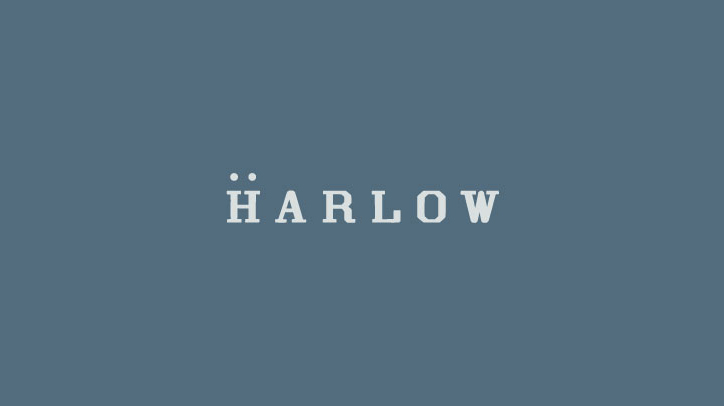
With the company name to hand, we could now focus on creating the brand identity. Our research revealed some really outstanding fashion outlets and quirky retailers across the globe. We explored texture, palette, photography – fashion, landscape and otherwise. We tested and worked with an array of type, symbolism and mark making. We used the stem ‘passion led us here’ as a backbone narrative for the project – this language opened up the door for passionate photography, and an overall ‘chill’ – ‘hippy’ lifestyle vibe for the brand – something that the client was immediately connected with.  The narrative paved way for an ‘airy,’ modern use of type with wide spacing between letters. The font used for the primary type mark is a Grecian typeface, one that screams ‘foreign contemporary’ to keep in line with the business ambition and to suit the product. The type in the mark now decided upon we wanted to introduce a simple device to enhance the overall identity. Traditionally when thinking to European or foreign language we expect to see accents or glyphs that derive from foreign alphabets, so how do we introduce this – cleverly. Taking inspiration from the missing holes inside a button we introduced an “umlaut”-style device above the H in Harlow. This addition creates a unique brand identity and creates a new brand atmosphere to begin to use dots and the separated H as part of the brand material and roll out.

The colour palette is subtle, confident and modern reflective of the 3 pillars of Harlow Clothing Company. The greys and blues echo the denim and highbrow fashion on sale. Pairing the colour palette with fashion photography enhances the brand personality, solidifying the clients’ expectations and price ticket of some of the brands on sale at harowclothing.co. Harlow’s initial brands are Italian denim magnates Freddy and Scandinavia’s SVEA – two unique, stylish brands that radiate quality and fashion. Harlow sits confidently in this brand landscape and showcases the products on sale fantastically. The photography brings another element of landscape to the identity, transporting its customers to the origins of the garments on sale. The photography is a welcome addition to the brand pack, it’s storytelling ability enhances the experience and establishes the new business as an already market leader in this field. I must highlight that Harlow is the first business in Northern Ireland to stock and sell the Freddy and SVEA brands.

We designed all brand material from online e-commerce site to tags, labels, packaging and signage. All brand elements adapt the same brand tone, minimal yet impactful. The brand is now live and boasts an already impressive online following on Instagram. As Harlow’s reputation builds we continue to work with them, acting as brand guardians, as they evolve so do we.
Little Hands Little Feet

Little Hands Little Feet are a leading day-care and afterschool facility that pride themselves on providing a fun, safe environment right in the heart of South Belfast. We’ve been working with Little Hands Little Feet for a number of years, from the development of their internal graphics and collateral to their external wall designs on their mobile classrooms. At the beginning of the year Little Hands Little Feet approached the team at Kaizen Brand Evolution to audit their brand. They felt that their brand presence needed revived both in print and online and wanted to lead the way in their marketplace. We were first tasked to solidify the LHLF brand at first by creating a set of brand guidelines for the business, setting the tone for the brand and providing a clear guide of how it should be handled in print and digitally.

We created the brand guidelines for LHLF revitalising the personality and brand culture of the workforce and experience that the children have when attending through design. We re-set the logo and brand colour palette to reflect a more fun brand outlook and overall contemporary brand identity. We provided the owners with a hard copy brand ‘bible’ outlining the new direction, palette, typographic direction and photography style. With this set in place we were then able to proceed with a new image library, branded collateral and web design.

Our in-house photographer visited Little Hands Little Feet for a photo shoot with the aim of capturing the creative, exciting environment at LHLF. The shoot spanned each room available on the premises as well as the interactivity the staff have with the children. The shoot was bright, colourful and messy at some points, which added to the new brand direction. Following a shortlisting process the new image library has began rolling out across a number of items from Interlocking Folder designs to event calendars supplied to exiting and potential parents.

With the new brand guidelines and photo shoot in place the next stage of the brand audit was the website design and build. The owners wanted the new Little Hands Little Feet website to reflect contemporary web trends utilising the new photography and colour palette in creating a highly visualy, engaging experience for existing and potential customer alike. We designed and built a clean, photo-led website with optimisation in tablet and mobile environments. Each page of the new site provides the user with an engaging, informative and playful experience, much similar to the offerings available at Little Hands Little Feet. New typographic styles and colour palettes have been introduced throughout the new site reflective of the new brand guidelines. (*The investment in brand guidelines at the early stages provides a solid foundation for the evolution of the brand and shows how the brand should be rolled out and controlled. They provide the designers and business owners with a clear understanding of progression and brand use which is agreed upon by both parties before any collateral is created or designed.) Navigating through the new site the use of white space provides clarity and support to the fantastic new photography. The new Little Hands Little Feet website stands out amongst the industry landscape highlighting how adapting and auditing your brand both on and offline can seriously affect your business for the better.

The brand audit of Little Hands Little Feet ensures consistency across the entire brand collateral. The audit highlights brand values clearly and concisely across all new and future brand exposure. With brand consistency comes trust and trust in a brand is one of the key elements for growth and brand sustainability.

Visit website: littlehandslittlefeet.org

Web design for Belfast Music Production Academy

The team behind Belfast Music Production Academy contacted us recently with the request to design and build their online presence. After researching the marketplace both online and locally we decided to build a content led website focusing on the courses and software Belfast Music Production Academy offer guidance on.

Courses are held in physical location here in Belfast and while optimisation for search engines is paramount the focus on converting leads into course attendees is the primary focus of the website. Working with some of Ireland’s greatest I’m most successful producers Belfast music production Academy is in an amazing position to assist has many people as possible on their journey into learning electronic music production.

Built on a content management platform, our primary aim from an administration perspective is to reduce the time required to update the website and manage the payments from course attendees.

We are extremely happy with implementation of the website and will be following this up with considered marketing campaign utilising social media channels and E-newsletters.

About Belfast Music Production Academy

BMP Academy has a single aim, to help you learn the art of electronic music production, giving you the opportunity to grow your skills alongside the best in the business. BMP brings together some of the biggest names and rising stars in the electronic music industry, creating a professional network with the skills, capabilities, contacts and resources you need to build your career in music.

Panacea in Vogue and online

We love seeing a brand do so well from its fruition in the Kaizen Brand Evolution Studio. Working closely with Panacea Drinks in their brand evolution has proven a massive success for the company with features in Vogue magazine, tastings from The Body Coach, Joe Wicks and growth in London and Ireland.

This week we see the launch of the brand new Panacea website. We use a contemporary site design that reflects the needs of the customer through interactive blogs, visually engaging page layouts and insight to the product and lifestyle. The site boasts a straightforward user experience from start to finish, setting Panacea Drinks ahead of their competitors, paving the way for healthy, pro-biotic water-kefir in the United Kingdom and Ireland.

The website follows as a part of Panacea’s brand strategy moving forward. As brand guardians to Panacea we ensure the direction is on point and communicating with the target audience as it grows. We are proud to continue working with this innovative brand as it reaches the masses.

View the new site here: www.panaceadrinks.com

Comber Pharmacy Branding

The owners of Parker Pharmacy desired to re-brand their business to appeal to the communities in which they were situated. With the name change to Comber Pharmacy they required a modern brand identity with a nod to the classic branding of the past ‘Parker Pharmacy.’

We developed a considered brand strategy for Comber Pharmacy which positions them as a progressive brand that respects the legacy of the old business. We introduced a ‘plus’ device which can be seen throughout their brand materials and in-store way-finding system. This fusion of contemporary and classic in the identity is adaptable for business expansion and new locations for the pharmacy, keeping the brand messaging, colour palette and device consistent each time.

Boojum, Cinco De Mayo

Boojum approached us to create a concept for the launch of their new ‘Win a trip to Mexico’ Campaign for Cinco De Mayo. We developed an online and printed campaign strategy that revolved around a ‘holiday tag.’ Using the tag as the device to drive the campaign it was clearly linked to the Holiday theme and strategically, ‘Tagging friends’ on social media became the staple of the competition. The tag also appears at the final stages of the competition where Boojum hold a special night where finalists have the chance to find a printed ‘Boojum Tag’ inside a Burrito on the night of the draw. Corona where the main partner in the holiday give away and we introduced some hashtag’s to coincide with the competition #boojum5demayo and #boojum&corona. The competition has proved very successful in driving new traffic to the main site www.boojummex.com (design by us) and raising brand awareness across Ireland.

Walking the Walk and Talking the Talk

Valuing brand with Robert Bau

Tuesday saw the alarm clocks set for 3.30am for Glenda and Lynsay as they embarked on a road trip to Dublin to attend a workshop hosted by the Institute of Designer’s Ireland with guest speaker Robert Bau, heavy-weight strategist and thought leader. Once fuelled with coffee and pastries courtesy of Brooks Hotel, they settled down to a compelling talk on the application of business strategy to selling and quantifying the value of design. Attended by mixed disciplines from interior design, packaging and ourselves from the point of view of brand and digital, the room was able to apply the theories to their own sectors within the design industry. It is easy to fall into a assumed pattern when pitching design and overlook the analysis of brief and predicted outcomes that as designers we all do, but don’t always communicate well or quantify as a valuable outcome of the process. The knowledge we gained in invaluable, both to our own company strategy as well as how we can help our clients. I feel a studio shared learning workshop coming on!

Web Design for Boojum, Belfast, Dublin and Galway

Ireland’s premier burrito bar and Mexican fast food restaurant Boojum, are firm favourites in the KBE studio. Friday is most definitely a Boojum day, as is Monday and a regular late night. We’re fully fledged #boojumaddicts and proud. When the team behind Boojum engaged us to redevelop their online portal, this was one project we were happy to sink our teeth into.

Puns aside, Boojum operate across the Island of Ireland, north and south. The brand appeals to such a diverse demographic that we hand to be mindful of this while retaining the charm and character of the brand, that has been crafted over the last 10 years.

Attention was also paid to the usability of the website both behind desks and on the move. We ensured the site was fully responsive to enable flawless delivery on the move. Web traffic and user experience has increased greatly within the first few months of the launch.