Why is typography important

Here in the Kaizen Brand Evolution studio, we use typography every single day in our work. In every brand that we generate, on every website that we design and in every logo that we create, it’s always there and always important to us.

Typography is described as being “the study of the design of typefaces and the way in which type is laid out on a page to best achieve the desired visual effect and to best convey the meaning of the reading matter”. It may seem like something very simple, and like it may not make much of a difference when it comes to design, however, this couldn’t be further from the truth. In fact, Typography can often be the element that either makes or breaks the main design, whether it is a logo or just a piece of packaging.

But why is it that important you might be asking? Surely the way in which an image looks is going to be more important than what is written there? Well within this article we are going to look at just why Typography is so important, and hopefully, after reading this you will understand it a little better.

Catches The Attention Of The Reader

The type that you put on your marketing material is your message. This is going to be the part that tells the customers exactly what it is that you are offering. As such it is important that it catches the eye of the reader. It needs to draw them in so that they begin looking at your marketing material, and then they can begin noticing everything else, such as the design. It is important in this sense then to have what is called a ‘type hierarchy’ on your marketing material. This means that when there is more than one piece of type, one takes dominance over the others, becoming the main body. This is the piece that will catch the eye of the reader and draw them in. Once they are in, they will begin to notice the smaller bits of type, where the rest of the details about your message are being conveyed.

Conveys The Feeling and Mood Of Your Message

Typography is just as great for helping to set the feeling and tone of your message as your design is, and it all depends on which font you choose and also the typeface that you choose. There are thousands, if not hundreds of thousands of fonts and typefaces out there for you to choose from. However, it is important that you make sure and choose one which suits the message your brand is trying to convey. It is often evident a mile off when the type on a brands marketing material doesn’t fit, and even if it is only small, it puts the whole thing off.

Shows Professionalism

Good typography not only helps your immediate design and marketing material look good, but it is also helping to look your and your business look good, by showing the professionalism you carry. It shows that you take care when designing your marketing material and that you want people to notice what you are trying to say.

Build up recognition

Consistency is key to recognition, and recognition is exactly what you want from your branding and marketing. If you start using one type of font and make it distinct to you, customers will begin to immediately associate this with you and your brand. All the biggest brands in the world are consistent throughout all of their marketing when it comes to type because their typography and font have become a staple of their overall brand.

Hopefully, by reading this article you can start to see just how and why Typography is important to your brand, often becoming just as big a part of the brand as the logo.
Glo – Brand Creation

Recently we branded Glo Beauty, a new Beauty Salon in Belfast. This undertaking included: full brand development, logo design website design and social media campaigns.

The client’s ambition was to create a modern beauty salon offering a customer service in Belfast. Bringing a similar feel to other Cities across the globe like Dublin, London, New York and Milan. Glo is based in Kings Square, off Kings Road, Belfast. Offering a variety of services from Manicure & Pedicures, Tanning, Wax & Hair Removal, Eye Enhancements, to Make Up. Building upon the foundation, Glo will deliver a quirky experience, which makes you feel really good about yourself.

Glo Beauty is one of the first Beauty Salons in Belfast, to be funky, modern and appointment only to give you a premium service and only using the Top Market brands. Ireland’s Leading Make up artist Aimee Connolly (Sculpted) has trained Glo’s very own Maria Chesser. Maria is a prodigy in the industry, bringing elements she has learned from across the country into Belfast. As well as running the business Maria wants to get heavily involved with the services, as that’s what she’s being training for. She will be available for appointments as well.

Glo approached Kaizen Brand Evolution to brand their Salon opening in their Flagship Store in Belfast. They asked us to design and develop a new branding system for their salon; it needed to feel welcoming, bright, and luxurious. It should look modern so it could really stand out in Belfast. We wanted to Glo to brighten up the beauty industry in Northern Ireland.

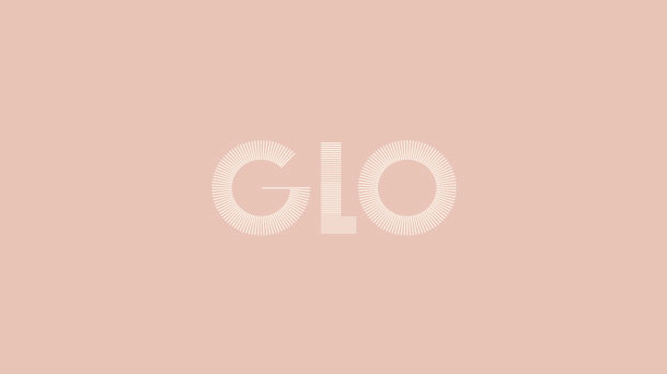
Our research revealed some amazing hair salons and beauty brands across the globe. We explored texture, palette, photography – fashion, landscape and otherwise. We tested and worked with a range of type, and mark making to create something unique. We used “Your skin is Glowing” as the initial concept behind the brand identity. We combined an array of light and eyelashes for beauty with the word GLO. This creates a beautiful mark, which becomes the GLO Ray device that can be used to highlight the subject and used throughout the branding collateral. The colours used in Glo Beauty are natural colours, which will work in contrasting colours across the brand.

We incorporated ‘Glo’ into the language. This helped with the photography direction used within the brand. We created Glo’s brand language and tone of voice to offer her services. Statements like “You Glo Girl and “Glo on your Day” were created during the creative writing process for the brand. Glo Beauty Is the place where you’ll feel better every time, your skin will Glo and to really make the brand shine we had to show the brand could be used to motivate women and feel positive about the way they look. Using this brand language will help Glo in the future for marketing campaigns and advertising and will across the services Glo offers.  We married together the brand language and the logo mark to successfully to show Glo’s brand.

Following the identity and language creation, we implemented the branding across a number of deliverables. We visualised how the brand can be used across everything Glo will need from coffee cups to uniforms to help with the overall experience at Glo. These visuals will help show the direction on how the brand can be used for the signage to branded collateral for when Maria goes to beauty events. Having a strong visual brand with a clear message will help her stand out amongst the big competitors within the industry.

It was great to work on the branding for Glo and we look to seeing the brand will be rolled out across their social media, uniforms and in the salon itself as Glo continues to evolve.

Watch out for these pitfalls when designing brochures

When it comes to Brochures, they can often be one of the best pieces of marketing material that you can own. For something being quite small, it can be so important, as they can carry a lot of important information, that perhaps you couldn’t quite get across in a meeting, for example, due to a lack of time or a need for further information, brochures expand on what you have already said in greater detail, or give you the choice to let it do the talking for you.

However, it isn’t just a matter of including all of this information and expecting it work from there, as well as getting across vital information your brochures also need to look good. If they don’t no one is going to want to pick one up and read it, as more than likely they won’t even notice it. Here’s what exactly to avoid when it comes to designing your brochures, and how you can get the most out of them.

Visually Pleasing

Brochures need to be visually pleasuring, there isn’t any denying that. It’s the first thing that is going to attract someone into lifting up your brochure, whether you happen to have left them behind after a meeting, or else you’ve sent some along to a trade show, as mentioned before if it doesn’t look good, no one is going to be enticed to pick it up. In that sense, it’s a good idea to make your brochure look exciting. While it may be a temptation to produce them quickly, and you might think it will look professional, this will not be the case. It will end up just being walked by and not noticed, as there is nothing there to make it stand out from the rest of the brochures that happen to be sitting on a table, for example in a waiting room, or at a show. There is a fine line between being too boring and also being too over the top when it comes to designing of brochures, and it is the middle ground that you want to be on. “don’t judge a book by its cover” is a phrase thrown about but the reality is people usually do.

Easy to Read

With all of the information that you are going to be putting in your brochures, it wouldn’t do them or you any good if your target audience can’t read them. There are a few factors that you have to be on the lookout for here, to make sure that they are legible and do what they are supposed to do. Firstly, make sure that you choose a font you can read, for example staying away from scripted fonts unless absolutely necessary or used large enough to be easily read. As well as this, make sure that the font you have chosen isn’t too small on the finished article. A good way to ensure that this doesn’t happen is to print a few tests runs with different fonts and sizes, so that you can see exactly what they look like, instead of printing a large batch, only for them all to be unreadable. Another thing to keep in mind is the colours which you choose, both for the overall design and also the font itself. Using a font colour that contrasts with your background colour is the best way to go, for example using a darker font colour with a lighter background and vice versa.

Good Quality

The job of a brochure is for it to be lifted, held and read in someone’s hands. This means that it is going to be moved around a good bit. Therefore, they need to be good quality. Don’t think that by going for a cheaper paper stock you will get the same brochure but you are saving money. It won’t turn out like this, as the cheaper quality will eventually show through. The more the brochure is read and handled, the more it will start to fall apart and therefore be discarded, meaning you don’t get anywhere near the same marketing coverage that you were hoping for. They need to be durable and feel good in the hand, meaning even if the better quality paper stock is slightly more expensive, it’s a good idea to choose it, as you will reap the benefits in the long run.

Hopefully, by reading this article today, you have a better idea of what to watch out for when you are designing your brochures or getting them designed for you.

In that regard, if you are need of some help designing your brochures, we can help you here at Kaizen Brand Evolution. Our team of professional designers have been designing them for years, so know exactly what they are talking about. Give us a call on 028 9507 2007 or get us by email via our contact form.

The Number 3 – Brand Identity

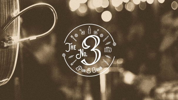
The Number Three is a traditional Bar & Restaurant based in Limerick with a contemporary audience. Previously trading as Tom & Jerry’s it has since changed owners, the new proprietors wanted a brand to reflect the new services that they would have to offer of food and drink as well as live music. The name Number Three comes from the location on Glenworth Street.  The logo’s mark is tasked to show that the business serves food as well as alcohol through iconography, we have interpreted the request across the logo with the symbolisation of beer, drinks and food brought into the logo. The most important message was food/drink and bringing that together for the new bar and therefore we came up with the tagline ‘Pub & Grub’ this shows the traditional Irish side with the slang term ‘grub’ meaning food, as well as the pub element. As the new owners are starting out fresh they wanted the logo to look contemporary but with the old Irish feel to fit in with the local community of Limerick and the industry landscape. Kaizen Brand Evolution had to create a logo that was adaptable for the future that didn’t fit in with trends so that it could be timeless and stand alone for the business and stay classic for the duration of the bar’s lifespan.

The No 3. logo design uses a timeless cursive styled font with vector illustrations of wheat, barley the types used in beer making, there is also wine bottles to symbolise the pub and drinking aspect. We have also used the iconography of a knife and fork to show the grub side, the style is a contemporary vector design around the framing to show food and drink together. The logo is a established with the colour scheme gold and dark green to give an old traditional feel of Irish food and drink in Limerick. The logo shape is in a circle with the iconography crafted around it, the circle breaks for the wheat and barley at each end to come to show. It gives that traditional friendly vibe with a modern take on it with the vector illustrations. The photography and art direction style is comfort and homely atmosphere with a sepia filter, showing good live music with also traditional connotations.

The No. 3 logo comes in two versions, the circular version with iconography and main 3 typography as well as the longer version with ‘The Number Three’ in landscape for signage for the front of the bar. For the rollout of The No. 3 logo, it will be used on glass etching for the glass windows which will work well for the etching typography for the number three, signage for the front of the bar and interiors, mirrors, doors, food and drink menus, social media. The interior designer will be working alongside the brand for the No.3 to give that homely traditional but feel inside with booths, picture frames, high stools, a long bar and wooden interiors everything you would expect to see in your typical traditional Irish bar. We look forward to working with The No.3 across all of the deliverables and seeing the brand live in Limerick, we wish the owners the best of luck in their new venture.