Understanding the Brand
The newest player in the CrossFit arena, ‘Boundary CrossFit’ came to us to create create a unique brand identity and system to showcase their brand new high-end facility, to help them prepare it for launch and growth within the industry. Their ambition was to achieve a modern, bold narrative that would pay homage to the raw industrial nature of the sport but also the physical interiors within the gym itself.
The Logo Build
The vast majority of us have heard of or have some kind of idea about what CrossFit is. For those who don’t CrossFit in recent years has become much more than just a choice of exercise. The growing CrossFit brand has become a culture amongst likeminded passionate individuals. We felt that this was a primary message we needed to get across through the Boundary Brand Identity Narrative. We needed to pay homage to the people who commit and support these gyms. We wanted to capture the spirit of these individuals and their culture and lifestyle.
The brandmark was created with the brand name at the soul of its direction. The term ‘ Boundary’ illustrates a conflicting ideology it can reflect a division, a defense mechanism, but also a sense of place, a sense of strength.
The word itself has such a powerful narrative that it was an organic development that the brand mark would be a strong typographic word mark.
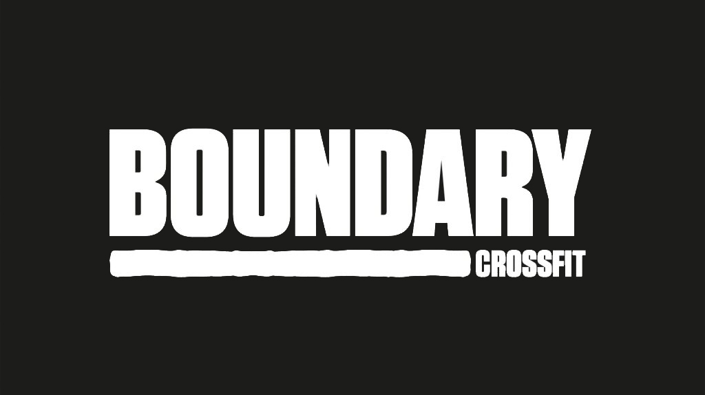
The logo is set in a modern Flat-Sided san serif typeface, a style also known as ‘gaspipe’. The modular letters evoke modernity and industrialism. The type led brandmark visualises the feeling of the word ‘Boundary’ and encapsulates the narrative of the brand. To further project the narrative of the brand an organic underline was incorporated to bring a softer contrast to the modular typemark. To amalgamate the strength of the word with the raw passion and commitment to the people who belong within it.
This notion of a warrior, war paint, the raw grit and dedication associated with the physically experience of the brand. The underline creates a device that can be used throughout the brand roll out as a visual sense of the word ‘bound’ to create metaphors and links through visual assets. The line device also enables ‘Crossfit’ to be neatly combined within the logo but also easily removed when needed and to ensure brand longevity. This strong typographic approach creates a unique typographic identity, which will become a natural association to the ‘Boundary’ brand.
The strength evoked within the logo helps to resonate with the desired audience of the brand. There is an immediate connection to the name ‘Boundary’ and the visual depiction of the meaning of the word throughout the type. This typographic language that will be used throughout the brand roll out creates a direct and powerful connection to audience the brand is trying to attract. A loyal client base who share like-minded goals, who are passionate about being a part of the ‘Boundary’ culture.
Photography
A creative direction for the photography was developed to further enhance the narrative of the brand. It is people focused to give the audience a true reflection of the ‘Boundary’ culture and to ensure the right people invest in that culture. The imagery depicts loyalty to the brand a common visual trend associated with the sports industry and the nature of the CrossFit community. Promoting through imagery of branded sportswear and to evoke this sense of belonging and passion. To showcase the hard work, dedication and passion valued by the ‘Boundary’ brand.
An image treatment has also been developed for the brand to create gritty, high contrast visuals that portray movement and energy. Contrast plays a primary role within the narrative of the ‘Boundary’ brand, with the confident stand alone brandmark the physical experience of the brand needed to be further introduced throughout the brand imagery as a storytelling device to stand out within a crowed industry.
Brand Colour
The brand colours will primarily be black and white to reflect a modern and minimal tone of voice. However, to achieve the contrast and successfully reflect the brand values associated with this industry and its audience a warm red palette was introduced as a secondary colour device for the brand to utilise.
Red is a strong colour that has a direct cultural connotation to passion and love, but also has conflicting meanings of jeopardy or boundaries, and in this case over coming these physical boundaries the blood, the sweat and the tears reflective of the industry and resonates with the target audience.
Brand Language
To further enhance the brand narrative of unity and strength we developed a tagline to define Boundary as its own culture, the unity of the people who experience it ‘Bound by Passion’.
Typography is one of the main devices used within this brand. The modular san serif typeface that not only gives life to the brandmark, will also encapsulate the entire brand story. The large type family allows us to utilize the typeface throughout.
Kaizen Brand Evolution
At Kaizen Brand Evolution we understand the difficulties that brands face in evolving their brand and in keeping it fresh. If you’d like to find out more about what we can offer you can visit our brand identity page. Alternatively, you can get in touch via our contact form or by calling 028 9507 2007.


