The Number 3 – Brand Identity

The Number Three is a traditional Bar & Restaurant based in Limerick with a contemporary audience. Previously trading as Tom & Jerry’s it has since changed owners, the new proprietors wanted a brand to reflect the new services that they would have to offer of food and drink as well as live music. The name Number Three comes from the location on Glenworth Street. The logo’s mark is tasked to show that the business serves food as well as alcohol through iconography, we have interpreted the request across the logo with the symbolisation of beer, drinks and food brought into the logo. The most important message was food/drink and bringing that together for the new bar and therefore we came up with the tagline ‘Pub & Grub’ this shows the traditional Irish side with the slang term ‘grub’ meaning food, as well as the pub element. As the new owners are starting out fresh they wanted the logo to look contemporary but with the old Irish feel to fit in with the local community of Limerick and the industry landscape. Kaizen Brand Evolution had to create a logo that was adaptable for the future that didn’t fit in with trends so that it could be timeless and stand alone for the business and stay classic for the duration of the bar’s lifespan.
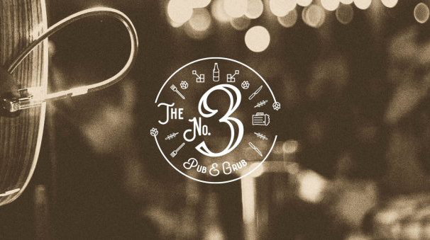
The No 3. logo design uses a timeless cursive styled font with vector illustrations of wheat, barley the types used in beer making, there is also wine bottles to symbolise the pub and drinking aspect. We have also used the iconography of a knife and fork to show the grub side, the style is a contemporary vector design around the framing to show food and drink together. The logo is a established with the colour scheme gold and dark green to give an old traditional feel of Irish food and drink in Limerick. The logo shape is in a circle with the iconography crafted around it, the circle breaks for the wheat and barley at each end to come to show. It gives that traditional friendly vibe with a modern take on it with the vector illustrations. The photography and art direction style is comfort and homely atmosphere with a sepia filter, showing good live music with also traditional connotations.
The No. 3 logo comes in two versions, the circular version with iconography and main 3 typography as well as the longer version with ‘The Number Three’ in landscape for signage for the front of the bar. For the rollout of The No. 3 logo, it will be used on glass etching for the glass windows which will work well for the etching typography for the number three, signage for the front of the bar and interiors, mirrors, doors, food and drink menus, social media. The interior designer will be working alongside the brand for the No.3 to give that homely traditional but feel inside with booths, picture frames, high stools, a long bar and wooden interiors everything you would expect to see in your typical traditional Irish bar. We look forward to working with The No.3 across all of the deliverables and seeing the brand live in Limerick, we wish the owners the best of luck in their new venture.