The importance of design in leaflets and flyers
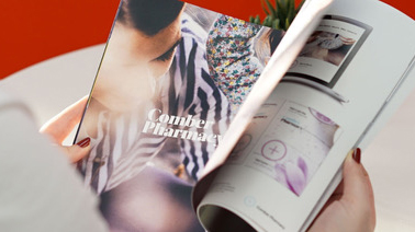
Leaflets and flyers are used by many businesses across the world, whether they are advertising a new product or talking about the services that they offer. However, when it comes to a flyer it is important to make sure that it looks good. This is due to the limited amount of space that you sometimes have to get across the message that you want, but also because more often than not people are being handed them as they are making their way to a certain destination, so have other things on their mind. This means that you need to capture their attention as soon as they are handed it and this is where the design comes in. Within this article, we are going to look at the importance of design when creating flyers and some tips for getting the best design on them.
Eye-Catching Design
Let’s start with the most obvious; the design. Whatever it is you are trying to sell or inform people of, the design on your flyer HAS to be eye-catching. Without an eye-catching design, people are either going to walk straight past your flyer, or take one and throw it out immediately as they think they won’t be interested in it. Obviously, this is exactly what you want to avoid. When designing your flyers, make sure that whatever you are putting on the front can be seen immediately and as such is the right size, instead of either being too small or too big and people can’t figure out what it is. In this instance, it’s probably alright to assume that you are going to include some form of text on your flyers. Make sure that you don’t cover your design in loads of text. Whatever you have to say, keep it short and snappy, as if the first thing that someone sees on a flyer they have been handed is loads and loads of text, they are sure not to want to read it, no matter if they are in a rush or not.
Use Colour to your advantage
Nobody wants to see a drab flyer. Instead of helping to bring out the design of the flyer, it will only dampen it and as a result, those who see it won’t want to read it at all. So make sure that the colour you use, compliments the design that you have chosen, but also makes people look at the flyer. By all means still use dark colours in your flyers, as they can really help to get across the message that you want, depending on what you are talking about. If you are using a theme in your flyer, do some research beforehand and pick colours from that era or topic. For example, if you are designing a flyer advertising an 90s disco party, research what colours would have been popular during this time, such as bright colours, possibly some neon and big lettering to accompany this. Doing some research beforehand will really help bring your flyer to life.
Organise
Before you start putting your flyer together, it is important that you have all of the information gathered that you want to be there. There is nothing worse than having something designed and then printed only to realise that some key piece of information is missing. So it is good to be organised while the research is being done, but just as important to keep everything organised on the flyer itself. Use an information hierarchy, where the most important pieces of information or text will be the easiest to see, as this is what you will want them to lock their eyes onto almost immediately. As well as this, while it may seem like a good idea to try and be abstract when designing a flyer, sometimes keeping it simple is the best course of action, because if the information is all scattered about it can make it hard to understand and read, leading to people not wanting to.
Hopefully, this gave you a little bit more insight into just why Graphic Design is so important when creating a flyer or leaflet and that one done up in Word, really isn’t going to cut it. However, we do understand that not everyone is a graphic designer. So if you are in need of some design for your next project give us a call on 028 9507 2007 or email us at studio@kaizenbrandevolution.com, we’d love to chat.