United Wines – Brand Identity
United Wine Merchants approached the brand team at Kaizen Brand Evolution with the objective of repositioning their brand identity and communications to be more in line with their unique service, product and reputation. With over 36 years in business, United Wines have moved with the times in terms of their product portfolio and brand associations, however, their own brand has remained unchanged. Today the company is modern, forward-thinking, and upholds a formidable reputation. With this said it deserved an identity to truly represent them.
In their own words:
United Wine Merchants incorporating HEINEKEN NI is a dedicated Agency led wholesale business within the Licensed Trade servicing the entire On and Off Trade. As a subsidiary of HEINEKEN IRELAND, we are the licensed wholesale company responsible for developing the HEINEKEN portfolio including Orchard Thieves across Northern Ireland. Now in our 34th year of operation, we pride ourselves on our market leading and award-winning portfolio of Beers, Wines, Spirits, and Soft Drinks. Beyond timely supply and reliable delivery, we have got a range of marketing support and an experienced sales team to help you select the right range for your customers. We can design your wine lists, supply POS and provide your staff with product training as our Sales and Marketing team are all WSET qualified.
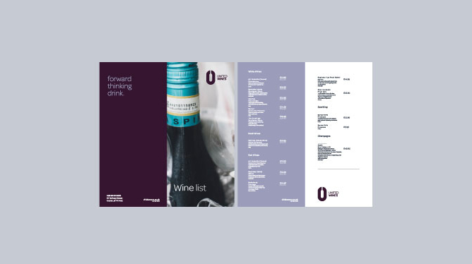
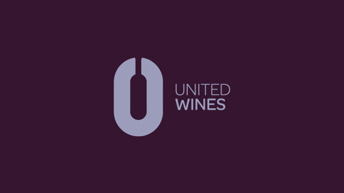
The team at Kaizen Brand Evolution created 3 unique brand designs for United Wine Merchants, each one exploring separate USP’s and reflections of their current standing in the marketplace. From colour variation, negative space, wine hints and some contemporary type styles we aimed to flex our creative skills in this brand audit, after all, it has been 30 years since the current branding, time for us to show potential. The new, chosen brand mark incorporates modernity, negative space and a clear, focused typestyle. The colour palette is reflective of their current ‘wine palette’ with a great balance of a highlight and base ‘berry purple.’ Each element of the logo represents truthfully the ambition United Wines set us from the outset. You will also notice that the word “merchants’ has been removed from the primary, simply for simplicity. When referring to the company people tend to drop the Merchants, so we dropped it.
Language plays an important role in the new brand direction for United Wines. We put together a language style for the brand to take forward, one which highlights their USP’s but one that has an almost tongue in cheek wordplay. Statements such as ‘from harvest for beer fest’ for ‘forward thinking drink’ set the brand apart from local and national competitors. Setting this tone of voice at the beginning of the new brands journey will pave the way for how the brand communicates on and offline, short and sweet…but engaging. The company and staff at United Wines are extremely personable and friendly so the language guide was set to reflect not only their products and service but their people – something that United Wines pride themselves on.
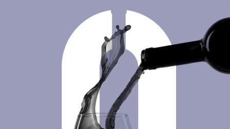
We directed the artistic and photographic style for the new branding using process, ingredients and the art of creating the products they sell at United Wines – rather that typical product imagery or cheesy stock imagery. The new visual narrative for the company has depth and explores the story of their products.
We are extremely proud of the United Wines rebrand and continue to roll the branding and design out across digital and printed materials. The new United Wines website is under development in the Kaizen Brand Evolution studio as well as the new internal office and vehicle livery which we are excited to see live and kicking. If you feel your business is in need of a rebrand or repositioning to represent your service or product accurately simply get in touch with our award winning brand experts at studio@kaizenbrandevolution.com